Color for kitchen walls: selection rules and recommendations
Everyone has their own favorite colors for the kitchen, but not everyone is suitable for wall decoration. There are proven developments that are used in design practice:
- Bright colors will attract all the attention and will tire you if you spend a lot of time in the kitchen;
- Furniture that matches the color of the walls looks respectable, but a beautiful set will be lost against a related background;
- When deciding what wall color to choose for the kitchen, remember that cold colors reduce appetite, while warm colors provoke the desire to snack;
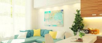
- Personal preferences do not always fit into interiors. Unlike clothes, you cannot use acidic shades or use 5-6 bright colors. The ideal “kitchen trio” involves a light background and two contrasting colors;
- In contrasting combinations, you cannot use “50 to 50”; a light shade should fill ¾ of the surfaces. Dark colors are suitable for contrast or graphic accents.
In principle, it is not so important what color to paint the walls in the kitchen; the main thing is to choose a good combination, correct the design flaws and place accents. According to the rules of Feng Shui, if you choose a cold color scheme, light shades are a priority. Textured surfaces (plaster, wallpaper, panels) look impressive only in combination with the smooth facades of cabinet furniture.
You can use a ready-made table of color combinations in the kitchen interior.
What wall color to choose for the kitchen, remember that cold colors reduce appetite, while warm colors provoke the desire to snack.
How to prepare a wall for painting
Even if the surface seems smooth, it is still worth treating it. When painting, imperfections will immediately become visible, and it will be impossible to correct them. In order not to redo everything twice, you should immediately carry out the following procedures:
- Sanding the entire surface.
- Plaster.
- A flat surface can be made from plasterboard.
Potholes are sealed with gypsum or cement based plaster.
In order for the coloring effect to be good, you need to get rid of traces of old materials. When preparing a concrete wall, you need to use the grinding method. You can get rid of old material using sandpaper or special tools.
Level the walls using plaster and acrylic moisture-resistant putty. When the wall is completely dry, sand it to obtain a perfectly smooth surface. This stage is very important, because all the irregularities will be evident after painting.
If there are traces of fungus on the walls or in cracks, you must first get rid of it. There are special mixtures and sprays against fungus. If the problem is left unchecked, things may become difficult and mold will grow under the new coat of paint.
If you find mold and mildew, remove them mechanically and treat the surface with antibacterial impregnation.
If the plaster falls off, it is better to completely replace it with a new one. Otherwise, the paint will simply fly off after application. Complete replacement of plaster can take a decent amount of time and will cost quite a bit. New smooth walls need to be coated with primer. It dries in about 5 hours. The layer must be completely dry to avoid problems in the future.
Basic combination techniques
When choosing the color of the walls for the kitchen, it is important to take into account all design elements, including metal fittings. A harmonious combination can set the emotional background of the room.
Important combination techniques when choosing kitchen colors:
- Pearl gray is suitable as a background for spectacular combinations with pink, blue, lilac, red and blue;
- The milky tone harmonizes with warm shades and is suitable for dark shades of the cold spectrum;
- The beige color of the walls in the kitchen is considered universal - any combination of colors and shades;
- Light brown, akin to beige, looks good with white, turquoise and azure complements;
- The pale pink color of the walls goes well with the gray, raspberry, chocolate and caramel colors of the facades;
- Burgundy and cognac look perfect with milky, pale blue and black and white contrast;
- A lavender kitchen in a Provencal style is combined with olive and pale blue walls;
- Peach and apricot combine nobly with cream in contrast with brown;
- Golden, yellow and lemon are combined with purple, black and granite;
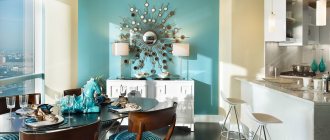
- Turquoise and azure go well with crystal white furniture.
Black is an extravagant color, but as the main color of the walls it is not always suitable for a white “kitchen”. It is important to maintain color balance. The “cosmic” color of the walls is able to “absorb” space. Black gloss has a mirror property.
When choosing a dark color, consider the texture and light absorption of the surface. Glossy and matte textures are perceived differently.
The beige color of the walls in the kitchen is considered universal - any combination of colors and shades.
Ideas on how to decorate the walls in the kitchen in an unusual way
You can make textured walls. They will have a relief and pattern that will resemble decorative plaster. Some designers mix painted walls with wallpaper. In some cases it goes very well and looks stylish. It is better for professionals to create such a finish, since amateurs can ruin the wallpaper and stain it.
A small kitchen is painted in light colors and tones; for a large area, dark colors are perfect.
Features of the geo-location of the kitchen
The degree of illumination is an important nuance when deciding how to choose the color of the walls for the kitchen.
- In low light conditions, it is advisable to choose light shades of warm colors. In the northern room, it is advisable to choose yellow, lemon or orange walls. The reflection of light will enhance furniture with a glossy facade;
- The southern location will be “cooled down” a little by blue-blue or lilac colors. A modern kitchen in purple complements well with a pink or light gray background;
- Bright shades of kitchen sets are suitable for the shaded side of the house; they are compensated by light wallpaper or plaster;
- Kitchen windows facing east receive little sunlight, so a light color scheme is recommended;
- The southwest rooms are well lit in the afternoon. Direct sunlight promotes fading. It is suggested to choose pearl gray, pale lilac or beige for the walls in the kitchen;
- Mint, lettuce or pistachio are suitable for the kitchen-dining room; they are a good alternative to bright greens.
In low light conditions, it is advisable to choose light shades of warm colors.
Associative properties of color
A large adjacent room will appear “cold” in blue tones. It is advisable to dilute it with more friendly companion flowers.
Walls are the basis or background for the entire interior. Before choosing the color of the “kitchen”, it is important to clarify the preferences of all family members. Small children will not say that they don’t like it, but they will be capricious and refuse to eat if the kitchen is purple or black with a red facade.
People prone to depression should not rely on the “dreary” gray-green color scheme. It is unlikely that it will be pleasant to cook and dine there in cloudy weather.
Fans of extravagant kitchen color combinations should take into account that the black ceiling “presses”, and the white and mirror floor makes one dizzy from instability.
The diagonal pattern will “brighten up” the difference in the height of the walls. Colorful wallpaper will hide small defects.
The decor of a small kitchen should be of a small format so as not to divide the space into blocks. Crushing will make it visually even smaller. Several small paintings in a row will visually lengthen the wall.
Dark shades slightly reduce the area. Light reflections reflected from glossy facades “fill” the room with cleanliness, air and light.
The decor of a small kitchen should be of a small format so as not to divide the space into blocks.
What paint is better to paint
The kitchen is a special room that is exposed to different influences every day, so increased demands are placed on paint for wall decoration in such a room. The walls must be regularly washed and cleaned of dust; the coating must withstand any impact. The dye must contain components that prevent the formation of fungus and mold. The paint should have a long service life, ease of application, and an affordable price. When choosing, you should consider certain points.
Mint, thanks to its natural appearance, is pleasing to the eye, does not cause fatigue or irritation and does not get boring.
The best option for painting a kitchen is considered to be water-based compositions. Water-dispersed ones create a moisture-repellent film of polymers, while the surface allows warm air and evaporation to pass through, thereby ensuring the absence of condensation. The coloring composition has no odor, it is easy to apply, and dries completely within a day after painting.
This wall design is very bold and extraordinary, and is perfect for creating exclusive and memorable interiors.
There are also several varieties of water-dispersion compositions; the differences lie in the different types of polymers in the composition.
Main varieties:
- acrylic - characterized by an increased level of moisture resistance;
- water-based - quickly fade in the sun and wear out when cleaning;
- latex - hide all unevenness and defects of painted surfaces;
- polyvinyl acetate - have all the listed properties, but are slightly inferior in quality to their analogues.
Soft and refined shades make the design more sensual.
When choosing paint for the kitchen, you should first decide for yourself the final goal. The paint can be glossy, matte, semi-gloss. The latter option is in greatest demand; after applying this composition, the wall looks perfectly smooth. The advantages of this choice also include the absence of the need for special care. Before painting, wall surfaces must be put in order and leveling must be carried out. It should be borne in mind that any defects in the wall will appear immediately after painting. Matte compounds mask unevenness, but they absorb dirt and dust. The choice depends on individual preferences; you should first consult with a specialist.
The light green background in the kitchen space favorably emphasizes and highlights the rest, both dark and light interior elements.
The influence of shades on mood and well-being
Without knowing which colors are suitable for the kitchen and which are not, it is easy to make a mistake - the emotional background of the room depends on this. It is known that psychologists have noticed the relationship between color and mood.
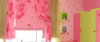
It is not recommended to choose flashy shades, especially if you have small children. They will happily eat in a room with a yellow-green or pink-raspberry design.
The red color of the walls in the kitchen excites active children, then it is difficult to put them to bed. Blue color calms, but discourages appetite.
Children are disgusted by a black kitchen, even with mirror tiles. The situation will be corrected by decor with flowers, fruits or bright citrus slices.
The red color of the walls in the kitchen excites active children, then it is difficult to put them to bed.
Painting technology
The exact order in which the paint is applied depends on the type of binder and base, and affects the effect you want to achieve. But there are general points:
- Before starting work, remove the baseboards, door frames, and remove everything possible from the room.
- Cover all surfaces that may get dirty. This is a window, doors, an apron in the kitchen work area, and the floor. For windows, doors and splashbacks, the easiest way is to use plastic film glued with masking tape. This coating can be easily removed without leaving any marks. You can also spread polyethylene on the floor, or you can use old wallpaper, newspapers, etc. You can secure them with double-sided tape, preferably also masking tape (it does not leave traces of glue after peeling off).
- The paint is applied with a roller or brush. Typically two to three coats are required to achieve an even color. Each subsequent layer is applied after the previous one has dried. This time is indicated in the technical specifications of the composition as “touch dry time.” Tools for painting walls in the kitchen
- When applying paint to a brush or roller, take a small amount of the composition and distribute it evenly. It’s easier to do this using a paint tray, which has a special area for removing excess. The paint is applied by rolling it out as thinly as possible. The most common mistake is the desire to paint over everything with the first layer of paint. This is wrong and threatens the appearance of drips - they try to apply more paint. It is much more difficult to get rid of drips than to get rid of unpainted areas. You will have to wait until they are completely dry, and then remove the sagging with fine sandpaper. Therefore, it is better to apply the paint thinly, and all imperfections will be covered with the next next layer. The result is an even, deep color. Painting walls in the kitchen: paint is applied in a thin layer
- When using a roller, a brush goes through hard-to-reach places - corners, the junction of the ceiling and wall, etc. Then, using a roller, paint over the rest of the space.
- To obtain an evenly painted wall, layers of paint are applied in different directions - one layer horizontally, the other vertically.
When painting the walls in the kitchen is finished, do not rush to test how well the paint you have chosen washes. Please read the instructions carefully first. Some of the compositions acquire their performance characteristics only a month after application. So there's no need to rush.
All of the above is true for all types of paint - water-dispersion acrylic, latex. But, before starting work, carefully read the manufacturer’s recommendations. If there are different recommendations, they must be followed.
Ideas for combining wall colors and furniture
The kitchen walls are a large format plane. Furniture determines the style and functionality of the kitchen. They must harmonize in color.
An elegant purple kitchen set has a light background:
- Gray-lilac tone;
- White;
- Pale blue;
- Fashionable color “dusty rose” (gray-pink tone).
If you have a white kitchen set, the walls can be any color. It will “get lost” against the background of white walls, so it is advisable to play up the texture of single-color surfaces. White marble countertops will look noble.
Not everyone manages to use gray tones beautifully in their design, but the color of the walls in the kitchen is in harmony with the white furniture. This is an ideal option for a high-tech kitchen. For dark facades, it is better to take the lightest tone in this range - it will be much more interesting than white walls.
If you have a white kitchen set, the walls can be any color.
Creamy and lilac
A wall painted in a different color than the kitchen front visually enriches the space. See how this can be done with companion shades of the pastel range: cream and lilac. Try to make your own “map” of pastel shades - companions.
Author of the project: Margarita Delacroix. Photo: Ivan Sorokin.
Author of the project: Margarita Delacroix. Photo: Ivan Sorokin.
What color is best for the kitchen space?
White color is considered universal. It can be offered to those who have not decided what color to paint the walls in the kitchen. It is used in all styles and design concepts.
Alternative to crystal white:
- Pearl grey;
- Pearl;
- Lactic;
- Cream;
- Light beige;
- Soft lilac;
- Blurred blue.
White color has several shades - light gray, white-blue, cream (yellowish) and pearlescent. It is not recommended to use them at the same time, otherwise against a pure white background they will look like “dirty” or “old” surfaces.
Nowadays the delicate peach color of the walls in the kitchen is widely used, but it requires gold or copper fittings. The silver-gray tone goes well with the chrome details of modern furniture - an ideal solution for urban minimalism and high-tech style.
Nowadays the delicate peach color of the walls in the kitchen is widely used, but it requires gold or copper fittings.
Stages of color selection
The first thing you need to understand is the scope of the work, so before you start designing and choosing the color of the walls, it is important to study the recommendations of designers, psychologists, and look at photographs in magazines. It is recommended to select 10 optimal options that you like and print them. After examining possible solutions, the following steps :
- The style of the kitchen is determined. Having chosen the ones you need, you will need to study all the subtleties, features and choose a shade.
- Decide on what you like, and not imitate fashion. If a certain color evokes delight and improves your mood, then you need to focus on it. This can be a base for walls or a complementary color for tables, furniture and other kitchen accessories.
- Before buying paint, take a few photographs of the kitchen, show them to the consultant, perhaps he will recommend several good options.
- It is better to choose 3 colors from the entire range. They must match the style, decorative elements, and mood. If the kitchen is planned in warm colors, you can choose a country-style kitchen, which will highlight the details.
- When purchasing, you need to use not only a photo of your kitchen, but also a small list of possible colors and additional accessories for the room. Be sure to clarify the quality of the paint, its advantages and disadvantages.
After all the stages have been completed, you can move on to decorating and painting the kitchen.
Color solutions that visually change the size of kitchens
When deciding what color to paint the kitchen in an apartment, you cannot ignore the layout features. In most projects, the cooking area is often limited in size.
When choosing options, take into account the dimensions of the kitchen, ceiling height, daytime and evening light, and existing furniture. For a small kitchen unit you need light colors, maybe in cold colors. In a kitchen where there is a large area of walls, avoid bright colors, they are tiring. Black color “steals” part of the space.
Light warm colors visually expand a small space, for example, if it is the beige color of the walls in the kitchen. A cool palette will slightly expand the narrow layout if cabinet furniture is located along the working wall.
Vertical stripes of walls and glossy stretch fabrics will “raise” the ceiling. Horizontal stripes of contrasting colors along the perimeter will make the kitchen appear wider. Diagonal lines on tiles or colored wallpaper add more dynamism to the design.
A good mood is guaranteed in a white kitchen with a silver patina in vintage style. The option in beige and apricot tones looks impressive.
Horizontal stripes of contrasting colors along the perimeter will make the kitchen appear wider.
Color combinations
There are ready-made principles for choosing the color of the walls in the kitchen, which are used by famous designers:
- Black and white version. Suitable for modern interior;
- Favorite color. It is not always possible to properly integrate it into a room. An extravagant fuchsia kitchen will be emotionally balanced by white walls and curtains;
- Monochrome kitchens are an excellent solution for those who do not like diversity. Beige, sky blue, gray-lilac, peach or cream shades look good. Pastel colors and some shades of green are suitable - mint, yellow-green, but you can choose the calm color of apple green;
- Classic duets. Win-win variations - blue and white, caramel-beige cuisine or white and dark chocolate. An emerald-colored kitchen is well complemented by pale blue walls, and a delicate lilac background will set off a plum-colored kitchen;
- Combinations from the color wheel. Use shades within the same color, opposite and adjacent combinations.
Those who want to slightly dilute the interior of a white kitchen are invited to decorate the kitchen floor and backsplash with tiles with a graphic pattern.
Monochrome kitchens are an excellent solution for those who do not like diversity.
The best color combinations
Everyone loves natural combinations, where the entire design palette is based on shades that are associated with something from living nature.
The simplest combination is a two-tone kitchen. You can experiment, not forgetting that one color should be brighter, the other muted.
Extravagant trio - white, red and black. He has the right to live when they don’t know what color is best to paint the kitchen. White is by far the best background. This option can be played up if there is a soft red for the walls and a black gloss on the façade of the set.
Four shades within one color are the designers’ recommendation. For example, a lavender-colored kitchen complemented by purple, lilac and white.
The simplest combination is a two-tone kitchen.
Choosing a color for the ceiling
If you think that this issue has been resolved, then you are deeply mistaken. White color has long ceased to be a monopolist when choosing the design of a kitchen ceiling. Nowadays, various color options and even conceptual drawings are increasingly used.
In small kitchens there is no need to experiment with color. The best options are white, cream, the lightest shades of gold, turquoise, gray, purple. But the spacious rooms allow you to create interesting original ceilings. They can be made in absolutely any color scheme, the main thing is that there is harmony with the room as a whole.
Complex ceilings look interesting, and often become an independent art object. If the ceiling is multi-level, levels of different colors will look great, but you should not use more than three shades and one of them must be light. An interesting pattern can also be created on stretch ceilings, but it must match the color and style of the kitchen interior.
What colors should not be used in the kitchen interior?
Today there are no “forbidden” combinations, but some colors will not look decent if they are not played up.
- The dark green color of the walls is associated with the older generation with the Soviet period, when there were problems with paint, it is replaced with emerald or azure;
- Dark gray has several noble “stone” shades, but it is not recommended to use it as a basis;
- Orange is a pleasant color in all respects, but it is used in an “aggressive” trio with white and black;
- A kitchen in gold or silver looks ambitious; this is “Rublev bad manners”.
The dark green color of the walls is replaced with emerald or azure.
Which shades are best to avoid?
When decorating kitchen walls, refrain from using bright colors. All tones will look bad:
- light green;
- orange;
- purple;
- burgundy
They may be preferred if the kitchen has a large area. In free space, the tones look beautiful and do not cause disgust.
Unsuccessful combination of shades in the kitchen with blue walls Source pinterest.ru
On a note! Many people paint their kitchens dark chestnut or black. This is not the best option for walls. Even with good lighting, the room will remain gloomy and depressing.
Expert advice
To understand whether it will be cozy in a room with a particular shade of walls, it is worth hanging a sheet of colored paper of the chosen shade in front of your eyes or eating area. If it is perceived negatively, you should abandon the idea even before the walls are completely transformed. In percentage terms, it is important which color will be the main color in the room; the rest will be regarded as additions and accents.
Some shades of brown and terracotta look quite noble, others are “dirty”. They are not suitable for classic interiors, but they significantly enliven ethnic and country style.
For classic kitchens, pastels, wood shades, and duets with a white or beige background are suitable. You can select noble additions by duplicating them in furniture and textile designs.
Furniture is most often the basis of interior design. When choosing a successful trio or duet, they focus mainly on the color of the facade.
For classic kitchens, pastels, wood shades, and duets with a white or beige background are suitable.
Today there is no perfect palette - with every renovation you have to summarize new trends and previously purchased furniture. Some people like monochrome, when everything is one color. This solution in interior design has a drawback - it often looks boring and faceless, especially in gray. However, each tone has at least 4-5 shades. You can choose several advantageous combinations from them when deciding what color to paint your kitchen.
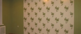
Shades “taken” from wallpaper
Interior designers recommend that part of the kitchen can be covered with wallpaper, and part can be painted. Colorful wallpapers can hide visually uncomfortable elements such as an air duct or a load-bearing column, but that’s not all: they can become a treasure trove of color solutions.
After all, in good wallpaper everything is very competent and professionally balanced. Just “get” the primary colors from them. You can make them lighter or darker, it’s your choice.
Author of the project: Evgenia Mishina. Photo: Sergey Krasyuk.
Author of the project: Evgenia Mishina. Photo: Sergey Krasyuk.