A little color theory
There are three types of colors: primary, compound and additional. Primary colors include red, yellow and blue. Composite colors are colors formed by mixing (for example, pink). Complementary colors are achromatic colors: black, gray and white.
Contrast is a sharp opposition of colors, expressed in noticeable combinations. When two contrasting colors are placed next to each other, they highlight and enhance each other. Examples of significant contrasts are red-green or blue-orange combinations. There are special tables indicating the contrast of colors in relation to each other.
Color theory chart
Colors are warm (yellow, green, red) and cool (blue, purple). Warm tones are associated with summer warmth, fire and sun, while cold tones are associated with cold, gray skies and depth. However, this division is rather arbitrary, since it is largely based on the emotional perception of a particular person.
General rules
When choosing a color, you should adhere to a number of simple rules:
- First of all, you need to correlate the chosen color with a specific room. It is especially important to consider the strength and nature of the lighting, since light can significantly distort the color of the coating.
- The maximum number of flowers in a room is three. If you exceed this norm, the room will seem too colorful. It should be noted that the shades are not included in the specified standard, and black, white, chrome colors will look organically in any color scheme, since they do not look like independent colors, but rather like their absence.
- You should decide on the main color that will dominate the range.
- Bright colors are usually not worth using to paint large areas. Brightness is more suitable for highlighting small details.
- You can make a monochromatic surface more diverse not only with multi-colored paints, but also with texture. For example, if you process the same paint with different types of rollers, you will get an interesting patterned coating.
- Adjacent rooms will be perceived as a continuation of each other if they have at least one identical design element. If you place moldings that are equally colored on both sides between multi-colored rooms, adjacent rooms will be more harmoniously combined with each other.
- The color scheme should not be dissonant with the ceiling. The best option is to paint the ceiling with the same paint that is used for the walls, however, in a lighter tone.
- You should not choose a color based on the fact that the room is empty. Without connection with furniture, carpets, textile and decorative elements, it is impossible to make the right choice.
- It's difficult to make the right choice while in the store. Surely the rack will be illuminated by fluorescent lamps, which will distort the true tone of the paint.
- The same paint composition will look different on different surfaces. For example, on a smooth surface the paint will appear lighter, on a rough surface it will appear darker, and on a matte surface it will appear warmer. Moreover, the matte surface can add warmth even to cold tones. Polished finishes impart freshness even to hot colors (for example, red).
- To add brightness to the room, you can paint adjacent walls in sharply contrasting colors.
- Usually walls serve only as a background for interior items. However, you can take a different route, making the walls the main design element, and furniture and other elements only an addition to the main theme.
Note! During sunset and dawn, the light spectrum differs significantly. The difference between natural and artificial lighting is even more noticeable. For example, a fluorescent lamp gives a yellow tint, while dawn lighting gives a soft pink tint.
Tips and tricks
When using colors to paint walls, you should adhere to the following recommendations::
- When applying to a putty surface, a layer of primer is a must. If wallpaper is already pasted on the wall, then you can skip this step.
- All work with paint is carried out with gloves.
- Simply adding color to the main volume of paint is not enough. It must first be mixed with a small amount (about 100 g) of the base and only then gradually added to the main volume.
- It is important to constantly stir the finished mixture. Then the color is uniform at all stages of painting.
- Before starting work, the roller must be rolled out, that is, soaked in the coloring composition and rolled over unnecessary pieces of wallpaper.
- It is better to try the paint in a place where it will not be visible (there is a cabinet or other furniture planned there).
- It is most convenient to paint the corner near the stream with a roller.
- All layers should overlap, not coinciding with the joints on the wallpaper.
Our experts have prepared a number of materials for those who are planning to paint the walls in their apartment with their own hands. Read about how to refresh the interior of the living room, bedroom, hallway, bathroom and toilet.
Using the color when painting walls does not cause any difficulties .
It is important to approach all stages of painting work correctly, then you will get a well-painted room, without flaws or defects. It is advisable not to overlook a single detail, since it is the little things that make up an excellent result.
Color perception
To decide what color to paint the walls, you need to understand that each color carries an emotional component and unconsciously evokes a certain reaction in a person.
For example:
- White color makes the room feel more spacious and voluminous. However, the significant presence of white creates a feeling of complete dominance. In addition, large-scale white surfaces do not correspond to the concept of comfort, are quite boring and create the atmosphere of a government-owned, for example, office space.
- Red is the color of aggression, passion, anxiety. It has been proven that red surfaces help increase human metabolism and also stimulate sexual arousal. You can’t overdo it with red, otherwise a person will quickly get tired in such a room.
- Blue and green colors look very natural as they resemble water, leaves and the sky. The abundance of such tones gives a calming and relaxing effect. Green and blue are ideal for bathroom decor. It is also worth noting that, despite the relaxing effect, green color helps to concentrate.
- Yellow tones are a great option for a living room or dining room. They have the same origin as sunlight and give a feeling of security, without having a soporific effect.
- Gray and brown allow you to focus. The brown palette looks noble, expensive and elegant.
- If the color scheme of paints contains orange, the body receives a positive emotional charge. However, if you overdo it with orange, a person falls into a drowsy state.
- Violet promotes mental work while relaxing the nervous system. The color is considered especially suitable for decorating children's rooms.
- Black color can be perceived as a source of danger and depression, but when used in moderation, it gives the room solidity and solemnity.
If you need a comfortable, relaxed atmosphere, it is better to prefer warm neutral tones: peach, cream, yellow, milky coffee, lilac, etc. If the goal is to create an interior that is invigorating, it is recommended to choose more energetic tones: green, red, orange, royal blue or pink. Cool colors such as blue, white, and emerald will bring coolness to the interior.
Wallpaper paint for painting, which is better?
When choosing paint for wallpaper, you need to consider all the options for paint and varnish materials and study their pros and cons.
Alkyd paint
Alkyd solutions are not used for painting wallpaper in residential areas. Such paints contain oils and resins that negatively affect human health.
At the same time, alkyd paints have the following features:
- Resistant to sunlight and humidity.
- Saturation of colors.
- The composition contains various additives that protect against fungi.
Bright shades.
Alkyd paint solutions have a short service life.
Water-dispersion paints
Most often, water-dispersion solutions are used for painting wallpaper. They are harmless to the human body and have a wide color palette.
Water-dispersed acrylic-based latex paints are intended for painting non-woven fabrics and glass wallpaper. This type of material is used for the walls of living rooms, bedrooms and kitchens. The solution has virtually no odor and dries in no time.
Latex mixture
Characterized by elasticity and strength. You can buy white mixtures in the store, and the required shade is created using tinting. This option allows you to create beautiful pastel shades. Recommended for rooms with high humidity. Painted walls can be wet cleaned.
Water-based formulations are produced with a neutral white base color. To obtain the desired shade, you will need to use coloring pigments, which are added in certain proportions and allow you to obtain a rich color palette.
Selection of colors.
Room dimensions
With the right selection of colors, you can correct the perception of the actual size of the room.
Basic Rules:
- For a small room (for example, a kitchen), it is advisable to choose light colors and bright artificial lighting - this will visually enlarge the space.
- If the ceiling is too low, you can paint it white, which will make it appear higher. Light-colored ceiling plinths will help enhance the effect.
- High ceilings also create a feeling of discomfort for many people. A dark ceiling in combination with light walls will help correct the situation. Moreover, this can achieve a double effect: the ceiling will appear lower and the area of the room larger. The desired effect can be further enhanced by using appropriate lighting.
- Cool colors best help visually expand a room: green and blue. A pale blue tone is particularly effective at creating the impression of a higher ceiling.
- The wall will appear taller if you paint the ceiling moldings in a similar color.
- In small rooms, too contrasting solutions should be avoided.
- If the room is too small, you should not paint the walls or decorate them with eye-catching elements, as this will only emphasize the cramped space.
- In large rooms, it is recommended to use deep and dark colors.
- If you need to visually reduce space, use yellow, red or orange colors.
Additional factors when choosing a color
Before you decide what color to paint the walls, you should ask yourself a number of questions:
- Do you travel often? Perhaps something you saw during your trip will inspire you to create a specific color palette.
- Do you have a hobby? Using a background associated with a hobby (a green golf course, white snow on a ski slope) will give the room additional comfort.
- Do you like to spend your leisure time in an apartment or house? If so, then perhaps you should think about calm, pastel colors.
- Do you spend a lot of time at work? Keep in mind that white walls are easily soiled and require careful care.
- Does work often bring stress? Flashy bright colors do not contribute to peace of mind.
- Do you have small children? Calm midtones appeal to children and do not have a stimulating effect on their psyche.
Choosing colors depending on the room
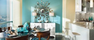
- Living room. If you love watching movies, it is recommended to use deep tones - they will help create the feeling of a cozy cinema. If the room is often used for games, you can add a wow factor, i.e. use elements that attract special attention (for example, an accent wall or decorative painting). Deep red or orange tones are conducive to conversation.
- Dining room. To give the room a formal atmosphere, gilded moldings are suitable, but this applies more to a dining room with banquet functions. Neutral, muted tones are more suitable for a family atmosphere.
- Bedroom. Most often, the greatest comfort can be achieved with pastel colors.
- Bathroom. As mentioned above, the best colors for this room are green and blue. However, women who apply makeup in the bathroom should take into account that the color green disrupts the perception of complexion when displayed in the mirror.
- Kitchen. Traces of dirt are more visible on light-colored walls. The blue tone reduces the feeling of hunger.
The tips above will help you figure out the right color selection. The most important recommendation is to take your time when choosing a color palette, not to succumb to the momentary mood and approach your choice systematically, taking into account all possible factors.
Combination with other materials
In the interior, 2-3 types of wall decoration are often used to diversify the design.
Wallpaper and painting
They can be combined in the case of finishing the ceiling with wallpaper and the walls with paint, creating an accent on a painted wall, or combining bottom - paint, top - wallpaper. There are also special paintable wallpapers that can be repainted several times.
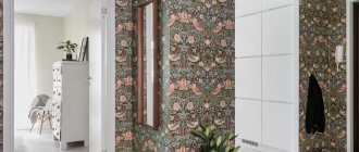
Photo wallpaper and painting
Used in the kitchen, hallway and toilet. The walls are exposed to moisture, so photo wallpaper is used for decoration.
In the photo there is a bedroom interior with photo wallpaper and neutral walls, the podium serves as a closet.
Plastering and painting
The plaster can be painted on top of the bark beetle, which will give relief to the walls, or combined with painted adjacent walls in the interior of the toilet, kitchen and hallway.
Wood and painting
A wooden wall made of beams or laminate is combined with plain wall painting in the interior of an attic, living room, or country house.
Stone and painting
Suitable for decorating a fireplace wall in the interior of a living room, country-style kitchen or chalet, where the apron is made of piece stone and the rest of the walls are painted in a single color or a transitional color. Brick and painting are suitable for finishing a kitchen in Provence or loft style.
Brick and paint
The brick can be white or red, and the paint can match the brick, or differ in color.
The photo shows an eco-kitchen with olive walls and a brick partition.
3D panels and painting
3D panels are suitable for simple but unusual interior design. Plain walls with volumetric panels are suitable for a discreet and stylish design, and two-tone painted walls with colored panels look good in a nursery or in an abstract interior.