How to decide on a color?
There are many different theories regarding which paints to use for certain spaces. At the same time, you decide for yourself which color scheme you feel best in.
For example, there are people who love their homes decorated in black, red and white. And for some, this combination has a negative effect, because it increases blood pressure and provokes the release of adrenaline.
The first question a designer asks his clients is: “What is your favorite color?” And if family members cannot come to a common opinion, the specialist tries to combine their favorite shades in a single combination and find compromises that suit the customers.
How do you know which color you like better than many others? Just choose any image that is pleasing to your eyes. Using special services, for example, Bighugelabs, you can determine the palette of each image and photograph.
In this case, the program will mix the shades and give an average result of three or five tones. You can see the accents in the original picture and use these colors in the interior.
If you don't find anything suitable, you can use the color wheel. Online services like Colorscheme help you choose harmonious combinations for monochrome, contrasting and accent palettes. In this case, you can change the degree of lightness of the main tone, darkening or lightening it.
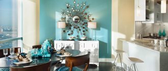
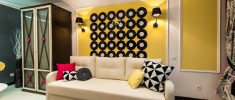
Important! In order for the interior to look professional, it is necessary that the main color occupies at least 65% of the entire space. The remaining 35% is allocated to additional shades. And about 5% of the space is allocated to accents.
For example, if your main color is chocolate and you want to use 5 different colors, then 65% will be the main tone.
In our case, it will be on the sofa, wardrobe and armchair. It will be accompanied by delicate turquoise on the walls. And use orange pillows and curtains as an accent. At the same time, a delicate toffee in the form of parquet will appear on the floor. And the cherry on the cake will be mint or mustard greens in the form of a discreet bouquet.
How to paint the walls in the hall?
The design of the walls in the hall depends on the location of the room. Before you make a choice of what color to paint the walls, you need to pay attention to this.
For a room facing north, warm shades are suitable. A brightly lit room on the south side should be painted in cool colors. If a light color scheme predominates, then you can use it to adjust the proportions of the room.
If you are decorating with your own hands, then choose darker or warmer colors for the side walls. Thus, the elongated room will expand and decrease in length. To do this, you need to decide what color to paint the walls in the hall.
For spacious rooms, yellow, blue, gold, gray-green tones are suitable.
For a small room, more saturated shades are allowed: peach, lilac, azure. A combination of milk and brown will make the room look respectable and elegant.
Taking into account the design of the room, you need to choose the colors that are best suited for the interior. Bold combinations of brown and lilac or brown and blue are characteristic of fusion or eclectic styles.
Related article: Sunny yellow - its shades and combinations
For Scandinavian style, calm pastel colors create a feeling of comfort and spaciousness. Classic design is characterized by the use of beige and brown.
Style and color
Each style has its own palette, from which you should not deviate. By introducing, for example, neon colors into a classic interior, you will get kitsch on the verge of bad taste.
Physiologically, a person evaluates an environment as safe and stable when the darkest shade is underfoot, the midtones are at eye level, and sky-white shades extend above the head.
At the same time, modern interiors indicate that designers love to play pranks and turn everything upside down. Therefore, we can find chocolate and even black stretch ceilings over beige and white floors.
So, here is a style sheet and color schemes.
| Color | Style | Combination with other colors | Suitable for: | Peculiarities |
| White | Modern, classic, modern | All | All rooms | Adds airiness and increases space |
| Grey | Provence, country, classic | Yellow, green, red, orange, black, white, purple | Office, living room, teenager's room, kitchen | Neutral color. Suitable for a relaxing time |
| Black | Art Deco, high tech, modern, loft, minimalism | Purple, white, gold, red, orange | Large living room | Visually reduces space and is associated with luxury |
| Red | Modern, high-tech, minimalism, classic, art deco | White, brown, purple, gray, orange | Living room, kitchen | Activates the optic nerve |
| Orange | Art Nouveau, Provence, minimalism, contemporary | Beige, black, white, blue, green, red | Living room, kitchen | Stimulates appetite, associated with oranges |
| Yellow | Modern, minimalism, Provence | White, grey, purple, brown, black, red, blue | Spacious living room, children's room | Reminds me of summer, the sun, and lifts my spirits. Often used for emphasis. |
| Green | Classic, country, modern | Beige, brown, white, grey, yellow | Kitchen living room, hall, children's room, kitchen, bathroom | Adds freshness to the interior |
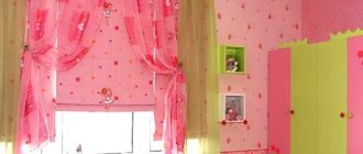
| Pink | Modern, classic, shabby chic, country | Black, red, purple, white, gray | Children's room for girls, living room, kitchen | Pastel pink soothes, bright pink tires |
| Blue | Classic, high-tech, country, loft | White, green, red, grey, brown, yellow, black | Large living room, children's room, kitchen, bathroom, toilet, studio apartment | Adds solidity and at the same time calmness. Represents originality and practicality. |
| Violet | High tech, classic, loft | White, pink, green, yellow, black, blue | Apartment studio, bathroom, living room, kitchen, children's room, bedroom | Associated with lilac, spring shades |
| Brown | Modern, country, Provence, classic | White, red, green, grey, purple, yellow, black, orange, beige | Living room, kitchen, bedroom, corridor, bathroom, office | Creates a homely atmosphere, adds comfort and warmth |
If you follow the designers' recommendations and use color palettes that suit your style, you will always win. Use the color wheel in situations when you are in doubt about choosing a particular interior element. Better yet, trust the masters to create the project. In this case, your home is guaranteed to be decorated tastefully and in full accordance with the chosen style.
Example of room design
Most often, light colors are used when decorating a bedroom, kitchen or bathroom. A bedroom interior in a light color will add style and comfort to the room. By choosing the right design solution, you will make the room unique.
Light colors will be appropriate for both large rooms and small bedrooms.
A classic-style interior that uses two types of wallpaper on the walls will look impressive. Three walls are designed vertically flat, which visually expands the space.
Hydraulic Rescue Tool - Main FeaturesWave color in the interior: 55 photo examples of revitalizing the environment
- Do-it-yourself Wilo pump repair
The main emphasis is on the wall near the head of the bed, decorating it with a beautiful pattern.
Rules for choosing colors for floors, walls, furniture and ceilings
So, we figured out which color goes with which. Next, we will dwell on the objects that are present in each room, and we will understand the principles of using certain shades.
Floor
There are several unspoken rules that should be considered when choosing a color scheme for the floor.
Light floor:
- Increases space.
- It is a reflective fabric.
- Can be used with a light shade of walls.
- Suitable for bedroom, bathroom, toilet, living room
Dark floor:
- Combines with light walls, ceilings, and dark ones. But it should be at least 1 tone darker.
- Suitable for any room.
- Bright accents look good against its background, provided there is good lighting.
- Doesn't go well with a dark door.
Walls
The walls can be made in absolutely any color. Depending on the purpose of the room used, it can be active, passive or neutral.
Active colors are an accent. They are combined either with the opposite bright color, or with a less bright, calm color.
A popular solution is walls in pastel colors. They play the role of background to the main view of the room. In this case, you can use any floor, furniture, ceiling. Since this is a universal option.
Ceiling
The ceiling is most often chosen in white or light shades. Since it is a universal color and can be combined with any furniture, ceiling, floor. Can be matte or glossy. If you want to add contrasts, it is better to add a rich color to the walls or interior items. Can be used in any room.
If the choice fell on a dark ceiling, then it is worth considering several nuances:
- A black ceiling can only be done in a large space with high ceilings. Minimum height 3 meters.
- Combines only with white and light furniture and milky colors of walls, floors, furniture
- Suitable for minimalist style
- Creates an expensive effect in a room with panoramic windows
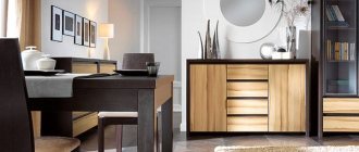
Furniture
When choosing the color of furniture, remember 2 basic principles:
- It should be darker than the walls
- Lighter than the floor
Then you can rely on your taste and make the combination of all interior items ideal. See a photo selection of various combinations and get inspired.
Use the optical properties of colors
The room you are planning to transform does not have ideal proportions? This is not a problem if you remember in time about the optical properties of colors. Warm tones visually bring the surface painted by them closer, while cold tones make them move away. For example, for a smaller wall of a narrow pencil case room, choose a yellow-brown color, and visually the room will take on a more regular shape. To enhance this useful optical effect, paint long walls in a harmonizing cool shade. For a small room, it is not recommended to choose saturated colors. In addition, a person who finds himself in a confined dark space feels depressed. Pastel colors will visually increase its area. If you are the happy owner of a room whose dimensions are significantly larger than the average, feel free to use dark shades.
9 successful color combinations in the interior of an apartment
Best combinations
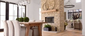
White wall color is universal, so it looks harmonious with most shades. Serious and uncompromising natures will like the monochrome furnishings - a contrasting combination of black and snow-white. This is a traditional option, giving an atmosphere of rigor and respectability, even if little money was spent on renovations.
Nature lovers will appreciate the combination of pearl, green and wood. This solution is relevant for Scandinavian and eco-style: light walls bring furniture and decor made from natural materials to the fore.
The milky color also makes an excellent background for bright details: yellow accessories make the atmosphere joyful and sunny, while red ones emphasize the courage and originality of the apartment owner.
The photo shows a living room with white walls and a black accent area in the TV niche.
The white color of the walls in the interior looks great in combination with calm beige and luxurious gold, giving the living room or bedroom sophistication.
Cool blues, aqua and mint tones are suitable for nautical-style rooms, as well as modern interiors that want to add freshness and airiness.
The combination of white and gray is considered a winning one: this option never goes out of fashion, and it is also easy to dilute with splashes of color.
The photo shows a living room with white walls, which recedes into the background, highlighting the original furniture and a magnificent fireplace.
Recommendations from experts on choosing colors for different rooms
The palette of colors for decorating a room depends on its main purpose. It is not recommended to use a lot of bright and saturated colors for the bedroom. This will cause oversaturation of the interior. In such a room you won’t be able to relax and recharge your batteries for the next hard day at work. For a children's room, bright accents are required that involve the child in the world of games and positive emotions.
Kitchen
Well-thought-out combinations of shades will allow you to successfully decorate your kitchen space. Particular attention is paid to decorating the walls, ceiling area, floor and furniture elements.
Important! The rules are followed: if the walls are painted in a bright and catchy color scheme, the furniture is made in neutral shades. And vice versa.
The design of kitchen units with imitation of natural wood and stone is popular. The optimal combination with cream, pink, bright blue, green and beige. The range you like is divided between the decoration of different areas of the room.
Wooden kitchen
The modern trend is kitchen design in high-tech style. The base background is grey. Although it is considered dull and boring, its skillful combination with other bright shades will make the interior luxurious. Attention is paid to dark pink, red, purple and bright blue.
Tips for kitchen interior planning:
- when choosing harmonious shades, remember that they may look different on different textures and surfaces;
- contrasting colors allow for room zoning;
- Lines, patterns, prints and drawings will allow you to revive the interior of a monochromatic kitchen;
- the kitchen set should be darker than the walls and lighter than the flooring;
- Glossy surfaces help expand the saturation and depth of shades, matte surfaces do the opposite.
Living room
The choice of colors directly depends on the purpose of the living room. Will this be a room only for receiving guests or at the same time a place to sleep. The living room creates a balance of beauty and comfort in the home. Its interior receives increased attention.
Red with a little gold will add a sense of celebration and celebration. Olive gravitates towards intellectual games and reading, interesting conversations and deep statements. The combination of purple and gray will enliven any friendly conversation and set everyone up for a good time. Blue is the personification of calm and tranquility. But it is used carefully so as not to make the interior gloomy and dark.
Bedroom
Rest is the key to health and well-being. Therefore, the bedroom must satisfy the individual needs of the owners. Neutral and warm tones are used. The percentage of bright and variegated shades to the background is 1 to 10. The use of more than 7 tones in the interior is not allowed. The walls are not painted in bright shades.
Bathroom
The bathroom is where the day begins and ends. You need to achieve balance and choose the right shades to use, invigorating in the morning and relaxing in the evening. White is actively used in combination with gray, beige, brown, and blue. It is better not to use green. It is associated with mold and dampness, which is unacceptable for a bathroom.
Hallway
The tone of the hallway directly depends on its size and degree of illumination. For small rooms it is recommended to use light shades. It is better to avoid white ones, because for a constantly passing room it is too dirty, and if there is insufficient lighting it will seem dirty and dull. It is recommended to pay attention to orange, cream, coffee, yellow and apricot colors. The three color rule is followed. Choose a base and two additional shades that are harmoniously combined with each other.