The role of color
Color can quickly transform a space, adding personality, life and interest to any room.
There are several ways to apply color in your living room design:
- From the color of the walls themselves to throwing pillows, rugs and wall art in different color schemes.
- When used correctly, color can do even more to a space—change the perception of the room.
Some colors visually move towards or away from you, which can change your perception of the shape or size of the room.
Whether your living room is long and narrow, large with a high or low ceiling, color can be key to making the most of the space.
Types of paints for room design
Alkyd
A special type of paint and varnish materials. Characterized by versatility of use. Alkyd paints come in matte, glossy, and semi-matte.
Among the main advantages of this coating are durability, quick drying and compatibility with any material.
Alkyd paint for wood, metal, and plastered surfaces
Emulsion
There are several varieties of this type of paint:
- Silicone. Universal, suitable for any surface.
- Latex. Versatile and damage resistant.
- Polyvinyl acetate. They are low cost, but not waterproof enough.
- Acrylic. Strong, resistant, durable.
- Water-based. Protects the surface from damage.
- Water-dispersed. They fit perfectly on brick, concrete, and wooden surfaces.
Emulsion paints
Textured
The main features of these paints that give them an advantage over others are the lack of ability to absorb odors, ease of use (they rarely get dirty), and environmental friendliness.
Textured paint for walls
Best color for living room
There is no best color for any space; some living rooms will look better with lighter, cooler tones, while others will benefit from a darker, warmer color.
A homeowner's personal taste, overall theme or style, and the accent colors already present in the room can all influence what the best color for the living room is.
When deciding what color to paint your living room, start by determining the size and shape of the room to find groups of colors that work best for the space.
How to combine wall color with furniture color
When choosing a color scheme for the living room, the design of the furniture is taken into account. Bright walls will harmonize with neutral sofa upholstery or facades in restrained shades. If the furniture is bright, it will be well set off by pastel shades of decoration.
The interior, made in the same color scheme, looks harmonious. The walls and furniture are decorated in one color, which differs by only 1-2 tones.
Large living rooms
If the goal is to make a large room feel more cozy or inviting, consider using a warm color on the walls.
- When you look at them, the warm colors taper off and the room appears smaller.
- This is why many people find colors like gold, yellow and red “cozy.”
If you want to create a conversation area in one area of the room, consider using a warm-colored accent wall against three neutral walls to define the space and give the room depth.
Shades
The color design of the walls allows you to visually adjust the parameters of the living room. Warm tones will bring the wall surfaces closer, and cold tones will move them away. Saturated shades can make a room smaller, while light shades, on the contrary, can expand it.
You can choose the color of the walls, focusing on the side of the world to which the windows of the hall face. If the windows are on the north side, then it is necessary to use warm colors, and if on the south, then it is better to give preference to cool, light shades. Wall surfaces that face east should be painted in muted pastel shades. Western rooms are preferably decorated in cool colors.
Walls painted in regular colors will help add sophistication to the room. In combination with a bright chandelier or colorful accessories, simple plain surfaces will be filled with life. In this case, the walls can be blue, pistachio, blue, pink, and so on.
Orange tones refresh the space, while green tones add freshness. But it is advisable to paint only one wall with bright colors so that they do not create an imbalance in the interior. For example, a black surface in combination with a dark floor and light walls will look interesting.
Chocolate surfaces look quite impressive. They can be decorated with turquoise furniture and white accessories.
Green, yellow, brown, olive, red, lavender, burgundy and mint colors will help to dilute the snow-white interior. White color harmonizes well with any shades, so it can even be combined with khaki or ivory.
When choosing a color palette for any living room, you need to remember the rule of five shades:
- dark pieces of furniture should be placed on a light background;
- You cannot use more than five colors within one space.
Before painting the walls, you need to check and make sure that the chosen colors will highlight the interior of the room well. It is necessary to think through the design of the room in advance and take into account the color scheme of all its components.
Rooms with high ceilings
If your living room has very high ceilings, anchor the room with dark or medium-dark colors on the walls.
Paint the ceiling itself a lighter color from the same series to visually lower it.
How to paint?
The renovation of the hall should begin with preparing all surfaces for painting or pasting. Often, water-based or oil-based paint is used for decorative finishing, which requires careful preparation of the walls. Even subtle defects in untreated surfaces will be very visible after painting.
To prepare the walls for painting, you need to go through several stages. First you need to remove the old coating and then go over the plaster. Only after this are the wall partitions ready to be painted with enamel or paint. The final stage consists of cleaning the room.
The choice of the base color of the walls should begin with taking into account the intensity of natural light, the size of window openings, the style and dimensions of the living room. The color scheme should suit all residents, so you can choose a combination of shades. For example, divide a wall into two equal parts using contrasting colors.
In a large room
Large and spacious living rooms do not need to be visually enlarged, so any colors can be used to decorate them. These can be light shades of blue, gold, yellow, gray or green.
Lots of natural light
If your living room has a lot of windows, skylights, or other sources of natural light, consider using a dark color on the walls to give the room richness and depth. Lighten your accent colors to balance this effect.
Choosing a living room color
The best color for the living room in your home is one that suits the needs of the space and goes well with any accent colors already present in the room.
- Be sure to take a look at your curtains, rugs, pillows, and wall art for inspiration when choosing living room colors.
- Look at other rooms nearby to create a colorful story as you move from room to room.
By paying attention to what your living room tells you, you'll be sure to find the best color for your main room.
Warm colors for the perfect interior
The warm color of the walls in the living room makes the room more comfortable, can lift your spirits, and evoke positive emotions. These include the following colors:
- Yellow and possible shades. The default color of the sun is associated with warmth. This living room is an ideal combination with little natural light. Overloading with additional decor is unacceptable. It is preferable to use pastel, greenish or universal gray tones.
- Red. Involves passion and leadership. Bright contrasts are used for the living room; muted ones will be a good option for the bedroom interior. It is used as the main one only in spacious rooms. You should be careful, as an overabundance will lead to the fact that the interior will provoke the impression of fatigue and irritation. High-quality complementary colors are any shade of universal colors.
- Beige. A station wagon suitable for most stylistic decisions.
- Peach. The color of softness, tenderness. A wide range of shades will allow it to be used for many styles.
- Coffee. Associations with the drink give a person a feeling of calm and tranquility. The assumption that a dark-colored living room makes a depressing impression is nothing more than a misconception. When properly combined with white or gray, you can get a stylish, extravagant room.
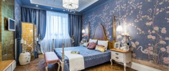
Interior of a bright living room Source Genuinefootball Warm-colored walls Source www.zastavki.com
An example of choosing the color of the living room walls Source pinimg.com
Bright decor that dilutes the gray color of the walls Source caparolpro.com
Important! When choosing the dominant light, pay attention to the availability of lighting. Dark walls “steal” light, while light walls, on the contrary, act as a reflector. It is recommended to “work through” this point at the stage of finishing work.
Universal Blue
Blue is said to be a firm favorite for living rooms, evoking a sense of calm and order but also valued for its versatility. Blue is a color that goes well with many styles of furniture, from traditional to modern designs.
Choosing the color blue is a very personal matter. Some people want a deeper shade with warm undertones to create a cozy feel in the room, while others may go for something light and airy.
Features of painting various materials
The existing range of paints is huge. This allows you to transform a wall made of any material. But each of them has its own characteristics.
Concrete
Before applying paint, the wall is washed with a soap solution. After this, all cracks and crevices are sealed with putty.
To do this, a polyethylene sheet is glued to the wall using adhesive tape. If after 24 hours moisture appears on the sheet, the wall is treated with sealant.
Painting concrete walls is very popular and is done using different techniques.
Finally, paint sealant is applied to the painted surface. It provides tighter adhesion of materials and extends the service life of the coating.
The concrete wall must be checked for leaks.
Tree
Glossy paints give the interior an original look, while matte ones allow you to emphasize the relief of the material.
In order to allow the wood to breathe and thereby extend the life of its aesthetic appearance, it is better to choose acrylic paints. After some time, oil paints lose their original shade and become matte.
Proper painting of wooden walls can emphasize their aesthetics
Brick
It will be difficult to remove the coating from such material in the future. In addition, paint on brick lasts about 4 years.
The best choice in this case is silicone coating. The disadvantage is that it is expensive, but this paint allows air to circulate and helps hide minor defects.
Brick, as a building material, is not entirely suitable for painting
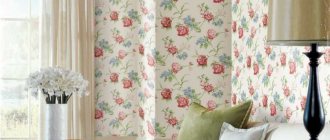
Wallpaper
When choosing paint, you need to start from the type of wallpaper. For example, latex paint is better for glass wallpaper, and water-based paint for non-woven wallpaper.
Wallpaper of any type can be painted no more than 10 times.
Wallpaper for painting
Plaster
To level the walls, use gypsum or cement plaster. For the first, acrylic or water-dispersed paint is suitable, for the second - water-based paint.
Energetic red
Red is one of the brightest colors. It adds energy and life to the living room.
However, to avoid being overwhelmed by this bright shade, it is best to focus it on one wall. Accent walls are great if you want to use a bold color like red but don't want it to completely overwhelm the room. Choosing the best shade for your home may depend on the room's lighting and architectural elements.
Neutral character of pastel colors
A living room in pastel colors is a universal solution for implementing a project in any style. This range is distinguished by a particularly light spectrum, almost imperceptible emotional coloring, and the ability to be combined with any other bright accents. The best shades in this range are, of course, beige, milky, cream, powdery, gray-beige. Less commonly used in design are pastel yellow, green, and blue. They are more emotionally colored, so choose them when the owners are sure of the mood they want for the interior of their living room, even in pastel colors.
This palette has both warm and cool tones:
- Beige tones in a wide range help make the room warm and cozy . They are suitable for interiors in any style and harmoniously combine with bright color spots of any spectrum.
- Pastel yellow will be warm . It is quite close to the beige color scheme, so in this color the living room design will become more sunny and cheerful.
- Cool colors include ultra-light and muted gray, blue and green, lilac, pink . Of course, there are warm tones in each spectrum. The choice depends on the overall design, the location of the room, its area and shape.
A living room in pastel colors can be different - restrained and neutral, strict and unemotional, hospitable and cheerful, solemn and elegant. The inclusion of any bright color defines the mood and shapes the character of the setting.
Atmospheric gray
Dark gray shades are gaining popularity in interior design these days. At first glance, this moody, sooty gray color looks stunning on a center wall behind a sofa, or on all four walls to make a room feel cozier.
- If you find yourself deciding between several shades of grey, try getting samples and painting posters that you can tape up and live with for a few days.
- Observe how colors look at different times of the day and move swatches around to see how they are affected by light.
Pros and cons of painting walls
Paint has advantages and disadvantages, so you need to familiarize yourself with them before starting repairs.
The advantages of painting walls include:
- Easy update. In order to update such a coating or change the design, large financial and time expenditures are not required.
- Water resistance. The painted surface can be easily washed if it gets dirty without fear of damaging the coating.
- Varied assortment. A wide selection of colors allows you to realize any ideas and dreams of your ideal interior.
Following the existing recommendations will allow you to get an attractive and harmonious living room
. Among the disadvantages:
- Difficult surface preparation. Paint will not cope with masking even small irregularities and cracks. If the walls are not properly prepared, all defects will be clearly visible. You can level the surface using plaster and putty. If you are unsure of your abilities, it is better to turn to a professional.
- Constant care. Painted walls get dirty easily, so they need to be washed frequently.
When choosing a material, you need to rely not only on personal preferences and desires, but also on the rationality of its use and the condition of the surface.
Bright yellow
A classically decorated living room in cheerful yellow tones is a common sight in period homes, perhaps because candlelight could illuminate the color particularly nicely.
Today, yellow continues to attract homeowners who appreciate its brightness.
- Yellow living rooms can be cozy, inviting and even sophisticated for both formal and family styles.
- Warm gold tones tend to look better in more saturated variations, while more lemony and cooler yellows look better if kept pale and less saturated.
White living room
White is the perfect backdrop for any living room style. And because it's highly reflective, it will brighten up a room if there isn't a lot of natural light in the living room.
Evidence of the constant presence of white in decor can be seen in the growing combination of this color with charming shades of green, gray, pink and other colors.
Cool colors for the perfect interior
A cool color can be either primary or complementary, depending on specific decisions. Includes the following range:
- Silver. Associated with frosty winter. It will be an ideal solution for those who prefer this time of year. Warm notes are added through combinations of yellow or green decor.
- Blue. The rich tone, evoking associations of elegance, charges with energy and additional vigor. To soften (domesticate) the interior, it is diluted with less saturated tones. Goes great with white.
- Blue. Evokes associations similar to blue, the surface of the sea, the sky.
- Lilac. Associated with blooming flower buds. Depending on the neighbor, it can be perceived as cold or warm. The interior of the living room, in which it is used as a dominant feature, looks impressive and amazes with its chic. Looks great in symbiosis with gray, white, beige.
- Green. Depending on the shade it produces a different impression. Bright contrast will fill you with energy, add strength and energy. Muted, calm - creates a feeling of privacy, reminiscent of summer warmth. When using a green background, you should pay more attention to the selection of accompanying shades. Sharp contrasts are not allowed here.
Pistachio color combinations in the living room Source www.oboidecor.ru
Dark sofa against the background of gray living room walls Source www.zastavki.com
Silver walls of a large living room Source legko.com
Living room with windows facing east Source caparolpro.com
Important! Some colors, in terms of warm and cool, can be universal. Depending on the variation of shade, they belong to one or another group. For example, the green color of mint, emerald or malachite is cool. Yellow-green or olive - to another group.
Light gray walls in the living room interior Source otlichnyjremont.ru