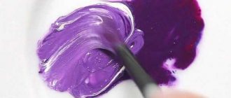
What colors should you mix to make red?
Red is one of the primary colors, and even in the most minimal sets this tone will be present. However, the inks that are used for mass printing are not red. Instead, use the color magenta, which produces red when mixed 1:1 with yellow. So, if you take “carmine” paint, which is similar to fuchsia, and mix it with yellow in a 2:1 ratio, we will get a medium red tint. (proportion 2:1, because the shade of the paint for drawing is redder than the magenta in printing inks)
Judging by the tones, fuchsia, from which we got the red color, is a pink tint, but if you take the classic pink color and mix it with yellow, you get orange.
This is because pink and magenta are different colors: while pink is the result of diluting red with white (with or without adding a blue tint to create a purple undertone), magenta is a light shade of purple - the color we see in contact with the retina of the eye at the same time red and violet. Since paints are nothing more than substances that reflect one or another wavelength of the spectrum, then by neutralizing that part that reflects violet (yellow color is complementary to violet, this means that when mixed they produce a gray (dirty) color) we get the substance , which reflects the color red. The intensity of the resulting color will still be lower than that of red paint due to the admixture of gray, which was obtained by neutralizing the violet spectrum.
How to make red
It is possible to make a red color only taking into account the presence of industrial conditions and the participation of special colors in the process. So, when printing, printing houses use strange combinations of dyes to create this color on paper:
- purple and yellow,
- fuchsia and yellow,
- yellow and black,
- blue and orange.
Professionals know the strict proportions of color combinations, sequence and technology. A similar procedure is carried out in textile production when dyeing fabrics.
In painting
While in a printing house it is possible to create a new base color, this will not happen in painting. Even using the same dyes in accordance with the typographic tables will not provide the required result. That is, it is impossible to make red by mixing gouache or another type of paint, and the artist will have to purchase it ready-made. But combining the basic red tone with other colors is only welcome, because through experiments you can get stunning shades.
In computer graphics
To create red on a computer, the RGB system is used. It allows you to build the desired model and get any tone, even a basic one. The development of such programs is carried out by programmers and computer engineers, creating colors using digital codes. There are other similar programs that build models of basic colors, and graphic editors help to diversify the palette of their shades and make the colors pure.
Natural dyes
Not so long ago, people made their own hair dyes, pigments for fabric, thread, knitting wool and other needs. They used dyes that are found in nature. Red color can also be obtained from natural materials. Here are the main ways:
- take bedstraw flowers, combine equal parts with alum, cook for 30 minutes, the result will be a bright red solution,
- mix St. John's wort and safflower flowers, cook in water until the broth becomes thick and has a reddish tone,
- cut the orange lichen, sprinkle it with soda, after 3-4 minutes cherry-colored juice will stand out.
You can even get the red color from a special type of worm that lives in hot countries. But for painting it is better to use store-bought paints, because natural pigments can give unpredictable results. Clothes painted with natural colors fade quickly and leave marks on the skin; this defect can only be corrected by the use of chemical paint fixatives.
The theory of obtaining red shades
Different paint manufacturers produce different shades in one set (of 12 or 6 colors). In addition, paints are of different quality: the brighter and purer, the more shades you can create from them. By mixing two colors, we get a shade that is duller than the originals, and if we mix the two resulting shades, the third color will be even more faded. Speaking about the theoretical creation of shades, we take a graphic model without taking into account the quality and brightness of colors. Knowing it, you will be able to navigate any palette and create the shade of red you need.
The main color is red in the center. There are patches of color around it that mix with it. The second circle of dies is the result of mixing the first ones. Third circle: decreasing the color of the second circle and adding white and black to the result:
How to get other colors and their shades: theory and practice. Click on the icon.
Red in nature
In the color spectrum, red coincides with the minimum frequency of the field visible to our eyes. In the natural environment, this color is found very often. For example, fruits and berries - pomegranate, raspberries, cherries, apples, strawberries. Many of them gave names to various shades of this tone.
Tomatoes contain a natural pigment that gives them their familiar color, but when it is released without reacting with other substances, it produces a purple color. Contemplation of nature often gives artists the basis for creativity, flights of fantasy, and helps to detail the idea on canvas.
How to get light green color?
Mix (1 part) yellow + (1 part) blue + (2 parts) white = warm light green color
Mix (1 part) yellow + (2 parts) blue + (2 parts) white = cool light green color
Vitaly (Wednesday, 23 November 2021 00:58)
Tatyana and Alexander, thank you for the information about color and paints and for sharing it with beginners and not so artists. Issues of mixing paints are always quite difficult, especially for inexperienced artists. And experienced ones often act on instinct, transferring a lot of expensive paint and ending up with dirt. The reason for everything is a lack of understanding of the essence of this process. Why do we see yellow paint, for example, as yellow? The answer is known from a school physics textbook - it absorbs all the rays of light falling on it (for example, daylight) and reflects only the yellow part of its spectrum. OK! And blue reflects blue, absorbing everything else! So far everything is clear. Now we will mix these two colors - yellow and blue. Blue in the mixture absorbs all rays (including yellow, reflected by yellow). Yellow will absorb everything, including blue (reflected by blue paint), and yellow reflected by it will be absorbed by blue. The colors will mutually absorb each other! And what color should this mixture be? She must be BLACK! All the light falling on it will be ABSORBED by it! But how can this be? Everyone knows that blue and yellow make green. What's the matter? The trick is that of all the pigments available to the artist, not one can be called pure. Colors such as pure red, pure yellow or pure blue simply DO NOT EXIST. Paints can be perceived as monochromatic and are often described as such, but this is not entirely accurate. Any color is a combination of shades. Any red color is either red-orange (for example, cadmium red) or red-violet (kraplak, carmine). Any shade of blue is either blue-blue (FC blue, Prussian blue) or blue-violet (ultramarine). And any yellow is either yellow-green (citric cadmium) or yellow-orange (light cadmium). Any artist who wants to become a pro (and who doesn’t want this?) is simply obliged to distinguish such nuances of color and for him there should not be just yellow or just blue, as a musician distinguishes, say, C from C sharp. We perceive yellow as yellow due to the fact that most of the reflected light is yellow, other colors REFLECTED BY YELLOW are simply lost in the reflected yellow color. And by mixing yellow-green cadmium lemon (which, along with yellow, also reflects a significant part of GREEN!) with blue-green blue FC (in the reflected spectrum of which there is, in addition to blue, a GREEN part), we get a rich bright green paint, which, as it were, “ is released" from this mixture after blue and yellow mutually "extinguish" each other! By mixing yellow-orange (cadmium yellow) with blue-violet (ultramarine), we get a neutral green olive color (sometimes you need one!) due to the fact that cadmium yellow, like ultramarine, reflects a very SMALL PART OF GREEN, unlike the previous example . The same applies to obtaining purple and orange. Red-VIOLET kraplak and blue-VIOLET ultramarine will give a pure and rich violet, while red-orange cadmium light and blue-green ceruleum will give faded violet shades, since the original paints almost do not reflect violet (in fact they do, but in very small quantities ). And, accordingly, the brightest orange will be obtained by mixing red-ORANGE light cadmium and yellow-ORANGE yellow cadmium. All this is true both for body paint mixtures and for glaze painting. Thus, ideally, it is desirable to have not three primary colors, but six (two in each color). This is why in printing (in the CMYK system) it is very difficult to obtain a pure and bright orange, since it is produced using lemon yellow (which is yellow-green) and magenta (red-violet) - paints that almost do not reflect orange! All this is not as difficult to understand as it seems at first glance. You just need to keep the color wheel in mind, and knowing these things will save you from wasting expensive paint trying to find the right color. I apologize for such a long comment, but as it went, it went like this :) Regarding the paints of Rembrandt and his contemporaries, they certainly had blue ones (expensive ultramarine from lapis lazuli, azurite is also a mineral paint, smalt). From 1430 to 1600, painters used only eleven pigments. In the 17th century there were already thirteen. Of the yellows, the most common in those days were ocher and lead-tin yellow (massikot in the de Wilde manuscript). Among the green ones, the Flemings had malachite and verdigris. Since 1630, green earth has been found. The main reds among the Flemings and Dutch are cinnabar and organic red. This information is in the famous de Mayerne manuscript. The unstable paint “yellow varnish” (stil de grain) was widely used; its fading in composite greens explains the blue foliage of trees in the paintings of Vermeer, Pieter de Hooch, etc. Thanks to everyone who read this comment to the end. I hope this helps someone in their work. Thanks to the authors of the site for the opportunity for those who wish to speak out on different topics! Good luck and creative success to everyone!
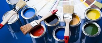
Color mixing table to obtain the original tone – Blog Stroyremontiruy
The choice of paint today is good, but if you need a rare shade that is not on sale, you will have to mix several tones. We offer a color mixing table, which indicates which tones and in what proportion should be mixed to obtain the original shade.
Some tips
:
- — The color of the paint manufacturer does not always correspond to the classic one, so the proportions may vary slightly,
- — Keep in mind that acrylic paint darkens when drying, as water evaporates and increases the concentration of pigment,
- — Do not spread all the paint at once - do a test spread,
- — The best mixing option is to use a mixer (attachment to a drill).
| Visual display | Color name | Mix to get it |
| Pink | 90% white + 10% red | |
| Royal red | 5-10% blue is added to red | |
| Tomato red | Add 5% brown and yellow to red | |
| Crimson | Blue base + a little white, brown and red in equal proportions | |
| Chestnut | Add 5% brown and 3% black to red | |
| Red | If you want to lighten red, add white | |
| Orange | Add up to 30% red to yellow | |
| Yellow | Yellow - lighten with white, darken with red and brown | |
| Olive | Green base + 10-20% yellow | |
| Turquoise green | Add up to 25% blue to green | |
| Bottle green | Yellow + 20-40% blue | |
| Turquoise blue | In blue 10-15% green | |
| Royal blue | In blue 10-15% black and 2% green | |
| Dark blue | Blue + 5% black and 2% green | |
| Grey | In white to 5% black | |
| Medium brown | Add red and blue to yellow in equal portions, add white if you want to lighten it, darken it with black. | |
| Golden brown | To yellow we add 10% blue, white and red, the more yellow, the higher the contrast. | |
| Mustard | In yellow, 5% black and red + 1-2% green | |
| Beige | Add white to brown while stirring until the desired tone is obtained, add yellow for brightness | |
| Pink gray | In white up to 5% black or red | |
| Gray-blue | In white up to 5% light gray + 1% blue | |
| Green-gray | In white 5% light gray + 1% green | |
| Gray coal | Black is added to white until the desired tone is achieved (with constant stirring) | |
| Lemon yellow | In yellow 5% white and 1-2% green | |
| Fern green color | Add black, green and white paint in equal parts to white | |
| Forest green color | Green is diluted with black (up to 5%) | |
| Emerald green | Yellow diluted with white (less) and green (more) paint | |
| Light green | Yellow is diluted with white (5%) and green (10%) paint | |
| Aquamarine | Add up to 35% green and 5% black to white paint | |
| Avocado | Add black and brown paint to yellow in equal parts (up to 10%) | |
| Royal purple | Red color is diluted with yellow and blue paint | |
| Dark purple | We dilute the red tone with black and blue paint | |
| Mandarin, orange | In yellow paint up to 10% red and up to 5% brown | |
| Reddish chestnut | Red is diluted with black and brown | |
| Orange | White diluted with red and brown | |
| Burgundy red color | Add 5-10% yellow, brown and black paint to red paint in equal parts | |
| Plum | In red, 10% black and blue and 5% white | |
| Chestnut | Add white, red and black paint to yellow in equal proportions | |
| Dark brown | In yellow paint 10-20% each of red, white and black | |
| Black | Black is lightened to different shades of gray with white |
Mixing acrylic-based materials
Designers love acrylic paints the most. They are very easy to work with, and the finished coating has excellent water-repellent properties. Their use has several nuances:
- The working surface must be perfectly flat and smooth. To do this, it needs to be sanded.
- It is important that the paint does not dry out.
- To obtain an opaque color, use undiluted paint. Conversely, you can add a little water for transparency.
- To be able to quickly select the desired color, it is recommended to use a thinner for acrylic paints. Thanks to it, the product will not dry out so quickly.
- Use the edge of the brush to distribute the paint.
- Mixing is best done with a clean instrument. In this case, the colors should be directed towards each other.
- To make a light tone, you need to add white dye to the solution, and to get a dark one, add black. It is worth remembering that the palette of dark colors is much wider than light ones.
Here are some examples of mixing acrylic-based paints:
- Apricot color is obtained by mixing red, yellow, brown and white.
- The recipe for making beige paint involves combining brown and white. If you want a bright beige, you can add a little yellow. For a light beige shade you will need more white.
- Gold is the result of mixing yellow and red colors.
- Ocher is yellow and brown. By the way, it is considered popular this season.
- Khaki can be made by mixing green dye with brown.
- To get purple you need three different colors: red, yellow and blue.
Easy mixing
Before we begin to describe complex shades, let's try to understand the basic ones. It is generally accepted that there are only three primary colors: red, yellow and blue. Based on them, secondary ones are obtained:
Orange
Red plus yellow;
Green
Yellow plus blue;
Violet
Blue plus red.
If we combine one primary and secondary color each, we will achieve transitional shades: red-orange; yellow-green; blue-violet; red-violet; blue-green and yellow-orange. Often these tones serve as the basis for obtaining realistic, deep and rich colors.