Ultraviolet for tattoo
The paint used is a powder that is “charged” by light and releases this energy as a glow.
With this combination, a luminous tattoo is obtained, and the desired color is achieved by adding dye. Ultraviolet pigment is safe for humans. The composition does not cause allergies, but the paint should be tested to avoid undesirable consequences for the body.
In conclusion, we note that coloristics is a very interesting science that allows you to give full rein to the artist’s imagination. The production of purple and its various shades clearly illustrates this. Moreover, these methods work not only when writing works of art, but also for decorating rooms, interiors and stained glass windows.
All about mixing purple flowers. Olga Bazanova
https://youtube.com/watch?v=C4Ze6cbENlU
Shades of purple - palette
There is a huge variety of purple shades that are widely used in clothing and interior design. In total, artists use more than 200 tones, where there are bright, delicate, grayish, cold and warm, dull and saturated colors. Their names are different - from simple to fancy. Here are the most popular:
- dark - eggplant, mulberry, plum, black currant, fig, prune, blackberry, raisin;
- dark cold – electric violet, indigo, dark purple;
- fuchsia group – cyclamen, thundercloud, crimson;
- purple group - beet, peony, phlox;
- light - crocus, lilac, mallow, orchid, lilac, mouve, iris, hyacinth;
- the lightest ones are amethyst, pansies, heather, pearls.
To obtain a number of original shades, experts advise introducing gray, pink, brown and even orange colors - there is no need to be afraid of experiments.
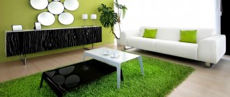
Application of lilac tone
This shade can give a room a unique chic, which is why it is used in different types of interior design. Lilac will provide pomp to the classics, a sense of space to the high-tech style. The shade will be appropriate in a romantic style, especially in combination with white. This combination will visually enlarge the room and make it soft and fresh.
Often designers combine lilac with beige, pistachio, greenish, and blue. The contrast will not be too pronounced, but the room will look interesting. The lilac color is widely used in the interior of girls' rooms - it gives a feeling of fairy tales, light and joy.
In an adult bedroom, a good combination would be to paint the ceiling pastel lilac and the walls creamy or beige combined with bright plum or violet accents.
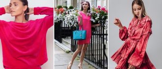
Often the lilac tone is used in clothing design. It looks great with peach, golden sand, caramel, pink. To create a unique style, use accessories or clothing items of malachite and mint color. You can dilute lilac with brown - this combination is perfect for office style.
Experiments with colors can be carried out endlessly, because coloristics is a fascinating science that gives incredible scope for imagination. It is only important not to paint too large areas with lilac in an apartment or in a painting - you need to correctly combine tones, ensuring complete harmony.
Source
Shades of purple: palette, color names
Purple color, today, is very popular among interior and clothing designers. Also, it is difficult to imagine various paintings without using at least one shade of this color scheme. As you know, purple is obtained by combining red and blue; for lightening you will need white, and black or simply a dark color will help to saturate the colors with a darker shade.
The Pantone palette contains almost 200 shades of this color, in which you can find not only bright, light, dull shades, but also dark, deep, with a blue or pink tint.
The most popular purple colors are:
- Deep, dark and rich:
- Plum
- Mulberry
- Eggplant
This group represents those colors that lack redness, and blue or gray are dominant.
- Light:
- Lilac
- Violet
- Orchid color
- Amethyst
- Pearl
- Fuchsia (has a brighter color)
Shades of purple: palette
These shades echo delicate scarlet tones and have a red undertone; it is thanks to this characteristic that these colors are classified as warm shades.
- Cool shades:
- Dark purple
- Indigo
- Rich, dark silky
- Purple electric
- Blackcurrant color
Here are those colors that predominantly have a deep blue undertone. Classic purple is considered the sixth main color; it has a huge number of shades, while having various tints, the main ones, as mentioned above, are red and blue; gray, pink, blue and even orange are also found.
The effect of purple color on humans
There is such a science - chromotherapy. She studies the effects of different colors on the human condition. So, purple has a very beneficial effect on almost all organs and senses.
- Promotes more rapid production of invaluable hormones of joy - endorphins.
- Rejuvenates.
- Has a calming effect on insomnia and migraines.
- It has a tonic effect on the pituitary gland and eyes.
- Increases immunity.
But you need to use this color wisely, without overloading your space with it. In excess, the color violet can lead to melancholy.
Now you know how to get purple. You know how it affects the human body and you can successfully apply the acquired knowledge in practice, be it color treatment or creating a confectionery or artistic masterpiece. So multifaceted, from soft purple to almost black, this color personifies everything sensual, mysterious and enigmatic.
Getting purple
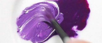
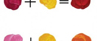
To obtain purple, at the initial stage you need to combine blue and red in equal proportions on the palette. The resulting color palette may not always match the desired tone, so it needs to be modified. This can be done using the following manipulations:
- To get a lighter purple paint, you can add a little white.
- When working with a mixture of lilac and white paints, you can get purple. The intensity is adjusted by the amount of white.
- A mixture of pink and blue colors will help create a soft lilac palette.
- If a muted tone is needed, black is mixed with cool red.
- When working with watercolors, saturation is regulated not with the help of white, but with the amount of water.
Additional option
Magenta is a primary color and cannot be created by mixing paints. It is mixed with available turquoise or bright blue. Any blue tone or cyan is suitable for this, without a greenish tint and not muted. With the gradual addition of colors, the color palette will acquire the desired shade.
In the video: how to get a bright purple hue.
Table for obtaining purple shades when mixing colors
This table will show you how a color should theoretically behave when mixed with other tones. This will help you navigate your experiments with beauty.
In the center is the color from which the construction is based, around it there are colors that will subsequently be mixed with the main one in the indicated proportions: the first circle of purple flowers are mixed with the front ones in a forgiven ratio of 100% to 50%, the next circle after them: at the end of the beam tint from 100% to 20%, from it the darkened and shaded tones are 20% white and 20% black.
How to get purple color
Where does the pheasant sit, according to the nursery rhyme? To get purple, you need to know what colors it consists of. Everyone knows from school that purple is the result of mixing red and blue. The difficulty is that often the shade turns out dirty. Follow the instructions for choosing the right paint and mixing harmoniously:
- Choose “clean” paints. How to make a purple color from paints so that the tone does not turn out dirty? Each tube contains extra pigments of other shades. It is because of this that the resulting tone has a brown tint.
- Use a purple-red without any yellow to avoid ending up brown. A sapphire shade with a green tint will not work; it is better to take bright ultramarine.
- Mix blue and red in different proportions. Depending on the type of paint, the purple color is obtained on the palette or directly on the canvas.
- Add an additional tone to create a color that suits the painting.
Use a white palette to mix colors. Wood or metal surfaces that are too dark can distort the color.
How to adjust the shade of purple: basics
Mixing tones directly on the canvas makes it possible to see unusual lines and outlines of the picture.
If you've tried your best and still haven't achieved the perfect tone, don't start over. Try some shade correction. To do this, you need to remember a few simple recommendations that will tell you how you can get purple.
- To organize a pastel color, you can mix a ready-made tone with white. Try not to add too much liquid, especially when mixing with watercolor paints.
- A little black will correct the situation if a regular purple tone is created, but a dark one is needed.
- Often there is a need for a lavender shade. You can organize it correctly using four colors: black and white, blue and red. But first the main tone is done and only then a mixture of light gray clarifier is added.
What colors can be mixed to get purple: possible options
Blue and red are considered the main base of purple as a result of mixing. However, the finished version will depend on how saturated the tones of the paints involved in mixing were. The structure of the material also plays an important role.
What colors to mix to get dark purple?
The dark purple hue is very often used for cosmetic purposes.
To understand how to get a dark purple color, you need to follow two sure-fire methods.
- Use blue and red at the same time. In this case, be sure to add more of the first tone. Otherwise, you risk getting just a basic tone.
- Add black to red. Here you need to carefully monitor the contrast so as not to overdo it with a dark shade.
In case you accidentally achieve a result that is too dark and barely differs from black, you can try adding a few drops of a white tint and mix everything thoroughly.
How to get light purple color: simple manipulations
All other colors are made by mixing the primary colors.
Let’s immediately make a reservation that there are two types of light purple tone: simply light and absolutely delicate. At the same time, the method for obtaining such shades of the palette will differ from each other. For example, to create an ordinary light tone, it is enough to add white to the base purple color. Or just dilute it with a little water on the palette. Again, it all depends on what types of paints you have to work with.
The gentle tone is very attractive, it evokes airy emotions and a pleasant feeling in the soul. To create this color, you need to mix pink and blue paint. It will not be possible to achieve the result by diluting the main tone. The result of correct tactics is a shade of blooming lilac.
What colors should be mixed to get a bright purple tone?
If you add a little blue to pink, you can achieve a very bright tone.
A bright or purple shade of paint is created by combining yellow, red and blue in equal proportions. Sometimes magenta is used. It is worth remembering that this is one of the main tones and it is impossible to obtain it by mixing.
To make lilac or magenta contrasting and monochromatic, do not forget about adding the correct tone. Do not add too much shade. The correct color of bright purple can only be achieved by gradually adding thinner.
Method 2: How to mix colors to get different shades of purple
How you can get peach color and its shades when mixing paints
You should have red, pink, white, blue, azure at your disposal.
- Make the right shade by mixing a small amount of paint at a time. Add small amounts of alternate shades to your purple paint. It's easy to add more if needed, but it's nearly impossible to bring the tone back to the original color if you add too much of a contrasting color.
What colors should you mix to get purple? For example, if you add white to purple to make it lighter, you don't need to add the same amount of white. Start by adding a small amount of white paint, adding more as needed. This way you won't miss the tone.
2. Add more blue than red to get a deeper purple. To get purple, you need to mix different colors: for a darker, richer, deeper purple, simply use more ultramarine blue than pink. Add blue little by little. Remember that it is easy to add more blue, but impossible to remove it once mixed.
You can also add some black paint to the mixture to deepen the color even more. Just be careful, too much black can overpower the purple.
Create a warm purple hue by adding more red to the mix.
After mixing a lot of pure purple, gradually add more red to create a lighter, warmer purple hue.
Add a small amount of white paint to this mixture if you want a light purple soft color.
How to get dark purple color
Mix pink and cerulean blue to make deep purple. Use pure red without any yellow pigment. Azure blue has a slight green tint, but adding it to pink will give a darker purple hue with a gray undertone.
- Combine cyan and magenta to make electric violet (electro).
The more purple you add, the more pink the paint will become.
Apply white paint over purple paint to create light purple tones. This is a really easy way to make some light shades of purple like amethyst, lavender and pastel purple. Add a small amount of white paint to the end of your brushes or putty knife and mix well into the purple paint.
If you are looking for a vibrant and stunning purple, use blues that have green undertones and purples.
If you have several shades of red-purple paint, it would be interesting to see how each one changes and what colors you can get by adding white to the mix.
Use a small amount of black paint to create dark shades of purple. You can make Spanish violet (a dark red shade), antique heliotrope and other shades by adding a very small amount of black.
What colors are needed to get purple from gouache, watercolors and plasticine
If you don't have the pure blue-red color needed to create a base purple shade at home, you can use pre-mixed purple-white paint to create a range of purple tones. Apply a little purple to your palette and gradually add a small amount of white paint to create lighter shades.
Don't be afraid to play with other tones too! Although yellow turns purple into something close to brown, you may have other colors that you can mix.
To make the perfect purple paint you will need:
- tassels
- palette of colors
- cup or jar of water
- paper towels
- paper
To get different shades of purple:
- tassels
- palette of colors
- cup or jar of water
- paper towels
- paper
What is red made of?
Red color in printing is made by mixing other basic colors. The CMYK color model is used here. All differences in the colors of the model used are made by mixing the desired base colors:
- Blue – cyan
- Magenta (violet) – magenta
- Yellow – yellow
- Black – black
As in other color models, you need to take at least 2 colors, and in our case, red on printed products is made by combining 2 process colors: violet (magenta) and yellow. This method is also used to make color engravings. If you acquire these paints, you can make not only red, but also achieve shades of it by adjusting the ratio of yellow and magenta (violet). The range of red colors will be from pale purple to rich orange-red.
Mix yellow and magenta to get red
Information: In addition to printing, the CMYK model underlies the operation of most printers. It is also used for professional painting of cars, decoration of interiors and facades of buildings, and in fabric production.
Acrylic paints
These materials are universal, they are used for many purposes: with their help you can simply paint walls, paint stained glass windows, apply designs on the wall and ceiling. In general, the scope of their use is limited by imagination. The compositions are easy to use and adhere well to the surface. But if you decide to paint a multi-component image on the wall, then buying paint in all the necessary colors will be too expensive, and after completion of the work there will be a large amount of unnecessary material left. In this case, it is better to buy a basic series, and to create certain shades, mix acrylic paints.
Mixing base paint colors makes it possible to get many different shades, while you can save a lot on your purchase
Main color range
Everyone knows from school: when you combine yellow and red, you get orange, but if you add blue to the same yellow, you get green. It is on this principle that the table for mixing acrylic paints is built. According to it, it is enough to purchase only the primary colors:
- white;
- black;
- red;
- brown;
- blue;
- yellow;
- pink.
You can simply mix acrylic paints of these tones to get most of the existing shades.
Basics of mixing according to the table
To properly mix materials, you cannot do without a table. At first glance, it is easy to work with: to get the desired result, you just need to find the color and see what components are required. But the color mixing table does not indicate the proportions, so it is necessary to gradually add tinting material to the base paint and apply the mixture to some unnecessary product: a sheet of plywood, drywall, and so on. Then you need to wait until the material dries. If the color matches what is required, you can begin work on the main surface.
Color Mixing Chart:
Coloring technique
Now about how to get colors. By mixing acrylic materials, you can achieve the formation of two main tones: light and dark. Basic tones: earthy, green, orange, purple. To create color, it is recommended to follow certain rules:
- Light. In this case, the main material is titanium white, to which one or two tinting compounds are added. The less additional paintwork materials are used, the lighter the tone will be. This is how you can make most shades of a light palette.
- Dark. To create shades of this type, do the opposite. Before mixing colors, you need to prepare the base tone; black dye is gradually introduced into the base. When working with black paint, you need to be careful because it can make the color look muddy rather than dark.
- Green. This shade is not in the main palette, so you will need to mix yellow and blue. The exact ratio can only be determined experimentally.
- Violet. This is a cool color that is obtained by mixing blue with pink or red. In some cases, you will also need to add black to darken the material.
- Orange. To create this color you need to mix red and yellow. For a richer orange, it is recommended to add more red and vice versa. If you want to create a soft color, for example, coral, then you need to lighten the material with white. Can I add dark dyes? Yes, you can, but mixing colors may result in a muddy tone.
- Earthy. Here the main color is brown. By adding various shades to it, they get a color from beige to dark wood.
Rules for working with the palette
To begin, you will need a basic set of paints, brushes, a container of water and a palette (you can take any surface, including school supplies for drawing).
It is recommended to place white in the center, since it is used in creating most shades. Dyes of the main color range are placed in the recesses around (if any). You need to mix carefully, gradually adding tinting material and constantly checking the result. After mixing the colors, the brush should be rinsed in a container of water.
How to make purple when working with different types of paints
When mixing paints such as acrylic, gouache, watercolor or oil, the master is required to know the structure of each material and the basics of compatibility of shades along the color spectrum. Sometimes it is difficult to create the desired purple shade. For example, to achieve a rich fuchsia tone, you need to know how to brighten the color. Therefore, for each type of paint there are mixing rules that must be followed.
Oil paint
Oil paint has a greasy paste-like structure, forming, when dry, an elastic, dense layer with a stable glossy sheen. She brings richness and depth of shades to painting.
The paint is diluted with a special oil-based solvent. When preparing the desired color, intensive mixing of the components will be required to obtain a homogeneous suspension.
Violet tones are obtained by mixing base colors in different proportions, adding, if necessary, black or white to give them lightness or depth.
To obtain purple color in oil paints use:
| Reds | Blue |
| Kraplak | Ultramarine |
| Kraplak pink | Cobalt |
| Cadmium red | Cerulean |
| Coral pink | Sky blue |
| Cinnabar | Prussian blue |
| Red quinacridone | Royal Blue |
| Pink quinacridone | Indanthrene |
| Neapolitan pink | Blue "FC" |
| Petersburg pink | Chrome-cobalt blue-green |
Using acrylic paint
Acrylic has a dense, elastic structure and good hiding power. Diluted with water or a special organic product. When dry, it gives a smooth, glossy surface that is highly resistant to external influences, including moisture. Acrylic does not fade or crack for a long time.
You can find out which paints to mix to get a purple color from the table:
| Reds | Blue |
| Alaya | Sky blue |
| Cinnabar | Cerulean |
| Cadmium red | Cobalt |
| Bordeaux | Ultramarine light |
| Carmine | Blue "FC" |
| Kraplak | Indanthrene |
| Light pink | Turquoise |
Watercolor
It is more difficult to achieve pure purple when working with watercolors. Since this paint, having a transparent structure, is diluted abundantly with water, achieving a bright shade is not easy. This shortcoming of artistic watercolor is compensated by a wide palette of shades based on basic colors, when mixed, the desired color of different saturation and tonality is obtained. Sometimes, to obtain delicate lilac undertones, artists mix white gouache to watercolors.
To obtain purple in watercolor use:
| Reds | Blue |
| Alaya | Ultramarine |
| Ruby | Cerulean |
| Carmine | Cobalt |
| Cinnabar | Prussian blue |
| Bordeaux | Azure blue |
| Pink | Varnish blue |
| Cadmium red | Turquoise |
| Kraplak | Bright blue |
| Red quinacridone | Indanthrene |
Mixing gouache
Unlike watercolor, gouache has a thick matte structure. The paint is opaque and has good hiding power. When dry, it is easily diluted with a small amount of water. Even a child can cope with obtaining the necessary color scheme. As in other cases, you need to take two primary colors and, if necessary, add a little white or black to the resulting one (depending on whether the initial shade is needed - darker or lighter).
What colors need to be mixed to obtain the desired shade are shown in the table:
| Reds | Blue |
| Cinnabar | Iron azure |
| Alaya | Ultramarine |
| Kraplak | Cobalt |
| Carmine | Turquoise |
How to get the most common paint colors?
The paint color mixing table assumes that you will mix the components in equal proportions, but there is always room for experimentation, since sometimes you need more saturated colors or colors with a tint of some color.
Here are the main ways to obtain the most common flowers:
- Apricot color. To obtain this color shade, you must mix either ocher, white and red, or brown, red, yellow and white;
- Beige color. To obtain this color shade you must mix yellow, brown and white;
- Turquoise. To obtain this color shade, you must mix blue and green;
- Color of mustard. To obtain this color shade you must mix yellow, black, red and green;
- Olive green color. To obtain this color shade you must mix green and yellow;
- Conifer green color. To obtain this color shade you must mix black, yellow and green;
- Golden color. To obtain this color shade you must mix either red with yellow or yellow with brown;
- Brown color. To obtain this color shade, you must mix green and red.
- Lemon yellow color. To obtain this color shade you must mix green, yellow and white;
- Orange color. To obtain this color shade, you must mix yellow and red colors together;
- Ocher. To obtain this color shade, you must mix brown and yellow. In a paint color mixing chart,
this color is used to create many others; - Purple color. To obtain this color shade, you must mix red, blue and yellow;
- Grey colour. To obtain this color you must mix white and black together;
- Warm gray color. To obtain this color, you must mix ocher with each other, as well as gray, or the same gray color and umber;
- Cool gray color. To obtain this color you must mix gray with blue, or with green, depending on the shade you require;
- Tobacco color. To get this color you should mix four colors at once: red, white, green and yellow;
- Terracotta. To get this color you should mix brown and orange;
- Purple. To obtain this color you should mix red and blue;
- Khaki. To get this color, you should mix green and brown;
- Rich black color. To get this color you must mix green, blue and red.
What colors does it go with?
It is generally accepted that the beige palette belongs to the natural group of tones.
As a result, it combines very well with natural colors. White goes quite well with beige. But we must understand that this combination is not always good. When combining white and beige paints, you should use no more than 2 beige shades in one room. Violation of this rule threatens that the situation will become oversaturated with inharmonious colors. It is recommended to introduce additional rich, bright accents. In a white-beige combination, it is advisable to use different textures. But people are justifiably interested in combining it with other tones in the interior.
Gray and black colors in combination with beige are useful for a calm, balanced person. This environment is suitable for a cozy and prosperous holiday. A beige-gray environment helps relax the nervous system and helps to distribute accents.
Beige-brown color is suitable in living rooms and kitchens. But the combination of such colors in bedrooms will also be harmonious. The chocolate beige design looks best in daylight. It’s good to make brown (or chocolate):
- textile products;
- furniture;
- other decorative items and structures.
Green color will make the interior more natural; the combination of shades looks as comfortable as possible for the eye. You can use all shades of green: rich grassy, emerald, dark green. The last combination is recommended for use in oriental interiors. The best places: children's room, kitchen area or sleeping room.
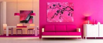
Beige color diluted with a pink tint will add sensuality. For obvious reasons, this combination is used more often when decorating rooms for women and girls. Stylistically, pink-beige coloring is compatible with a wide variety of design trends. But from the compatibility table it follows that in some cases blue is a much better color. Its combination with brown has already become a kind of classic in interior design.
Beige-blue space:
- perfect for bedrooms and children's rooms;
- looks wider than it actually is;
- helps overcome lack of lighting;
- looks airier than a simple beige setting.
Beige paint can also be combined with yellow, forming a rich combination. Sunny yellow shades are especially good. They make rooms more elegant and at the same time visually lighter. As for the color purple, it is quite complex.
Therefore, you should always ask for the opinion of everyone at home before mixing beige and purple colors. But the blue color is pretty bad. Excessive enthusiasm for it can give a beige room an outwardly untidy character. Dirty gray and green colors should be treated in the same way. The beige-blue combination requires good lighting to reveal its design potential.
The lilac color also deserves attention. It should be either bright or present in a large space. Otherwise, beige components are lost and may look inexpressive
If you choose the best option with a green tone, the main attention should be paid to olive and salad colors. To visually refresh beige paint, a cool sky blue color is recommended
The gray-beige furnishings even received a special name in design - greige. To avoid excessive boredom and neutrality, add small bright accents. The pink and beige mixture makes the room look nicer and fresher. However, you should never add too much pink paint. Dynamic interiors require rich pink, but in the bedroom or living room you need calmer shades.