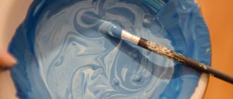
Combinations of pink are a win-win when you need to update your design, create interesting images and drawings. Offers from markets and shops are not always suitable for the intended idea. You can achieve unusual combinations yourself if you know how to get pink from paints.
Various shades of pink are very popular when decorating apartments and houses.
Characteristics and composition of pink color
Its main features:
- not part of the primary color spectrum;
- unsaturated, unlike its related red;
- combines many similar tones.
Ingredients: white and red. When mixed with others, it ranges from berry (blue based) to salmon (orange based).
Shades are divided into subgroups:
- light and warm;
- light and cold;
- medium warm;
- medium cold;
- pale;
- bright.
Simple and complex shades of pink.
How to make gray by mixing colors
Hairdressers who use highlighting techniques are well aware of the possibility of obtaining an ashy color by combining white and black. Indeed, the easiest way to make it is to dilute a drop of black with a certain amount of white. In watercolor, gray can be made even easier: dilute black paint with water. The less white in the mass, the darker the gray turns out.
Mouse tone can also be cold or warm. This is due to the second method of creating it - mixing dyes of opposite meanings. For example, gray is prepared by combining green and red, and since the latter is warm, the resulting color will also not be cold. To give ashen a “frostiness” without yellowness, it must contain blue notes. Adding brown, red, and beige will help “warm” the tone.
It is not recommended to mix paints of different types or from different manufacturers. Their brightness and density indicators can vary greatly, which will affect the quality of the result. Any ready-made dye can be made lighter or darker by dropping a little white or black, respectively.
Getting the base pink color
Basic pink is characterized as light red. To obtain it, most standard purple and scarlet tones are used. Each of them gives a different shade, so the mixing proportions to create the base color will depend on the chosen paints.
There are 2 methods:
- Red is diluted with water. The saturation can be adjusted by adding more or less liquid.
- Mix white and red. When you change the proportions, the color becomes brighter or lighter.
Shades of green and their creation
The green undertone has many shades (at least 15), which are presented in both light and dark, and in bright and pale variations, which significantly expands the scope of their use.
As for the artistic field, green has no less than 110 shades, which artists use to paint still lifes and other paintings.
In “winter” paintings, cooler shades of green are often used (for this you need to combine blue and green colors).
While in summer landscapes light green color is more often used in combination with a yellow tone.
Pastel light green
Pale tones, regardless of color, are “always in price”, because they look refined and noble.
Such tones have a calming effect on both the eyes and the nervous system and are often used to paint surfaces in clinics and childcare centers.
This color can also be used to create cool bedrooms and children's rooms.
In order to get a pale light green color, you just need to add white dye to green (the more white you use, the paler the undertone you can get).
Olive
Olive color is often needed for interior decoration, in order to give an atmosphere of sophistication, tranquility, and, at the same time, unobtrusive richness.
It is also possible to make this color yourself. For example, you can add a small amount of yellow dye to green and mix the color with brown (to tone it down a little).
If you do everything correctly, you can get an interesting dark light green color.
Bottle shade
This color is somewhat similar to a rich, but at the same time deep emerald color.
In order to make it, you must first mix blue and yellow until a uniform light green color is achieved. Next, add a small amount of black dye to it (but you need to use it carefully and in small portions so as not to spoil the undertone).
If you need to get blue, then you need to add blue paint to the mixture portionwise.
Shade of pine needles
In order to create a coniferous tone, you only need to lighten the green by adding a little yellow paint to it, followed by a small amount of black.
If the color is made for the purpose of using it when painting a picture, and you need to “sprinkle it with snow” a little, you just need to add a little white to it and get what you need.
Shade of light green fern
It is made by combining light green with a small amount of black and adding a drop of white.
After the color is mixed until uniform, it will acquire an interesting light-dark shade.
This color is often used to paint the exterior surfaces of residential buildings and other types of premises.
Shade of forest green
It is a classic “fresh” light green.
To add richness and brightness, you need to add a little yellow paint to the dye.
If, on the contrary, you need to darken it, you should add black dye to it (the main thing is to use it in portions so as not to spoil the color).
Light green
The easiest way to get a light green shade is to add white and yellow dye to the green color in the required proportions. But this method is not the only one that will help you get light green.
An identical version of light green can be obtained by combining yellow (which will be the main one), a small amount of dark blue or light blue paired with black.
Note: a rather interesting light green shade can be obtained by combining turquoise and yellow in equal proportions. In order for the undertone to turn out bright and juicy, it is necessary that turquoise predominates.
If we talk about light green when decorating interiors, then in most cases it is used only as accents or decorative elements (textiles).
It is not recommended to use light green as a base or background color (after all, it will put pressure on the eyes and nervous system).
Swamp shade
In order to get it, you need to mix light green with brown and a small amount of red.
This tone is somewhat similar to khaki, but it contains more greenery.
If we talk about using it in interior design, it is better to either abandon it altogether or use it as accents. Otherwise, it will depress the atmosphere and mood of the residents.
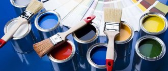
Universal rules for mixing paints to get pink
To get bright or, conversely, subdued tones, you can “play” with colors. But there are universal rules.
Selecting red
The nature of red in the color scheme will affect the final result of the work performed. For example, bright scarlet will give a natural tone, brick red – peach, blood red – fuchsia.
Choosing the Basics
You can mix paints if they belong to the same group and have a homogeneous chemical composition.
The choice of incompatible ingredients leads to uneven distribution of materials, cracks, and delamination.
For example, if watercolor and acrylic paints interact with each other, then oil cannot be mixed with other bases.
Procedure
To avoid waste of materials and not to spoil them, mixing must be done in stages:
- Prepare a spacious container so that the liquid can mix easily and freely.
- Dilute part of the base with the required amount of the selected color, stir thoroughly. Cover a sample surface with the mixture and see how the composition behaves when dried.
If you are satisfied with the trial result, you can start coloring; if not, correction should be made.
General information about white color
Refers to achromatic, that is, opposite, like gray and black tones. It is impossible to obtain it by mixing paints, since the material reflects spectral waves. Due to the peculiarity of the human visual organs, it can be obtained by mixing the main spectral colors used in film projectors and computer programs.
The color is considered basic; it has an electromagnetic radiation spectrum, where the wavelengths are evenly distributed in the visible zone. From the physics side, it is the reflection of light rays hitting parts and objects. Provided that the surface is not perfect, otherwise the rays will be reflected and begin to produce a color picture. This is the only color that is neither warm nor cold. It has the exact opposite - black tone.
Features of obtaining pink from various colors
To obtain the desired shade, determine the type of paint.
Artistic
The most common options:
- Watercolor. When working with it, water acts as a clarifier. In the standard palette set you can find carmine. When diluted with liquid, the desired tone is obtained. Adjust its saturation with the amount of water.
- Gouache. Also created on a water basis. It loses some brightness once it dries, especially when blended. To enhance the effect, add more red or apply a second layer of the mixture.
- Acrylic. With its help you can adjust the desired shade. Acrylic has water-repellent properties and durability, lays uniformly on the surface, and dries quickly. It is enough to select a color to match the base and mix until you get the result.
- Oil. Such paints are more difficult to use. It is better to study their properties in advance in order to obtain a clean, rather than yellowish and dirty tint. For work it is better to use linseed oil. The working procedure is the same as with gouache. But if it becomes lighter when it dries, then the oil, on the contrary, darkens.
Shades of pink are widespread in painting.
Construction
They are used to paint facades, walls and ceilings. Glossy paints are bright and shiny, matte colors are muted and pale. To prepare them, choose a white base and a universal red color. White is poured into the container, adding dye little by little and stirring until the result is obtained. This is done using a construction mixer to avoid specks and veins.
Food colorings
White food colors are not produced; they are replaced by powdered sugar. A pleasant pink tone can be obtained by mixing it with water and red food powder. It must be added little by little due to the high concentration of the dye.
As a replacement, you can use natural berry or beet juice.
How to get light green color from paints
There are many options for making light green from different paints. For work, in addition to colors, you need a white palette, brushes and a palette knife, a jar for water, and paper napkins for cleaning tools. The easiest way to create a lighter green tone is by adding white to the finished green paint. The latter can also be created with your own hands: mix blue and bright yellow in equal proportions.
Using white paint it is easy to lighten any green shade that is available. But most often it turns out not juicy enough, without the characteristic light green yellow. In this case, a little yellow color is dripped into the paint and mixed thoroughly until a uniform light green color is obtained.
Getting different shades
Combination shades consist of 3 or more primary colors.
By adding a few contrasting drops to the red and white mixture, you can get unexpectedly interesting results.
Dirty pink
For production, scarlet, white and gray are used.
Hot pink
Coral, cyclamen, fuchsia - all these shades are called hot pink, but there are some differences between them. By mixing rich red with white, you can get sea coral by taking a little yellow - cyclamen. A drop of lilac gives a fuchsia tint.
Rules for mixing paints to obtain different shades of pink.
Pink-peach
Warm peach is obtained if you add brick.
Pink-lilac
This cheerful tone is formed by mixing pink and blue.
Other
With the help of brown, “pink clay” is obtained. Adding blue creates a cool pink mist effect. Gray will give the base a smoky, ashen tone.
Visible spectrum colors
There are three primary colors, the combination of which will lead to all other shades of the palette. They are called basic and include red, blue, yellow. Black and white stand apart - these colors cannot be created by mixing gouache, watercolor, plasticine, but they actively dilute and darken different tones.
All basic tones are considered the basis of the color wheel and optical spectrum, and are included in the range of visible light radiation. If you examine the spectrum under magnification, the white pixel will be decomposed into several shades. But it would be a mistake to think that you can make white by combining such tones on the palette - this effect is only available in computer graphics.
Combining colors of the visible spectrum
If you take a color wheel divided into 7 colors (red, orange, yellow, green, blue, indigo, violet) and spin it, you can see the color white with your own eyes. Why does the human eye perceive the main shades of the rainbow this way? This happens due to the additive mixing (addition) of tones, which are again combined into a light beam (it has a whitish color). But when mixing paints, this effect cannot be achieved, because some colors will suppress others.
Whitewash cannot be obtained even with the help of a printer - you will have to pour ready-made paint into the cartridge. Attempts to combine colors always lead to the formation of intermediate tones, and sometimes completely achromatic - dirty, gray. This applies to any paints - acrylic, gouache and others.
Table for obtaining pink shades
The final result is influenced by proportions. This table shows the most common options.
| Colors | Proportions | Result |
| White and scarlet | 2:1 | Base tone |
| White, scarlet and brick | 2:1:1 | Peach |
| White, scarlet and purple | 2:1:1 | Fuchsia |
| White, scarlet and yellow | 2:1:1 | Cyclamen |
| White, scarlet and gray | 2:1:1 | Dirty tone |
| White, scarlet and blue | 2:1:1 | Lilac |
Color Basics
Coloristics is the science of color - its nature, basis and components, basic and additional tones, characteristics and color contrasts. Coloristics discusses in detail the rules for mixing shades, all of which are based on knowledge of the color wheel.
Any artist knows that colors are divided into chromatic (colored) and achromatic - the latter, when combined, give a gray mass. By mixing yellow, blue and red in different variations and diluting them with black and white, you can get the rest of the many tones and halftones.
Green and its varieties can also be made with your own hands; all you need is a basic set of gouache, watercolor, acrylic or other types of paints. The color can be lightened or darkened, and new notes can be added to it.
Possible difficulties
You can make a mistake with shades, as well as with their combination with each other. Getting the proportions right is another challenge, because the transition from one tone to another has subtle edges, and too much paint can ruin the result. Difficulties may arise if you do not take into account the covering power of the resulting composition - its ability to hide the color of the surface when applied. The material consumption depends on this.
Correct mixing ratios
The proportion of mixed paints is determined based on what color you want to get:
- Classic orange is made by mixing red and yellow in a 1:1 ratio. This color is a base color for obtaining other tones.
- The yellow-orange hue is dominated by yellow paint.
- White helps create a pastel color scheme.
- A darker tone is obtained by adding a small amount of dark gray paint. Black is an active dye, so you should add it carefully.
Receiving process
To get the orange color by combining shades on paper, you first need to decide what you want to get in the end. Because if you apply yellow on top of red, the resulting tone will be darker than if you apply red on top. It is also important to ensure that the mixing brush is clear of any extraneous shades, because... the presence of paint of a different color on the brush hairs can give a completely unexpected result. The same rule must be followed if you are planning to obtain the required orange color in dry painting. Just apply layers of red and yellow on top of each other and then rub together. The resulting shade will entirely depend on what color layer was applied on top: if the last layer was yellow, then the orange will be lighter, if red, a red-orange tone will be formed.
We recommend watching a video about mixing:
When mixing paints on a palette, the situation is somewhat simpler. You need to apply a little of one base paint and another to it, and then mix with a palette knife (a special small spatula). A regular brush will work, but again, make sure the brush is free of other paints.
Completely different mixing rules must be followed if you work with oil paints. To make the final color orange, you need to apply the yellow and red strokes very close to each other, then when you move a little distance away, you will see that you have achieved the desired effect.
How to get gray and its shades
To prepare an achromatic gray color, mix black and white in different ratios, depending on the intensity of the shade required. To prepare a light gray tone, black paint is gradually added to white.
To obtain a concentrated dark gray tone, add white to black. New shades of gray are created by mixing white with one base color and one component color that are in contrast to each other on the color spectrum.
| Colors and proportions | Resulting color |
| White + blue + orange 2:1:1 | Gray-blue |
| White + orange + green 2:1:1 | Gray with a yellow tint |
| White + lemon + purple 2:1:1 | Gray with beige tint |
A whole range of gray undertones is obtained by mixing basic, composite or additional colors. In this case, you should take as a basis a classic gray color scheme made from achromatic colors.
| Colors and proportions | Result |
| Base + blue 1:1 | Gray pearl |
| Base + emerald 1:1 | Marble gray |
| Base + lemon 1:1 | Yellow-gray |
| Base + white + blue 1:0.5:0.5 | Bluish gray |
| Base + white + green 1:0.5:0.5 | Gray-green |
Necessary tools and paints
Tools required for painting and varnish works:
- brushes of different shapes, sizes and hardness - for different types of work;
- spatulas - for puttying surfaces before painting;
- paint rollers – for performing large volumes of work.
The best paint brushes are made from hog bristles. They are made flat and round. There are synthetic brushes, they are durable, but they do not provide such a neat and even surface when painting as natural ones. To apply an openwork pattern, thin artistic brushes made from kolonka or squirrel hairs are used.
There are the following types of brushes:
- Swing round brushes are used to cover large surfaces (floors, ceilings, walls).
- Flat brushes help smooth out imperfections in the paint after painting with other tools. Suitable for working with stencils.
- Hand brushes are designed for painting small surfaces (window frames, doors, radiators).
- Narrow panel brushes are designed for creating patterns, even stripes or painting areas that are inaccessible to handbrake brushes.
- End brushes are designed to create a “shagreen” effect on the surface to be painted.
There are 2 types of paints used for design and repair:
- for interior decoration;
- for street painting.
They differ in chemical composition, solvents used and method of application to the surface.
There are special requirements for materials used indoors; they must:
- do not burn out in the sun;
- withstand exposure to moisture;
- be resistant to temperature changes.
The following types of paints are used for interior decoration:
- Oily. For painting wooden floors, doors and window frames. They fade strongly from sunlight and are not suitable for façade decoration.
- Water-based. They are diluted with water, dry quickly, have no pungent odor, and are resistant to fading. Gives a smooth matte surface
- Acrylic. Bright and durable, resistant to moisture and temperature changes, and do not fade in the sun. Suitable for painting walls, ceilings, furniture and facades.
- Alkyd. Durable, resistant to fading, but toxic to humans. They are used for painting floors in large areas provided there is good ventilation. Suitable for external work.
- Latex. Quick drying and non-toxic. Protects against mold formation. When dry they form a shiny glossy surface. Suitable for painting walls and ceilings in bathrooms and kitchens.
Options for obtaining gray and its shades
Classic gray is a neutral color.
When chromatic spectral colors are added to it, it acquires cold or warm shades:
- Achromatic neutral colors of various tones are prepared by mixing chromatic colors in different proportions.
- When adding cyan, emerald or blue to classic gray, cool shades are obtained.
- For rich colors in warm tones, add ocher, orange or bright lemon paint to gray.
- Copper shades are created by adding red, burnt orange or terracotta to a base.
Shade options
From classic orange you can make yellow-orange or red-orange. To obtain more complex shades, additional colors are added.
Light orange colors
By adding additional shades, you can get many different colors from the classic color scheme:
- light orange - a color obtained from yellow mixed with pink or white;
- coral – a combination of red-orange, pink and white;
- peach - a mixture of classic tones with lemon, pink and white;
- copper - yellow and red, mixed in a 2:1 ratio.
Dark orange colors
Dark shades are often used in interior decoration and painting:
- terracotta is obtained from a mixture of blue and red-orange;
- red – a combination of red and light ocher;
- Mustard can be obtained in 2 ways: in the first case, a little brown is added to yellow, and in the second, orange and blue.