Upon completion of the renovation, the owners of the house are faced with the most important choice of colors for the walls, since a harmonious combination of colors has a beneficial effect on a person’s mood and well-being. The color palette for the interior is so diverse that you can create a special mood in each room. So, to decorate the walls, you can choose beautiful wallpaper with a pattern, paintable, or choose a suitable decorative finish.
Why do you need to choose a color?
Color styling is an important section of modern design. The functions performed by the color composition in the apartment are very diverse:
A combination of shades can either help with the visual expansion of space or aggravate the problem. For this reason, this issue should be approached carefully.
The color scheme affects a person’s psychological mood. A number of scientific works have proven the dependence of a person’s mood, performance and vigor on the color interior of the room.
Eye fatigue during a working day directly depends on the chosen shade. Since wallpaper takes up the largest area in terms of color, the choice of canvas should be conscious and practical for the owner.
Using combinations of wallpaper, you can zoning a room into several functional sections.
Not the last step is the question of room design. An irrational combination of colors is the basis of bad taste.
Factors influencing color choice
Designers or their practical advice can help with the optimal choice of shade for wallpaper.
There are a number of factors that should be taken into account when choosing a color composition:
Purpose of the room. The shades and colors for the dining area will be very different from the colors for the living room.
The degree of natural or artificial illumination. This factor is important in practice. For example, dazzling white wallpaper in a room with three wide windows is a completely impractical design approach.
Note!
- Wallpaper glue - 155 photos of the best compositions. Review of manufacturers and the best glue brands
Wallpaper from Leroy Merlin: 180 photo examples and video master class on the use of different types of wallpaper
Wallpaper for the kitchen - types, types, designs and expert advice on choosing a design (165 photos + video)
The area of a specific room. It has long been known that the shade of wallpaper is used for the visual effect of expanding or narrowing space.
Interior style chosen by the apartment owner. Wallpaper and its design must be original in combination with the chosen design direction.
Color design of furniture, floors, ceilings and auxiliary accessories. The optimal combination of wallpaper color with the shade of the upholstery of the sofa, the façade of the furniture or stretch ceiling will create a unique style in the room.
It is also worth considering the owner’s personal preferences regarding the color scheme in the room.
Current shades
This point is about current paints, according to manufacturers of paints and varnishes and companies involved in design. The table will help you navigate in choosing specific ones.
| Gamma | Shades |
| Yellow | Mustard, lemon, pastel yellowish |
| Orange | Ocher, clay, copper, grayish orange, brick |
| Red | Terracotta, burgundy, fuchsia, coral |
| Purple | Lavender, blueberry, eggplant, blackberry, dusty |
| Blue | Dusted turquoise, bleached azure, blue-green, Navi, natural blue |
| Green | Emerald, khaki, gray-green, herbaceous, mint |
We specifically do not include the basic ones in this table, since they are relevant without reference to time. Their choice, in addition to personal preferences, may be influenced by the parameters of the room itself. This is, for example, illumination (the more light, the darker the color can be). And also stylistics. So, in high-tech and loft, a cool gray palette is suitable, in modern designs - ocher, in minimalism all natural tones are relevant, and in Scandinavian - bleached ones.
8 photos Design: Sweet Home Design studio
Design: Smart Interior Design in collaboration with Olga Louis
Design: Smart Interior Design in collaboration with Olga Louis
Design: Smart Interior Design in collaboration with Olga Louis
Instagram @arianaahmad_design
Design: FlatsDesign studio
Design: FlatsDesign studio
Design: Sveta Khabeeva
- Decoration
The most fashionable colors in the interior 2021 (spoiler: there will be a lot of beige)
Harmonious color combination
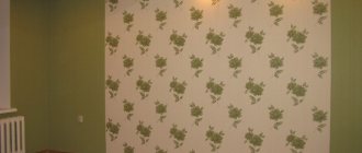
It is not at all necessary to know all the compatible shades - it is enough to understand the principle of color combination. There are tones that are called neutral. These colors go well with all other tones:
- All shades of white. White wallpaper is most often used in combination with black inserts or as an independent tone for a classic design style.
- Beige tone (all colors of beige paints).
- Gray tone. Gray wallpaper allows you to create a neutral background for additional decorative finishing.
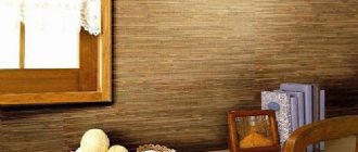
- Brown shades. This background is warm and goes well with all representatives of cold tones.
Another situation arises when the interior already has certain colors, and it is necessary to choose the optimal tone for them:
- Green wallpaper will go well with natural shades of furniture (sand, brown or pale yellow).
- It is better to choose blue and purple tones of wallpaper for a yellow or white interior. Such combinations will not have a negative impact on a person’s psychological mood and will not hurt the eyes with bright contrasts.
One way to zone a room is to use wallpaper of two colors, the border between which represents the dividing line.
Note!
- Types of wallpaper: features, pros and cons of wallpaper types. Classification by texture, number of layers, drawing (photo + video)
Wallpaper for the apartment - TOP-150 photos and videos of wallpaper design options for the apartment. Variety of materials, textures, colors and wallpaper patterns
Wallpaper for the bedroom: TOP 140 photos and video reviews of bedroom designs with wallpaper. Suitable styles, colors and patterns of wallpaper for the bedroom, choice of materials
To create a similar layout and not cause a sharp contrast, you can use wallpaper that differs from each other by 2-3 tones.
Yellow wallpaper
Yellow has always been a popular color. After all, it is associated with bright sunlight, summer warmth, and the tenderness of chicken fluff.
It has a more than positive psychological effect - it relieves stress, relieves fatigue, and fills you with positivity. Therefore, yellow wallpaper is an unmistakable choice for decorating a hall, bedroom, office, or living room.
Using canvases in yellow shades you can create any type of interior:
- calming (pale shades contribute to this),
- invigorating (when choosing saturated spectra),
- creative (combining tones from light to bright, bordering on orange).
In any case, yellow wallpaper will become a pleasant accent, adding comfort, optimism and cheerfulness to the atmosphere.
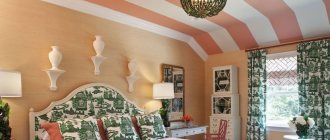
Color scheme for the bedroom
For a bedroom, the optimal solution would be wallpaper in a neutral color:
- White tones.
- Beige tones.
- Wallpaper with small flowers on a natural background.
Natural shades create a calm mood, positive emotions, do not irritate the eyes, and do not cause fatigue.
As an original idea, you can highlight one of the walls with a rich color, for example, in the form of a large flower or a painting.
Color composition for children's
For a children's room, it is not advisable to use bright and toxic shades, which irritate and distract the child from doing homework, quiet games and sleep.
The best solutions would be the following color combinations:
- Pale pink shades with fairy-tale characters against the background (for girls).
- Beige and sand tones of wallpaper for a boy.
- Wallpaper in two colors for a shared children's room, which also serves as room zoning.
Photos of wallpaper in two colors in various variations are presented in practical design catalogs, where you can choose a suitable interior design idea.
Multicolored
As a rule, colorful wallpapers for decorating walls are chosen by extraordinary, creative people who avoid monotony, monochrome and routine.
Multicolor in interior design plays both a decorative and functional role, allowing you to play with spatial perception, visually expanding the walls or “raising” the ceilings. They will also help to zone the room, highlighting some areas advantageously and shading others.
What is attractive about multi-colored wallpaper is its versatility and versatility. They are appropriate in any type of room - children's playroom, bedroom, kitchen, living room, hall and corridor.
Black canvases are produced:
- on non-woven, paper, vinyl base;
- smooth, embossed and 3D;
- with abstract and geometric patterns.
If desired, you can create many harmonious options by combining multi-colored canvases with each other or with background monochromatic companions.
Choosing wallpaper for the living room
For this room, which is a guest area, bright colors and rich decor are preferred. The most daring decisions on color composition can be used in this room.
Furniture plays the main role in arranging the style of the living room, so the wallpaper should highlight the furniture design from the overall picture with its shades.
An excellent solution would be wallpaper in light yellow or sand tones with bright decorative patterns.
Hall decoration
The hall is decorated according to the same rules as the living room. Here is additional information on what color of wallpaper is suitable for the interior of this room, taking into account the psychology of perception of different shades:
- A blue background is associated with success in business.
- Different tones of green help to find harmony and balance.
- White is the color of luck.
- Yellow and orange shades give self-confidence, treat depression, and evoke joyful emotions.
- Red color creates a good mood. But it should be used in limited quantities, supplemented with calm or dark tones.
Color solutions for the dining area
The dining area, in contrast to the working kitchen section, is decorated with wallpaper. Color solutions mean highlighting one of the walls using a stencil design, intricate ornament or mosaic pattern.
For small rooms, use the lightest colors possible, which allow you to visually expand the room.
Optimally selected colors will help you create a beautiful and stylish interior in your apartment.
Tips for those who do DIY repairs
If you have not done such types of work intended for painting, then first you should purchase a small amount of paint, for example, 1 liter, to try. At the same time, do not throw away the sticker with the name of the manufacturer and color. At home, you can only paint an area of no more than 1 m. After drying, you can examine the result of your work and decide how much you like it. If the resulting effect is what you need, then it’s time to return to the hardware store to buy more paint.
Paint consumption is difficult to predict. To paint the walls, you spend approximately 200 to 250 g per square meter. Instructions from the manufacturer will help you calculate paint consumption more accurately. Using the information provided in the instructions, you can determine the paint consumption for any room in your apartment or house. And for tinting, professional craftsmen advise choosing a color that is half a tone lighter than the one you chose from the catalog.