Research has confirmed the impact of office color design on employee productivity and productivity.
Different shades can have both a calming and stimulating effect on the human psyche, improve mood and set one in a creative mood.
Experts have developed a number of recommendations for choosing a color scheme for office walls.
Many managers needlessly do not pay due attention to design and paint or wallpaper the walls, sticking to neutral tones - white, beige or gray. Others go to the other extreme, introducing an excessive amount of bright accents.
Still others understand the importance of a properly designed interior and engage designers to create truly effective projects. The arguments in favor of the latter option are:
- employees work with great enthusiasm
- work capacity and productivity increases
- customers have a positive first impression of the company
- the image of the enterprise improves, and therefore the rating
- Often, improving employee performance indicators directly affects profits
The key to a successful renovation will be a competent choice of color scheme that meets expectations.
When developing an office design, it is necessary to take into account the following factors: office size. Light colors with a glossy finish will help expand the space in a small office.
Dark tones, on the contrary, hide volumes. For large offices, matte lighting is better suited.
Correctly selected shades can make the perception of offices warmer or, on the contrary, cooler. An insufficiently lit office should not be painted in dark colors.
But if you add light by complementing the interior with lamps, floor lamps, sconces or bright ceiling lamps, even an office in dark colors can look like a harmonious style solution.
There are certain established color combinations for different styles.
For example, lofts are decorated by adding beige, gold, and brown. The avant-garde is characterized by combinations of bright, flashy shades - lemon, fuchsia, raspberry, light green.
Art Nouveau adheres to classic, restrained tones - gray, silver, white, black.
It is important to take into account the color of the furniture so that there is no dissonance between the interior items and the walls. The office needs wall colors that encourage creativity and constructiveness, that do not tire the eyesight and are not irritating.
Designers approach office design in a comprehensive manner, taking into account all the above rules. To begin with, they listen to the wishes of managers, coordinate the style of the office and the expected effect, take into account the wishes of employees and the dimensions of the office.
Next, they develop a sketch where they try out different color combinations, taking into account lighting, color of furniture and decoration, height and other parameters. Only after final agreement with the customer do they begin to put their ideas into practice.
There are unspoken rules according to which it is optimal to paint the walls in two main colors, with accents of a third shade if desired.
The dominant tone should occupy approximately 60% of the area, the auxiliary tone - 30%, accents - up to 10%.
Painting in several shades of the same color looks attractive.
Effect of different colors
When choosing a design for an office, you should take into account many factors and the influence of colors on a person’s visual perception. To create an overall picture, you can give the following examples of wall painting:
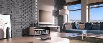
- Gray and its derivatives or neutral colors. Refers to calm tones. They do not irritate the eyes, but cause despondency and apathy. The gray shade of the walls in the office matches the color of the employees' clothes, so it is possible that soon everyone will fall asleep at work, and as a result, labor productivity will decrease.
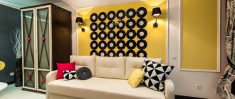
- Painting the office yellow. The opinion of psychologists is twofold. Some believe that this color of the office pleases the eye, lifts the mood and increases productivity. Experts have a different opinion that in such an environment it will simply be impossible to concentrate on the task at hand. Both are scientifically substantiated and have their own evidence, but for each person, the attitude towards this color is individual and everything will depend on his perception.
- Green. For the office, this tone is the most optimal. It does not tire you out during the working day, and therefore you can work quietly for a long time. Decorating walls with green color is soothing to the eye. When doing work that requires concentration, this is the most suitable solution. The design of the selected covering in green tones gives it a business-like appearance at the same time.
- Blue. If you paint the walls of office premises with this color, the productivity of employees will also be at a high level. If your work activity involves calculations or small details, then this solution will be optimal. It is important to choose the color blue, not blue, otherwise the perception will be the opposite.
- Brown. When choosing such a design, you should take into account that it has a depressing effect on the human psyche. But if you paint the walls, for example, in an investigator’s office, it creates a feeling of security for visitors.
- Red. Only creatively minded workers can choose such tones. A room painted in similar tones enhances emotionality and causes aggressiveness in mentally unbalanced people. Red is invigorating and good for people whose work activity is aimed at performing physical labor. This color is strictly not recommended for use in the office of a manager involved in negotiations and concluding contracts. Such a design will only aggravate situations that arise when resolving controversial issues, causing excitement, irritation and, perhaps, conflict situations.
- Orange. Applying this tone to the walls will be ideal for receiving clients and concluding contracts. But it is recommended to use an orange tint; it is softer and does not irritate the eyes.
- Violet. It calms and helps you relax, so certain places can be painted in these tones.
- White. Painting the walls in an office in this color will make even a small room visually larger; white also gives a business-like and austere look.
- Black color in the office is used to create contrast with other tones. In general, black will only cause negative reactions from others.
Color or style? How to choose a design option based on tones?
Designers choose a certain style for office decoration for a reason. The decision is based not only on beauty, but also on knowledge of the features of the color palette. More precisely, its impact on the performance and productivity of employees.
Among the most popular styles are loft, classic and modern (modern). Each of them deserves special attention.
Features of the loft style color palette in the office
The popularity of the style began in the 40s of the 20th century in the industrial areas of New York. In Russia, the loft came into fashion much later. But now they decorate almost any office space.
Offices decorated in a loft style have a minimal number of partitions. Large rooms are filled with light. High ceilings and panoramic windows emphasize the beauty of the interior.
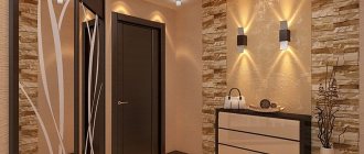
The color schemes for the loft are characterized by a combination of white, red and black. The main details are done in bright colors. The walls are pastel or brick tones. The combination of details literally sets the mood for flights of fancy and creative work.
Spaces in a modern style
Modernity, minimalism, light and space - all this characterizes the new fashionable trend in office design - modern style. The layout of such premises is dominated by open space, that is, 75% of the space remains free (empty).
Flexibility of work areas is also an important feature of modern style. Mobile glass partitions, furniture on wheels and other details emphasize the practicality and mobility of offices.
Among the color solutions, there is a combination of contrasting shades: black and white, deep blue and pale blue, bright purple “spots” and snow-white walls.
Timeless classic
The most luxurious offices and executive offices are decorated in a classic style. Natural finishing materials combine perfectly with liquid wallpaper in light, warm colors.
Classic-style executive offices combine rigor and respectability. The walls are painted white or beige. Massive furniture in natural wood color. A small number of cabinets are complemented by modern appliances.
Such an atmosphere sets the mood for productive management decisions and encourages the conclusion of major contracts and transactions.
How to choose the right shades
The chosen design depends on several parameters, and in order to correctly determine what exactly is suitable, you do not have to be a specialist. The following factors should be considered:
- room area parameters;
- Which sides are the windows facing?
- room illumination;
- window opening sizes.
Adviсe:
- If additional lighting is needed, this problem can be solved by adding lamps on tables or walls.
- Decorative paints of warm shades are used for rooms whose windows are directed to the north side, and, on the contrary, cool tones are used for the south sides.
The color of the walls in the office also depends on the furniture intended for purchase or available in the room.
Additional recommendations:
- interior style;
- personal wishes of employees or managers;
- furniture color schemes;
- colors of other finishing materials, if available;
- impact on mental state.
On video: paints for the office and living room.
Office design in an apartment
Unlike offices in houses, the owners usually furnish the premises in an apartment minimalistically due to the small square footage. In addition to visually expanding the space, it is worth paying attention to a few more points to ensure maximum productivity:
- It is better to place a printer, scanner, fax and any other large equipment in the corner of the room farthest from the window. This way the equipment will not interfere with sunlight entering the room and will not take up much space.
- You cannot do without a computer or laptop in your work area, so you need to arrange them wisely. The first method: put gadgets in desk drawers and take them out when necessary, if it’s a netbook or tablet. If you use a desktop computer, then it should occupy no more than one third of the work space. The second option: place all the office equipment on an additional miniature table, where only this equipment will stand.
- A good solution for an office is a basket or small rack for a telephone. Some feel more comfortable when it is behind the office door. By putting the phone on silent mode and removing it from sight, a person will protect himself from empty conversations. Thanks to notifications, you can see messages and missed calls later.
- If you use a landline phone for work, then it should only be a work phone. For personal conversations, there should be another one in the house. This will allow you not to be distracted by personal conversations.
Features of rooms for men and women
The men's office is not much different in appearance from the women's office. But psychologists highlight several differences that are worth considering when arranging a room based on gender.
It is advisable for men to place diplomas in such a way that everyone who enters can immediately see them. Therefore, they are hung opposite the door or near the desktop. It is also preferable to use conceptual decor for a men’s office. A pendulum, designer table clock or figurines will fit perfectly into the decor. In addition to the desk, it is recommended to place a long conference table in the office.
For women to feel more confident, it is better to place awards in sight. This will create more motivation and increase productivity. The office can be supplemented with succulents and other plants that do not take up much space and do not require complex care. The work area will also be well complemented by stone decorative elements: calendars, stands and decorative items. It is appropriate to make the interior of an office in a house or apartment even more functional with the help of a small wall mirror and a pair of armchairs.
Psychologists' opinion
As noted above, the color of the walls in the office has a direct impact on a person’s mental state, his performance, including the ability to concentrate on tasks and, in general, his productivity during the working day. In practice, many factors have been confirmed.
List of expert opinions:
- The design, rich in bright colors, is aimed at stimulating the nervous system.
- Decorative paint of different colors and shades can trigger migraines and increase fatigue.
- Calm tones are good; they increase performance.
- It is recommended to choose cool colors for small areas; they visually expand the space and provide focus on a particular task.
- The best results are achieved by combining warm and cold shades, and the effect on the human psyche will be positive.
- The green color is always pleasing to the eye; this solution ensures the concentration of employees’ attention, especially if their activities involve working on a computer.
- The design in gray tones is calming, but also allows you to fall asleep at work.
- Yellow color is used to increase mental activity.
- Decisions on choosing purple or blue colors will not be entirely successful; they suppress performance.
- Pink colors also have a negative impact on labor productivity.
The manager or his subordinates decide what color to paint the office. But if the work being done is related to creativity, then bright and rich colors should be used. For work that requires concentration, calmer shades are suitable.
Yellow
Photo: Global Look Press
Here the scientists were a little torn by the conclusions they had drawn. Some say yellow is cool. Everyone will look at him, enjoy life and be creative to the fullest. Others argue that it couldn’t be worse; your eyes will get tired of yellow before you even get to work, and it will be completely impossible to concentrate. Well, they can continue to argue, but it seems to us that everything is quite obvious: if you plan to be creative and produce new ideas, paint the walls yellow, if you are going to concentrate and concentrate, don’t paint!
Office decoration
What color should I use when decorating my office? Such a decision depends on the opinions of employees, including their type of activity. But it should be borne in mind that the choice of light shades is most optimal for employees. This gives both efficiency and efficiency.
The main goal is compliance with labor safety standards, including maintaining health during work. Every manager should know this, since he is the one responsible for the health of his subordinates.
If it is difficult to determine on your own what colors to choose for decorating your workspace, especially if the work has different directions, then it is recommended to turn to professionals. Specially trained people who have supporting documents for this type of activity will be able to correctly assess the situation and find a suitable solution.