Time passes, but wallpaper still remains a popular material for wall decoration. Including in the kitchen. Perhaps this is generally one of the simplest and most accessible ways for everyone to make the interior more beautiful, but you will make it many times more unique and interesting if you try to combine several shades and even textures in one room at once. The design of combined wallpaper in the kitchen in this regard seems to be a truly fertile territory where you can come up with really cool and non-trivial combinations.
The advantages of combined wallpaper
If you are trying to combine two types of wallpaper in the kitchen, then you are killing not two, but three birds with one stone:
- correct deficiencies in layout and texture - narrow or, conversely, expand the space, level out crooked walls or individual cosmetic defects;
- divide the common kitchen space into functional zones;
- you place the right color accents - this not only allows you to set the right mood, but also emphasize a specific element that plays a key role in your interior scenario.
We also note that you do not need any special tools to hang wallpaper. Just regular wallpaper glue, a stationery knife and a scraper to smooth out bubbles.
Basics of proper combination
- Wallpapers with the same level of density and approximately from the same price segment are combined. This way, all your joints and seams will look extremely neat, and the wear of the fabric will be approximately equal.
- Give preference to washable options. Do not forget that you are dealing with a kitchen that is actively used for its intended purpose, which means that drips and contamination are inevitable. In addition, such wallpaper will last you much longer, since it is not afraid of either high levels of humidity or direct contact with water.
- The design slogan “Everything goes together” works well in cases where there is a solid texture and the range of expressive tools used is not limited. Applicable to small kitchens up to 10 sq. m. It is still better to follow certain principles and combine wallpaper taking into account the overall design style.
- In order to correctly combine wallpaper in the kitchen, when choosing in a store, simply attach one canvas to another. It’s good if it is possible to make a conditional model of the interior on a computer. At many points of sale, this service is free and really helps with the choice.
Horizontal and vertical combination
If you live in a Khrushchev-era building and the size of your kitchen leaves much to be desired, then the best option is vertically combined wallpaper.
This combination will visually raise the ceiling and slightly expand the room. Of course, all this is a visual illusion, but what difference does it make if this makes the kitchen more comfortable?
Wallpapers can be combined:
- symmetrically - from the center in different directions, a simpler and more practical option, ideal for narrow kitchens;
- asymmetrical - strips of different widths are used and placed in different corners of the room, significantly enlivening the space.
If you have a larger kitchen, then it makes sense to combine the wallpaper horizontally. It is often practiced to divide a wall into top and bottom, and moldings and borders are used to decorate the transition.
How to properly and beautifully wallpaper your kitchen with different wallpapers: options
There are several ways to combine wallpaper to create an original interior design. They should be chosen based on the characteristics of the kitchen.
Vertical
This option is suitable for long and narrow layouts. Such gluing will increase the height of the ceilings and balance the length and width of the room. There are two ways of vertical combination: symmetrical and asymmetrical. A symmetrical combination is suitable for a classic style, and the second option is for creative individuals who want to add dynamics to the design of the space.
Vertical options are suitable for narrow areas
Horizontal
It looks more harmonious in spacious kitchens with high ceilings, because such a combination can visually narrow the space. You can alternate wallpaper from stripes of several shades. But the most popular option is to divide the wall into two halves, each of which is highlighted with different colors. The border between them is decorated with another finishing material.
Standard options:
- the lower half is covered with plain wallpaper or with a small pattern; to decorate the upper part it is recommended to use a large pattern or monograms;
- It is better to combine a bottom with stripes with a plain top or small ornament;
- It is better to choose shades from a similar color range.
Designers recommend using dark colors for the lower part of the wall or using an asymmetrical highlight that looks original.
How to combine wallpaper with each other (photo): kitchen with horizontal selection
Panels or decorative inserts
If the kitchen is already fully decorated, but you want to update it, an alternative could be panels or wallpaper inserts. Thick wallpaper is suitable for this, preferably flaseline-based. You can choose colors from a similar palette of shades or from a contrasting range. For greater effect, designers advise using frames to highlight the panels.
Popular combinations of two types of wallpaper
From theory to practice. Let's try to demonstrate with specific examples and photos how you can beautifully and, most importantly, harmoniously combine wallpaper with each other in the kitchen. We are looking for a variety of combinations - and revealing the secret of their successful use in the interior.
Combine the pattern with light green color
The decorative effect of the combination is enhanced significantly if the same color from the pair is used as the background for the image.
On one wall, a straight vertical combination was used.
A little more floristry. In the photo below, fresh flowers on the kitchen dining table, wallpaper with a floral motif and plain light green flowers are in perfect harmony with each other.
Abstraction + mustard color
In general, abstract compositions can be combined with any color and invariably obtain an ideal color balance, if they contain its elements.
Abstraction + flowers
It would seem that this is an oxymoron, but with balanced shades anything is possible. Harmony is guaranteed.
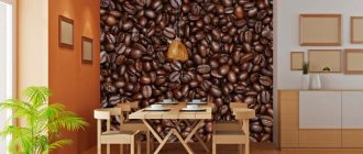
We combine photo wallpaper and brick texture
Combining different textures is always bold and interesting.
Photo wallpaper + yellow/gray color
Emphasize the importance of the dining area with beautiful photo wallpaper. A win-win that always works. Even with the yellow color, which is sometimes very capricious in relation to other shades.
Compared to the option above, the gray solution looks much more modest. But the tasks of organizing color temperature in a room are obviously different.
Combination of photo wallpaper and light green color
A light green shade will make even the smallest room cheerful, and the mood of the people in it - festive. Especially if you correctly combine it in the kitchen with a large-scale floral photo.
Geometry + light gray
Circles are also geometric shapes. And they go great with gray. Moreover, it echoes them and is present as a background.
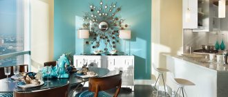
Several other examples where the owners placed emphasis on the wall adjacent to the dining area.
Lilac color + neutral white
The wall adjacent to the dining area can be highlighted with plain, pale lilac wallpaper. As a pair - consonant shades. But you can also just neutral white.
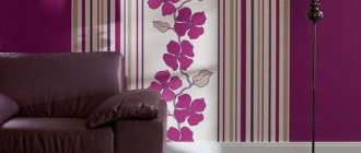
Pattern and vertical stripes
The drawing can be anything. In this case, an imitation of a kitchen set. Vertical stripes also work great to expand the space upward.
You can do without drawing. Especially if the stripes are heterogeneous in color and perfectly enliven the interior. A great way to combine wallpaper in the kitchen if you don't want to delve into the nuances of color combinations.
Flowers and trees
Most often, an element with a pattern is placed in close proximity to the dining table. If the color on the background overlaps with the pair, the result is such a harmonious pair that sometimes it seems that these are not two types of wallpaper, but the same one.
Here is an example of the synthesis of yellow with a bright floral bouquet. It greatly refreshes the atmosphere, which is as important for a tiny kitchen as air is for a person.
Similar options in a more modest interior.
A risky option is a rich floral bouquet with dark gray or even as close to black as possible. The risk is due to the potential narrowing of space. But in the case, as in the photo below, it was possible to beautifully combine such wallpaper even in a very small kitchen.
Orange and yellow in one interior
You can beautifully beat this cheerful couple if you connect them not on a separate wall, but on a transitional niche. Cozy, bright and somehow homely.
Dark-light couples
Contrasting shades make the most effective combinations. They radically transform the interior design and saturate the space with energy. However, take a look for yourself.
Accent wall
It is designed to attract attention, that is, it is better to make it bright and unusual. These can be coatings with large flowers, photo wallpapers, geometric designs, etc. It is important not to overdo it with paints, otherwise the interior will be oversaturated and lose its uniqueness.
For it, choose bright wallpaper or wallpaper with a pattern. The remaining walls serve as a background, so it is better to choose plain wallpaper for them.