Katrin
3712 0 0
Katrin February 7, 2018
Coffee beans on the wallpaper - stylish interior
A balanced interior can be achieved by using bold and unusual color schemes. For example, coffee-colored wallpaper for the kitchen will bring calm, harmony and comfort to your interior. Let's get to know them better.
This color is considered the basis of a classic style and can be easily combined with other shades.
My instructions will help you understand the features of using coffee shades in the interior.
Design subtleties
Often conservative people choose a coffee interior. But it’s not just the older generation who have a love for the classics. Attractive shades do not go out of style for many years. Designers choose a soft palette, as it is an excellent backdrop for placing various objects of art. These include paintings, sculptures, photographs.
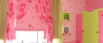
When it comes to a small living room, a coffee accent looks great on 1 wall. The interior in the color of coffee with milk looks beautiful in the office. It has the ability to soften decor while aiding research or teaching activities.
The choice of textiles is important in an interior in the color of coffee with milk. Replacing curtains can affect the perception of a room. If the windows face south and the walls are white, then coffee curtains can protect you from the hot sun. The shade of coffee perfectly ennobles any room. It makes the room cozy and luxurious.
You can purchase accessories for the interior - figurines, antiques, paintings, lamps. Embroidery on textiles looks great. Pillows and carpets are suitable for such an interior. The background can be diluted with gray or blue inserts. It is advisable not to use yellow and purple, as they can make the space heavier.
Coffee with milk color: combination with popular shades
Beige walls can evoke completely different emotions and impressions. It all depends on what exactly they are combined with, and what tone was initially chosen. Classic combinations include latte and light peach, apricot, white, yellow, and dark chocolate. They are always relevant and create a cozy and calm atmosphere.
If you want to bring something new and interesting into the interior, experiment, stop at:
- pink powder;
- pistachio;
- blue;
- salmon;
- gray;
- lavender;
- olive
Such combinations will add dynamism and uniqueness to the space. Bright shades are best used as decoration and textiles, and the background should be dominated by coffee and milk. And now we propose to consider the possible combinations in more detail. So, what can you combine the color of coffee with milk with?
Earth tones
Brown, dark green and ocher perfectly complement the pastel palette. It’s easy to find wooden furniture sets, ceramics, and linen products on sale. All these things look natural in living rooms. Lovers of exotics and owners of large country houses will certainly find furniture made from bamboo or rosewood useful.
Marine motifs
The golden tone of latte is often used to decorate rooms in a marine style. It perfectly sets off the white and blue of natural, untreated wood. Milk coffee and pale blue also go well together.
Marine motifs in a combination of coffee shades
It’s like plus and minus – cold and heat, which when meeting each other are balanced and form a harmonious picture. The interior will contain both warm notes and freshness.
Monochrome combination
A combination with shades from the brown-beige spectrum is not universal. This is static, regularity, which is acceptable in the kitchen and appropriate in the bedroom. In other rooms, such an “alliance” will quickly get boring, you will want to add variety - and there is a high probability of going too far with bright elements. To prevent this from happening, order in advance for the bedroom and kitchen, dining room curtains and tablecloths, covers, pillowcases with an interesting texture and contrasting colors.
Combination with gray
The best solution is cool gray and coffee-milk. It is suitable for any layout and room parameters, because sometimes it allows you to eliminate all flaws without additional techniques. Thanks to light brown, volume is added, and cool tones visually expand the boundaries. It is this feature that is happily used in modern kitchens in small apartments.
Plus white
Coffee with milk and white - again, classics. It's fresh, unobtrusive, calming. Emphasis is placed on additional elements and various textures. As a rule, one cannot do without glossy surfaces, furniture with leather upholstery and bronze.
What do psychologists think?
What effect does an interior in the color of coffee with milk have on a person, according to psychologists? According to experts, this color stabilizes the nervous system. Comfortable housing allows you to “talk” and discuss problems. Since the milky range does not include cold colors, the room remains warm in winter. Thanks to the lack of pressure on the psyche, you can quickly relax.
Interior design in the color of coffee with milk helps you forget your worries for a while. It does not have a depressing effect on guests, but is able to stimulate the hosts to creativity and intellectual activity. Therefore, popular colors are often found in offices. Brown wallpaper is useful for those who lead an active life.
Coffee color was previously used in the decoration of aristocratic palaces. Chocolate decoration makes the room look solid. This effect will be enhanced by expensive furniture made from precious wood and parts made from genuine leather. A luscious accent is provided by a luxurious Persian carpet on the floor.
Benefits of color
Although the coffee-milk color serves as a reminder of the taste properties of the chocolate drink, it can still have a calming effect. These shades are often used to decorate furniture - sofas, kitchen units, tables, cabinets. This combination is not annoying. The colors don't get boring for a long time.
A skillful approach to design allows you to create the desired effects, since the shades of coffee are different: from light to dark. This color in the kitchen will allow you to install antique pieces of art, photos, paintings, and souvenirs. And in a small living room, the color of the walls can become decor. In the sleeping area, the color coffee with milk perfectly calms and lulls you to sleep.
Basic rules of the coffee theme
In order for the kitchen to turn into a stylish, modern room, it is necessary to correctly place accents and use only the advantages of wallpaper with coffee:
- in a colorful design, the coffee theme will lose its charm. 1-2 bright shades are enough, but no more;
- if wallpaper with large or giant coffee beans or cups is used to decorate the walls, then it is better to keep small items away from the image;
- By choosing material with such a theme, you can give free rein to your imagination and combine several types of wallpaper. You can also pay attention to additional elements - coffee on the kitchen set, curtains, kitchen utensils;
But you should be careful, as an awkward combination can ruin everything. If in doubt, it is better to give preference to similar drawings in a given topic.
The abundance of different wallpapers allows you to create your own “coffee” kitchen, taking into account your preferences and personal tastes.
The video shows other themes for kitchen design:
Recommended Posts
3d wallpaper for the living room + photo
How to properly glue wallpaper on drywall with and without putty…
How to hang wide wallpaper
Beige wallpaper in the interior
How to choose two types of wallpaper for the living room
How to glue wallpaper with your own hands
Interior use
If you carefully look at the photo, the interior in the color of coffee with milk looks original. When major renovations are not planned, you can make 1 accent wall. It is best to purchase a furniture set made of natural wood, as the combination of natural textures and shades creates a peaceful environment.
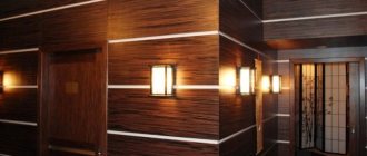
If you are redecorating, you can use wood panels instead of painting. For finishing you can use:
- Bog oak.
- Mother-of-pearl nut.
- Ripe cherries.
- Larch.
Since the shade of wood is very different, owners can choose the finishing material directly to match the interior. Much is determined by the way it is processed. Usually simple impregnation or painting, as well as heat treatment, are used.
Colors
The color of the coffee-with-lait walls in the interior will look harmonious only when it is correctly matched to the rest of the room’s details. To do this, you should familiarize yourself with several shades. Experts advise using the following color combinations of coffee with milk in the interior:
- For large rooms with high insolation, coffee wallpaper is perfect. But brown color is also suitable for small rooms, if used in moderation. It is necessary to decorate one wall to express the accent. Other walls may have light shades.
- Finishing wallpaper for painting allows you to do the work yourself. A matte structure will look more attractive compared to a glossy one. It emphasizes the texture of the material.
- A great option would be a print of coffee beans on the wallpaper chosen for the kitchen. Dark areas can be used to decorate the work area.
Additional design nuances
The color of the walls, coffee with milk, has a huge advantage - it is unpretentious. You don’t have to worry too much about delighting your guests and emphasizing the chosen decor option. It is enough to periodically buy new things, for example, bring souvenirs from trips, purchase exclusive tables with carved legs, some rare books, decorative vases. The walls can also be decorated with colorful posters or artistic abstractions. Designers have found use for all shades of coffee with milk.
Fashionistas often confuse this color with chocolate or chestnut. However, experienced hairdressers are sure: all the listed colors differ noticeably in the depth of shade.
If you are a coffee lover, you can scoop up a handful of roasted coffee beans and take a closer look at them. You will see a color that is not too dark, brown, decorated with gold and rich in tints of light. Your hair will be the same if you choose a dye from this “family”!
Who is “Coffee” hair color suitable for?
The ideal appearance for dyeing your hair coffee color is considered to be: dark skin, green or brown eyes. He makes such a girl very noticeable, paying attention to all her advantages, and leaving her shortcomings “behind the scenes.” If you want to stand out more, add some color to your look!
Do you have brown eyes and a deeply tanned face, or, on the contrary, cold blue eyes and pale skin? This appearance is also not a contraindication to the use of such paint.
In general, experts believe that it will work equally well on both light and dark strands. Hairdressers recommend “coffee with chocolate” for brunettes or dark-haired girls, and “coffee with cream” for light-blond girls.
Of course, coffee hair color can be different. But its most “basic” version is rich in warm golden notes. Noble, expensive, sophisticated - this is what the shades of this paint are called in beauty salons.
Do you really like coffee-colored hair, but you are not sure that you will look beautiful with it? Start exploring your favorite undertone by purchasing a tint balm. If you don't like the color, it will quickly wash off!
Shades
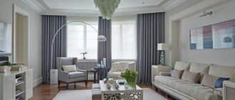
The color of coffee with milk in the interior of a living room or other room looks original with a harmonious selection of all design elements. Light colors are often used to decorate surfaces, while dark shades are chosen for furniture. This is the right approach. The emphasis is on an aristocratic setting, which looks great against a light background. You should not use only light or dark shades, as the space loses its shine and grandeur.
The combination of cream and brown tones, diluted with splashes of seasonal flowers, looks great. These are turquoise or amethyst details, orange or terracotta. If the room lacks freshness, you can use olive inserts. You also need to consider quality lighting. The right light highlights exclusive accessories and expensive items.
Lighting Features
It is important to think through an artificial lighting system in advance. The light should be soft and yellow. Experts advise installing multi-level light that illuminates each zone separately. To illuminate work surfaces, rotating lampshades or structures built into the ceiling are used. They make it easy to wash dishes or cook food in the dark. To illuminate the dining table, use a floor lamp, a table lamp or a cozy pair of sconces.
Properly selected light zones the space and corrects it. The shape and appearance of the lamp depend on the style of the interior. To illuminate a vintage kitchen, choose original lanterns, for a retro style - spectacular spotlights, for Provence - sconces or cozy floor lamps.
Important ! Experts advise using LED lamps. Compared to traditional lamps, they last much longer, their light is softer, and the lighting is of higher quality.
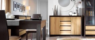
Decor and finishing
Thanks to accessories, you can complement glossy furniture. Mirror surfaces can visually expand the space. Combinations may include the following set:
- Milky-colored hanging shelving and brown chairs can create a cozy atmosphere in the kitchen.
- The combination of brown and red details on cabinets, according to experts, increases appetite.
- The use of gold fittings will make the decor luxurious.
- Frosted glass and brown wood texture create a sophisticated, modern decor.
The color of coffee with milk in the bedroom interior will look good if harmonious elements are selected for the design. At the same time, the materials used for finishing are varied.
Advantages of brown color in the interior
Brown color and its shades are a universal solution. It goes well with many styles, fits into the interior of classic, modern, country, and high-tech style. The advantages are:
- Several color shades can be combined in one color;
- on surfaces of brown tones, dirt is practically invisible;
- brown color is combined with orange and its shades;
- a palette of brown shades creates luxury, a warm and comfortable atmosphere in the interior, brings completeness and tranquility to the room;
- Shades of chocolate have a beneficial effect on a person’s emotional state.
Related links: Pros and cons of glass countertops in the kitchen
Wallpaper
Wallpaper in the interior in the color of coffee with milk should be chosen taking into account the functional purpose of the room. If this is a kitchen, then the best decoration would be the theme of small cafes. For the hall, it is preferable to choose contrasting ornaments and brown borders. Art Nouveau curlicues above the head of the bed will suit the bedroom.
Coffee color can be on one or more walls. In your office, you can use the alternating method: use dark wallpaper at the bottom, and light colors at the top. A decorative border is placed at the joints.
In the interior, the color of the walls, coffee with milk, can be used in other rooms. For the hallway, choose the shade of milky cappuccino with vertical lines, since this room is usually cramped. Combination with wooden furniture allows you to expand the space. It is better not to use dark colors. And photo wallpaper with a still life, abstraction or engraving will suit perfectly. An industrial style is possible, in which brick walls are imitated.
Design conditions
A coffee-colored kitchen is designed with the following requirements:
- Convenience of cooking.
- Compliance with the overall concept and design.
- External attractiveness.
Redevelopment allows you to increase the area by several meters.
Removing the wall between different rooms
Such actions must be coordinated with different services.
What should you consider?
The advantage of color is its unpretentiousness. There is no need to use complex design techniques to emphasize decorative elements. For such an interior, original souvenirs, coffee tables with carved legs, books, and vases are suitable. You can place posters or artistic abstractions on the walls.
Designers know how to combine colors, creating new design options. Shades of latte, espresso, cappuccino, and macchiato can be used in the interior. Similar tones are often used in catering establishments. They decorate walls and furniture. This creates a cozy space. To decorate the interior, it is not at all necessary to involve specialists. You just need to follow simple recommendations:
- Do not use a combination with bright and acidic colors - green, pink, blue.
- The general background can be diluted with decorative details of a contrasting tone.
- A local lighting system must be used.
When decorating the interior, you should not skimp on materials. They should suit the room and be practical. Then the completed repair can last for a long time.