The color of coffee with milk, or a wonderful latte in the interior: palette, combination and secrets
Interior of a room with a sofa in the color of coffee with milk
Coffee with milk or latte is a color that is included in the palette of beige shades. It is equally successfully used in the beauty industry and design; it is very much loved for its neutrality and the ability to “play” with decorative elements without much risk. With its help, you will create a harmonious, unobtrusive interior and avoid chaos.
Kitchen in Latte color
The main thing is not to overdo it with decorations and find out in advance what the color of coffee with milk goes best with, and in what proportions it is best to use it. There are many options, and we will be happy to tell you about them. Let's talk about paint for walls, wallpaper, furniture, and about decorating different rooms in latte colors.
Design subtleties
Often conservative people choose a coffee interior. But it’s not just the older generation who have a love for the classics. Attractive shades do not go out of style for many years. Designers choose a soft palette, as it is an excellent backdrop for placing various objects of art. These include paintings, sculptures, photographs.
When it comes to a small living room, a coffee accent looks great on 1 wall. The interior in the color of coffee with milk looks beautiful in the office. It has the ability to soften decor while aiding research or teaching activities.
The choice of textiles is important in an interior in the color of coffee with milk. Replacing curtains can affect the perception of a room. If the windows face south and the walls are white, then coffee curtains can protect you from the hot sun. The shade of coffee perfectly ennobles any room. It makes the room cozy and luxurious.
You can purchase accessories for the interior - figurines, antiques, paintings, lamps. Embroidery on textiles looks great. Pillows and carpets are suitable for such an interior. The background can be diluted with gray or blue inserts. It is advisable not to use yellow and purple, as they can make the space heavier.
Main trends in coffee shop design, styles and trends
Today, themed establishments have become very widespread, where in addition to coffee you can order, for example, sushi and rolls, and pizza.
In addition, such enterprises focus on family vacations, offering visitors a fairly extensive children's menu.
If you intend to decorate the interior of a coffee shop in an original way, you need to start by choosing a direction, developing a concept, focusing not only on your own taste preferences, but also on the needs of the market.
As examples, we can give several popular solutions today:
- traditional design. It involves arranging several rows of tables for visitors in the hall, as well as placing separate sofas that will help ensure the most comfortable stay for the client;
solutions for interior design of a coffee shop in the original Russian style. In such an establishment, in addition to coffee and pastries, guests can be served alcoholic drinks and snacks to go with them. It is best to decorate a coffee shop “as a restaurant” - with a large hall, massive tables, comfortable chairs or armchairs;
coffee shop combined with a fast food establishment. In the hall of such an establishment, it is best to place bar counters and high stools, highlighting a completely separate area for those who come to enjoy coffee, peace and quiet.
What do psychologists think?
What effect does an interior in the color of coffee with milk have on a person, according to psychologists? According to experts, this color stabilizes the nervous system. Comfortable housing allows you to “talk” and discuss problems. Since the milky range does not include cold colors, the room remains warm in winter. Thanks to the lack of pressure on the psyche, you can quickly relax.
Interior design in the color of coffee with milk helps you forget your worries for a while. It does not have a depressing effect on guests, but is able to stimulate the hosts to creativity and intellectual activity. Therefore, popular colors are often found in offices. Brown wallpaper is useful for those who lead an active life.
Coffee color was previously used in the decoration of aristocratic palaces. Chocolate decoration makes the room look solid. This effect will be enhanced by expensive furniture made from precious wood and parts made from genuine leather. A luscious accent is provided by a luxurious Persian carpet on the floor.
Benefits of color
Although the coffee-milk color serves as a reminder of the taste properties of the chocolate drink, it can still have a calming effect. These shades are often used to decorate furniture - sofas, kitchen units, tables, cabinets. This combination is not annoying. The colors don't get boring for a long time.
A skillful approach to design allows you to create the desired effects, since the shades of coffee are different: from light to dark. This color in the kitchen will allow you to install antique pieces of art, photos, paintings, and souvenirs. And in a small living room, the color of the walls can become decor. In the sleeping area, the color coffee with milk perfectly calms and lulls you to sleep.
Trick #2: glossy surfaces
In a narrow corridor, a glossy light floor and a reflective ceiling surface are welcome. To increase the area of the corridor, it is advisable to choose the floor and ceiling in a single color scheme.
A suspended two-level ceiling, as a rule, visually aligns and expands the narrow space of a room. Equip one level of the ceiling, made in the shape of a square or rectangle, with hidden lighting - this way you will visually enlarge the walls of a narrow corridor. The light will be reflected in the glossy surface and give the feeling of a wide room.
It is also easy to create the effect of expanding space using a transverse pattern on the floor covering. Longitudinal stripes, on the contrary, will visually narrow the corridor.
Interior use
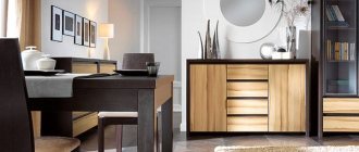
If you carefully look at the photo, the interior in the color of coffee with milk looks original. When major renovations are not planned, you can make 1 accent wall. It is best to purchase a furniture set made of natural wood, as the combination of natural textures and shades creates a peaceful environment.
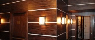
If you are redecorating, you can use wood panels instead of painting. For finishing you can use:
- Bog oak.
- Mother-of-pearl nut.
- Ripe cherries.
- Larch.
Since the shade of wood is very different, owners can choose the finishing material directly to match the interior. Much is determined by the way it is processed. Usually simple impregnation or painting, as well as heat treatment, are used.
Colors
The color of the coffee-with-lait walls in the interior will look harmonious only when it is correctly matched to the rest of the room’s details. To do this, you should familiarize yourself with several shades. Experts advise using the following color combinations of coffee with milk in the interior:
- For large rooms with high insolation, coffee wallpaper is perfect. But brown color is also suitable for small rooms, if used in moderation. It is necessary to decorate one wall to express the accent. Other walls may have light shades.
- Finishing wallpaper for painting allows you to do the work yourself. A matte structure will look more attractive compared to a glossy one. It emphasizes the texture of the material.
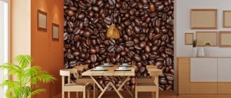
- A great option would be a print of coffee beans on the wallpaper chosen for the kitchen. Dark areas can be used to decorate the work area.
Shades
The color of coffee with milk in the interior of a living room or other room looks original with a harmonious selection of all design elements. Light colors are often used to decorate surfaces, while dark shades are chosen for furniture. This is the right approach. The emphasis is on an aristocratic setting, which looks great against a light background. You should not use only light or dark shades, as the space loses its shine and grandeur.
The combination of cream and brown tones, diluted with splashes of seasonal flowers, looks great. These are turquoise or amethyst details, orange or terracotta. If the room lacks freshness, you can use olive inserts. You also need to consider quality lighting. The right light highlights exclusive accessories and expensive items.
Beautiful examples
A white hallway is a universal solution.
Black color is an unusual and luxurious choice.
Yellow elements really refresh the design.
Red and wine shades are well suited for expressive interiors.
Lilac and violet in combination create a mysterious and magical decor.
All shades of turquoise form an original, sophisticated design.
Orange is best combined with a neutral beige palette.
See below for useful tips on renovating your hallway and living room.
The corridor is the calling card of your home. The first impression of the apartment will depend on how it is decorated. Therefore, when updating your interior, think carefully about its design.
A spacious room is an excellent field for experiments, but what to do if the apartment has a narrow corridor? Such a room sometimes looks depressing. A poor design creates the impression of a closed space, as if the walls are about to close in. Today we will show you several techniques that can increase space and make a narrow corridor cozy.
Decor and finishing
Thanks to accessories, you can complement glossy furniture. Mirror surfaces can visually expand the space. Combinations may include the following set:
- Milky-colored hanging shelving and brown chairs can create a cozy atmosphere in the kitchen.
- The combination of brown and red details on cabinets, according to experts, increases appetite.
- The use of gold fittings will make the decor luxurious.
- Frosted glass and brown wood texture create a sophisticated, modern decor.
The color of coffee with milk in the bedroom interior will look good if harmonious elements are selected for the design. At the same time, the materials used for finishing are varied.
What style does it suit?
It’s not for nothing that coffee cuisine is considered universal. As practice shows, a set designed in similar shades can be successfully integrated into almost all style trends, but such a set would look more appropriate in the following styles:
- Classic (combination of basic neutral colors with straight lines).
- Minimalism. To create such an interior, it is recommended to purchase modular furniture and built-in household appliances.
- Modern. The direction is characterized by red, white, and black tones. A coffee set with a bright stone-look countertop will fit perfectly into such an interior. The surface may differ radically from the color of the body and facades, for example, it may be red.
- Provence. Involves the use of pastel wallpaper and a kitchen coffee set with matte fronts. The shade of the furniture can be either light beige or chocolate.
Wallpaper
Wallpaper in the interior in the color of coffee with milk should be chosen taking into account the functional purpose of the room. If this is a kitchen, then the best decoration would be the theme of small cafes. For the hall, it is preferable to choose contrasting ornaments and brown borders. Art Nouveau curlicues above the head of the bed will suit the bedroom.
Coffee color can be on one or more walls. In your office, you can use the alternating method: use dark wallpaper at the bottom, and light colors at the top. A decorative border is placed at the joints.
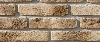
In the interior, the color of the walls, coffee with milk, can be used in other rooms. For the hallway, choose the shade of milky cappuccino with vertical lines, since this room is usually cramped. Combination with wooden furniture allows you to expand the space. It is better not to use dark colors. And photo wallpaper with a still life, abstraction or engraving will suit perfectly. An industrial style is possible, in which brick walls are imitated.
How to visually lower or raise the ceiling
Interior design dilemmas accumulate when, in addition to narrow planes, ceiling height poses a significant challenge. If the hallway is low, it is recommended to choose vertical stripes or cover the ceiling surfaces with a lighter color - for example, white, blue or soft gray.
The chosen shade should be slightly thinner than on the walls, this will create the illusion of increasing the distance between the ceiling and the floor. The resulting impression of “lifting” will be enhanced if the tonality passes to the walls in the form of a strip about a dozen centimeters thick.
In high interiors, you can also use drawing tricks that will align the proportions of the four corners and lower the ceiling.
- The first method involves the use of horizontal stripes, the task of which is to optically expand the room.
- The second is to cover the ceiling with a darker shade than on the walls. Thanks to this, the room becomes not only lower, but also more comfortable.
What should you consider?
The advantage of color is its unpretentiousness. There is no need to use complex design techniques to emphasize decorative elements. For such an interior, original souvenirs, coffee tables with carved legs, books, and vases are suitable. You can place posters or artistic abstractions on the walls.
Designers know how to combine colors, creating new design options. Shades of latte, espresso, cappuccino, and macchiato can be used in the interior. Similar tones are often used in catering establishments. They decorate walls and furniture. This creates a cozy space. To decorate the interior, it is not at all necessary to involve specialists. You just need to follow simple recommendations:
- Do not use a combination with bright and acidic colors - green, pink, blue.
- The general background can be diluted with decorative details of a contrasting tone.
- A local lighting system must be used.
When decorating the interior, you should not skimp on materials. They should suit the room and be practical. Then the completed repair can last for a long time.
Interesting color combinations
Coffee combines well with gray tones, makes friends with white, looks original in a duet with shades of yellow and more.
Grey
The cool range of gray combined with warm shades of cappuccino works to expand the space
It is important to maintain color balance; do not overload the interior with an abundance of accent details, even in spacious rooms
Bronze
The neutral coffee and milk background will sparkle in a new way if you add bronze accessories. These can be floor lamps and lamps, a chandelier, decorative elements of a set, frames and moldings. Bronze figurines, candlesticks, vases and flower pots, and textiles of appropriate design are suitable.
White
Brown-white dominance attracts with its unobtrusiveness, freshness and amazing sensitivity to powdery colors of the natural palette. The combination of different textures is favorable: a luxurious set with a glossy facade emphasizes the noble appearance of leather furniture; the composition is successfully complemented by a thick woolen carpet and jacquard curtains with nylon tulle.
Orange
Light cappuccino and muted orange work well in a duet in modern, high-tech and ethnic interiors. Most often, the beige palette dominates; bright colors are used in doses. However, when creating stylish compositions, even use of milky coffee and orange colors is also allowed.
Green
The combination of natural shades of greenery and cappuccino with the addition of steel colors is considered successful in arranging a room for a teenager. The solution will easily fit into the design of an eco-style room if you use exclusively natural bases.
Ocher
Yellow in the shade of ocher with small splashes of brown is a winning combination for projects in the ethno style. In a small room it is worth adding light colors, cream, pastel colors. In the design of spacious rooms, the tandem of ocher and cappuccino is successfully complemented with muted blue, green and red-brown notes in small quantities.
