Design features
Any finishing requires a competent approach. When choosing a burgundy tone for wallpaper, it is worth considering some features of the room for which it is intended.
- Burgundy wallpaper should be used to decorate bright rooms, to avoid the feeling of a closed space.
- Drawings and patterns on the wallpaper will help make the burgundy color a little lighter.
- In a small room, burgundy wallpaper is best used to decorate individual areas.
- The contrasting white ceiling compensates for the lack of light.
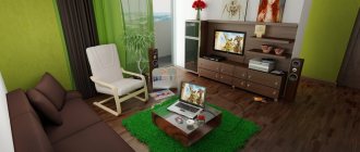
Burgundy sofa
Calculate the exact cost of repairs using an online calculator
and receive a free detailed estimate for repairs
Calculate
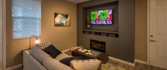
Despite the large size of the sofa, it can be called an accent in this bright room. Of course, the sofa will attract all the attention, so there is no need to include other bright and large objects in the interior.
Choosing a wall color can be a difficult task due to the huge number of colors and shades available to match burgundy. Consider the layout of your room and natural light in addition to the style of the sofa and the colors of other furniture.
Photo: messagenote.com
What types are there?
A variety of materials makes it possible to finish in accordance with the chosen style.
Non-woven
Durable material is divided into two groups: wallpaper made entirely of non-woven material or a covering with a non-woven base. Those that are made entirely of non-woven fabric are used for further painting; such coatings have a textured surface. Wallpaper with a non-woven base is covered with an outer layer, most often vinyl or acrylic.
The photo shows a bedroom design with non-woven leather-look wallpaper.
Vinyl
They are made using different technologies, which explains the variety of textures. There are four types of vinyl wallpaper: thick, foam, smooth and silk-screened. Each of them has different characteristics and appearance.
Paper
Material with a low price and a wide variety of colors. Paper wallpaper allows air to pass through well, but also absorbs odors well. Their service life is not durable, but the coating is durable. In addition, paper sheets quickly lose their brightness in the sun and are practically impossible to clean when contaminated of various kinds.
Liquid
Essentially this is decorative plaster for interior decoration. Liquid wallpaper is sold in the form of a dry mixture and is diluted in the required proportion with water or glue immediately before application to the surface. The composition must be applied in one go to avoid overlapping layers. The main distinguishing feature is the seamless application on the wall.
Photo wallpaper
Photo printing is applied to various types of coatings. Wallpaper can be paper, non-woven, laminated or vinyl. The image can be of any complexity, based on the buyer's preferences.
Textile
They are made from different fibers, such as neck, linen, velor and others. The surface is beautiful, especially in burgundy color, all the charm of the textile fabric will be noticeable, but the fabric attracts dust well, which will require more attention to cleaning. Textile wallpaper has a high cost, but this is compensated by its appearance, increased heat and sound insulation.
Burgundy living room: characteristics of a stylish color
The burgundy color in the interior instantly catches the eye. This color does not particularly welcome contrast, so it looks better in company with similar shades of red, brown or purple. But, fortunately, these are not the only color tips with burgundy in the lead role. There are many more possibilities, especially since this season burgundy is one of the most fashionable colors in the interior.
Burgundy is most often defined as red with a hint of brown. It is sometimes confused, for example, with the characteristic purple. It is a demanding, very strong and expressive color, which is why it is considered difficult in interior design and fashion styling. However, skillful use ensures taste and an elegant effect. It is important to note that burgundy enjoys the company of several noble colors that boldly entered living rooms this season.
Design options and drawings
It would seem that little things like drawing create the style of a home. Burgundy color by its nature is quite dark and rich, drawings and patterns can change the picture and make the design lighter and more interesting.
Plain
Plain burgundy wallpaper can be combined with other colors, thereby highlighting certain areas. As a rule, these are light shades.
When choosing plain wallpaper, the main emphasis will be on color.
Geometric pattern
Geometric patterns are suitable for decorating the walls of a modern room; the design can be Scandinavian, hi-tech, minimalism, modern and others. For classics, the exception is straight stripes; they fit perfectly into an aristocratic interior.
With flowers
Flowers against the background of a burgundy canvas will be especially luxurious, for example large roses or peonies with splashes of gold. It is worth remembering that volumetric images and dark colors visually bring the wall closer and make the room smaller. A small flower against the general background will take up less space.
In the photo, the walls in the bathroom are decorated with wallpaper with a floral pattern.
Rear photo wallpaper
A more creative approach to interior design. A 3D drawing will “give” the room additional volume due to 3D printing. The applied image can be realistic and convey the smallest details, or avant-garde and represent a unique work of art.
With golden designs
Gold with a dark wine tint is certainly associated with luxury and charm. This combination will look especially beautiful on silk-screened fabric and vinyl wallpaper. The most suitable room for such a design would be a bedroom or living room.
With monograms
Monograms can become part of a classic living room or bedroom. The combination of burgundy color and ornate patterns creates an aristocratic atmosphere and will look better in spacious rooms.
Rules for combining burgundy color with other colors
As for combinations of burgundy color and other representatives of the color spectrum, then, according to designers, it can be combined with light tones of almost all natural colors. It is very important to correctly calculate the proportions of the combination of different shades and take into account the effect of the color combinations used:
- white will make the design of the room lighter and fresher;
- pink will allow the interior to look more feminine and sophisticated;
- shades of beige will bring extraordinary tenderness and warmth into the room;
- yellow will add elegance and aristocracy;
- blue will make the interior deep, sharp and fresh;
- chocolate softens the overall impression and adds an element of luxury, making the decoration of the room more colorful;
- green brings the design of the room closer to nature, creating a special coziness;
- orange makes the atmosphere of the room sunnier and more positive.
A completely special tandem will be burgundy wallpaper with gold. This combination when decorating walls is often used in classic interiors and style trends such as Art Nouveau or Baroque.
Why is the combination of gold and burgundy so popular:
- this is the embodiment of luxury in its historical understanding, a reminder of royal and knightly ceremonial halls;
- Golden patterns on the wallpaper, reflecting light, completely eliminate the gloom inherent in burgundy color.
Today, this combination is gradually becoming the most popular in the interiors of both office and residential premises. The use of such wallpaper for wall decoration requires the presence of decorative items in the interior that match the design of the room. To avoid excessive pomp in the design of a room, it is enough to cover only one wall with burgundy wallpaper with gold flowers or ornaments.
How to combine with other colors?
An illiterate combination of colors can ruin the entire picture of the interior. The shades should be in harmony and create a single “duet”.
With gold
As already described above, the noble burgundy color goes perfectly with gold. The combination is royal, rich, suitable for a spacious room.
The photo shows burgundy and gold wallpaper.
With beige
A warm palette will not be as provocative as a combination with gold. The beige tone will lighten the dark burgundy color a little.
The photo shows a combination of beige and burgundy colors on the walls in the living room.
With gray
Stylish combination. The burgundy color in this case will become a bright accent on a gray background. The combination is suitable for design with a modern direction.
With black
Both shades are dark, the combination will turn out to be gothic. The combination is best used in a room with large windows and abundant daylight.
With blue
Dark shades can be “diluted” with a lighter tone, for example, in wallpaper or textile design. A rich combination can be used for partial finishing, for example a niche in the wall.
With yellow
A truly warm autumn combination, a good option for a “northern” room. In the morning and evening light, the room will be enveloped in an incredible atmosphere.
The photo shows a combined burgundy and yellow wallpaper.
With pink
Pink color will add tenderness to the burgundy tone. The combination can be in the form of drawings, wallpaper companions or a spectacular amber.
Burgundy wallpaper: what psychologists say
Bordeaux in the interior is the personification of sophistication, luxury, and wealth. Color speaks of chic, depth, originality. However, this is only the first impression that can be created in a room covered with burgundy wallpaper. Psychologists say that if the room is decorated correctly, the right shades of burgundy are chosen, then such a room takes on a special aura.
If the choice fell on finishing with burgundy wallpaper, then you should follow 3 simple rules:
- Bordeaux-colored wallpaper should never be placed in small rooms;
- You can glue burgundy canvases only in a well-lit room;
- The floor covering should be light; dark floors are unacceptable.
Experts say that this color is not suitable for rooms where relaxation and rest are planned. It is better to arrange burgundy wallpaper either in the office or in the living room.
Impact of burgundy color
Shades of burgundy:
- Helps to concentrate attention;
- Helps you gather your thoughts;
- They help you get rid of external problems.
If a person is tired, then burgundy promotes vigor. Color will give a boost of energy.
Psychologists recommend choosing a burgundy color for people with a strong spirit, and when decorating the interior, use the services of a designer, since not everyone can correctly combine decorative elements, furniture, accessories and the background of the room.
Options for combining with other finishing materials
Combination with other materials provides more opportunities to create a unique design.
Today, the use of companion wallpaper and natural materials in interior decoration is popular.
Tree
Dark red wallpaper will be an excellent companion for natural wood; the natural grain of the wood and its texture will look harmonious with the rich color of the wallpaper. If you need to make the room brighter, then you can use wood painted in a light tone, but if you want to emphasize all the luxury of the materials, then it is enough to polish and varnish the surface.
Stone
Considering the high cost of natural stone, an analogue can be artificial materials that convey all the beauty of the wild material. The combination will be successful in the hallway or living room, and will also emphasize the atmosphere of a country house.
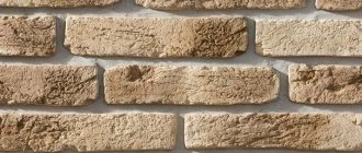
Brick
Brickwork can blend in with the color of the wallpaper or stand out in a contrasting color. It completely depends on the style of the room and its lighting. Large windows and plenty of light allow you to use red brick without worrying about space. Painted light brick, on the contrary, will brighten the room.
Decorating the living room with burgundy wallpaper
To decorate a living room beautifully, first of all, you need to take into account its size, geometric proportions, and where the room is oriented according to the cardinal directions.
The burgundy tone is perceived as very rich, so it should not be used to completely cover the entire room. This can visually make the living room smaller, since the color is dark. Burgundy wallpaper in the living room can aggravate the perception if the living room is not on the sunny side, where there is little light.
It is not advisable to use burgundy to decorate small rooms, but if you really want it, then in the form of a horizontal insert plus a couple of burgundy accents, for example, pillows on upholstered furniture and so on.
A peculiar “picture” or two will also be perceived as unusual - a piece of wallpaper framed with moldings or inserted into a frame.
If the living room is of normal or large size, then there are more possibilities. A good option would be to stick burgundy wallpaper on one wall or take over part of the adjacent wall. Wallpaper can be with a pattern or pattern - everything to your taste.
If desired, it is possible to use another technique. Cover only part of the wall with Bordeaux and thereby accentuate the area where the fireplace (false fireplace), upholstered furniture, antique slide, TV, home theater - whatever you want.
The remaining walls should be done in light shades that expand the space, visually making the room larger and lighter, which will balance the overall color balance.
It should be borne in mind that if the room is square, then by sticking wallpaper of a darker tone on one of the walls, the overall design will be perceived more attractively.
If the living room is narrow and long, then sticking burgundy wallpaper on one or both end walls will help to visually geometrically expand it, and paste the long sides with light wallpaper.
Often, a niche made of plasterboard, which can be designed rectangular, with curves, or rounded in geometry, is very advantageously decorated with the interior. The inner surface may be covered with burgundy wallpaper of a lighter shade, while the ends can be decorated with dark red or the color of ripe cherry.
If you provide a soft backlight, you won’t be able to take your eyes off it. Cover the remaining walls with light-colored wallpaper, and your intuition and your preferences will tell you the shade, pattern, and texture.
There are several traditional ways of dividing walls with wallpaper - vertically, horizontally, patchwork and others, which you can learn more about in the article - wallpapering.
Wallpaper is perhaps the most popular type of decoration, since the labor costs for stickers are small, and with skillful combination, you can create an original cocktail of a beautiful interior.
Burgundy wallpaper in the living room can be combined with other tapestries in design, texture, and color scheme, which will make the room aesthetic, bright, and memorable.
An interior in burgundy tones requires maximum lighting, then the overall perception of the room benefits. Natural lighting is natural, but it is only during the day, but there should be a lot of artificial light.
This includes the main lighting from a ceiling chandelier (you can choose shades in light pink colors), sconces on the walls, a floor lamp, lighting with built-in lamps, neon lighting and other types.
Shades of burgundy in the interior
Burgundy color does not have a light palette; all shades are juicy, thick and rich.
Maroon
The darkest shade in the palette. It has notes of chocolate color. Visually, the shade can be compared to ripe cherries.
Marsala
The shade contains notes of purple, similar to the color of young wine. Pairs well with pure white tone.
Pomegranate
The color of garnet seeds is bright and juicy, the lightest of the burgundy palette. One of the best combinations with cool gray color.
Cherry
The color of ripe berries, a fusion of red and brown. A good choice for kitchen decoration.
Wine
Very beautiful and rich tone, the color of aged wine. This shade will become the main decoration of the house. The depth of color is emphasized by fabric wallpaper.
Selecting burgundy wallpaper for the kitchen
The kitchen is the heart of the home. There is always movement in the kitchen: food is fried and cooked, water runs and dishes clink. Bordeaux is the very color that perfectly symbolizes the described image. A shade of red will stimulate blood vessels, appetite and a positive mood.
What you should pay attention to when hanging burgundy wallpaper in the kitchen:
- Don't overdo it with color! If your choice fell on burgundy wallpaper, then you can choose a set of a light, delicate shade that you like.
- Choose your wallpaper material carefully. The kitchen is a place where it can be humid, hot, etc. Therefore, it is necessary to do high-quality wallpaper using a suitable type of wallpaper.
- Burgundy color stimulates appetite and imagination. Therefore, dishes prepared in a burgundy kitchen will be unsurpassed masterpieces of culinary skill!
- Burgundy is a dark shade that is not overly soiled. This is a big field for the kitchen, because anything can happen here.
A burgundy kitchen will remain incomplete without a high-quality lighting system. Consider a large number of lamps for every corner of the kitchen.
Ideas in different styles
The interior style is influenced not only by the color of the wallpaper, but also by the pattern and texture of the surface.
Classic
A dark burgundy tone combined with ornate floral patterns or straight horizontal stripes is suitable for a classic design. The combination with natural wood and plaster will look harmonious.
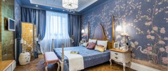
The photo shows a classic-style bedroom with burgundy wallpaper on the walls.
Country
In a rural country style, burgundy wallpaper with a checkered pattern or a small floral pattern will look good. The design will be complemented by natural wood furniture, wall decor, decorative pillows and bedspreads.
In the photo, the wall in the kitchen is decorated with paper wallpaper with a pattern.
Oriental
For a mysterious oriental style, burgundy wallpaper in a beautiful wine shade will be an excellent solution. Gold objects and designs of unusual shapes, and a combination with dark colors, such as vegne or black furniture, would be appropriate.
Modern
Modern design allows itself the use of bright colors, large and unusual patterns and various textures. Matte burgundy wallpaper in combination with black furniture or a large stereoscopic image on one of the walls of the room will look interesting.
The color of strong people!
If the apartment has burgundy walls, this means that the owners are strong-willed people who know the value of words and take from life everything they want.
And there is nothing surprising in the fact that the color of the wine looks stable, deep, and you want to look at it for a very long time.
Burgundy is a combination of red and blue. A warm shade is obtained in combination with yellow. Accordingly, the burgundy palette is endowed with numerous qualities of the red gamut, but at the same time, it is calmer and less provocative.
You can see this for yourself by looking at the selection of photos of burgundy walls that we have selected for you.
This range is ideal for adults and fairly stable individuals, increasing concentration and tone, without overexciting people’s emotionality. This version of the color scheme is much softer and more delicate in comparison with purple, which also combines blue and red, only in different proportions.
The option of burgundy walls in the interior is completely unsuitable for the design of a modern avant-garde or modern style. But it will fit perfectly into classic or even baroque! Bordeaux can also be used in a country kitchen, or in a high-tech/minimalist living room.
If you decide to choose a burgundy wall color, your interior will definitely be luxurious and representative.
In this case, you just need to choose the right shade option, and also combine it with the right color options, including accessories.
By choosing from a wide palette, you can create an unrivaled design for a bedroom with burgundy walls, a kitchen, a living room, a home office…
Examples of photos in the interior of rooms
Many factors are taken into account when creating a design. Lighting, general palette, purpose of the room, style. With the correct combination of all criteria, you will get a unique design that will delight the owner every day.
In the bedroom
When the bedroom is completely decorated with burgundy wallpaper, you will get a backstage atmosphere. With the help of curtains and pastel linen, the interior can be slightly modified, for example, making it lighter with light fabrics or brighter and more modern with contrasting shades.
The photo shows burgundy wallpaper with a silver pattern.
In the kitchen
Burgundy wallpaper in the kitchen will be associated with wine or ripe cherries. For a small room, it is better to use a light palette for kitchen furniture; in spacious open rooms, the color of the furniture can be dark.
In the photo, the walls in the kitchen are decorated with burgundy and gold wallpaper.
In the hallway and corridor
In a compact hallway, burgundy wallpaper can be combined with light details, such as milky wood panels, light furniture, bright lighting, mirrors. All these details will “expand” the space of the corridor.
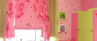
In the children's room
Quite a complex color for a child's room. A burgundy tone may be present in drawings or partial design, for example, the main color of the room is cream, and the sleeping and working areas are highlighted in burgundy.
The photo shows a children's room for a girl with burgundy and gold walls.
In the living room
A living room or hall is the most suitable room for finishing with burgundy wallpaper. The design will convey the style of the room, for example, damask, flowers or monograms on a burgundy background are ideal for a classic room, while geometry, abstraction, and 3D images correspond to more modern styles.
In the office
Burgundy wallpaper will help you get into the working mood. In combination with natural wood and leather furniture you will get a full-fledged office in the English style.
Classic burgundy wallpaper
The presence of dark, rich colors in the room indicates the severity of the room, as well as the fact that the owner of the house knows how to experiment with such a palette. But, unfortunately, due to their own inability, many refuse rich shades, although they can add special dynamics to the interior. One of these tones is burgundy.
Visual perception
Interior use for kitchen and living room
This classic tone belongs to the deep shades of red, and to achieve it you need to mix bright red (3 parts), dark blue (1 part) and yellow (a few drops). This color scheme symbolizes solemnity and dynamism, but in order to use it correctly in the interior, you must definitely follow simple rules.
- First of all, it requires a large amount of space, and it is unacceptable to use it as the main one in small rooms.
- In addition, the room where there is burgundy-colored wallpaper must have very good lighting, and this applies not only to artificial, but also natural, i.e. daylight as well as solar lighting. And so that the room does not lose its volume, it is worth using a light floor covering.
- Psychologists do not recommend using such a background in rooms intended for rest and relaxation, since, on the contrary, it stimulates active mental activity.
Use in the living room
The right combination with olive
The living room is exactly the room in which you can safely experiment with a palette of shades. Our “hero” himself is quite strong and self-sufficient, but requires special attention to design in order to eliminate gloom and limited space in the room. As a rule, designers recommend taking into account two or three other tones that will also be present in the room.
Different combinations are allowed in the living room. When combining it with black, you can only achieve gloominess, so in contrast you need to use rich white, which will give the dark shades richness. By turning to the classic combination with brown, you can make the interior more comfortable. To do this, you need to combine light furniture and curtains with burgundy wallpaper, as well as minor details of a milky or chocolate shade.
Application in the bedroom
Majestic bedroom
Related article: Making a mosaic table with your own hands
This majestic and dynamic color can be used in the bedroom, but in this case you need to use the right combination (white, pink). As the main wallpaper, you should use burgundy color wallpaper. Floor coverings should also be preferred in dark colors (rich wood). But for minor details you need to choose light milky and pink shades.
If the bedroom is in an oriental style, then you can combine burgundy and gold, but in this case there will be some pomp.
How does it look in the kitchen
This shade is also allowed in the kitchen, and it is also credited with the ability to have a beneficial effect on the digestive process. If such dark, expressive shades are used for the walls, then it is best to select a furniture set in brown tones. However, other interior details should be selected in green and milky tones. Particular attention should be paid to lighting, since the main color is too dark.
A good combination with bright accents
The use of burgundy color in a nursery can be extremely limited, since this room should be lighter and lighter. Its limited use is allowed, and only on small accessories.
Tips for choosing colors for interior elements
It is important that all interior elements are in harmony with each other, especially if such deep and dark colors are involved in the design. Otherwise, you can end up with a completely tasteless design.
Curtains
Curtains can be a continuation of the walls, combining colors or patterns, or contrast against the background of burgundy wallpaper, thereby visually enlarging the window. This technique will be especially noticeable with white curtains. You can also choose another bright tone for the curtains, which is included in the pattern on the wallpaper or other interior items, for example gold or blue.
Furniture
Burgundy wallpaper is a bold enough and dark shade so that the room does not become gloomy, you can lighten it a little with the help of furniture, for example a white sofa, a light kitchen set or a bed with beige pastel linens or a headboard.
Ceiling
Even in a spacious apartment, beige wallpaper will “eat up” the space. A contrasting white or beige ceiling can compensate for this. Firstly, the room will become lighter, and the charm of the burgundy shade will be noticeable, and secondly, the ceiling will seem higher than it is.
Floor
For burgundy wallpaper, a wooden floor makes an excellent companion; it can be parquet made of natural wood or laminate in a natural natural color. For the bedroom you can choose a light carpet or a beautiful rug, and in the open living room a marble floor will look impressive.
Which curtains will suit burgundy wallpaper: photo
Choosing curtains is an interesting activity, but with burgundy wallpaper the choice remains small, since capricious burgundy does not tolerate too bright and dark colors next to it.
What shades are best to combine burgundy wallpaper with:
- The unsurpassed leader in compatibility with burgundy wallpaper is a light sandy warm shade.
- Stark white curtains will also match burgundy wallpaper, creating a more modern look for the room.
- Golden curtains are luxury brought to reality. Bordeaux and gold are a combination that not everyone can understand.
- Pastel blue. Even a delicate and light shade will look extreme with burgundy. However, those who like to experiment can take note of this combination.
- Pastel green. Shades of lettuce and pale turquoise will also highlight the depth and beauty of burgundy.
Be careful about the shades. Combine light curtains with interior elements to achieve perfect harmony.
Burgundy curtains in the living room interior - luxury and elegance
Burgundy can also play a supporting role as a decoration that complements the aesthetics of the interior. Introduce color in the form of separate accessories, such as a soft rug, velvet throw or curtains. Thus, the room will change its appearance, adopting the elegance and sophisticated charm of the rich colors of the kings.
Burgundy is a deep shade of red that, by its name, refers to the noble, ethereal Bordeaux wine. For this reason, it is associated with sophistication and elegance, and the color itself has become an inseparable companion to all majestic church or court events. Burgundy curtains are an excellent addition to the living room interior. Full of temperament and dominance, they bring a touch of sophistication and elegance to the design of the main room of the house, thanks to which even an ordinary apartment in an apartment building will turn into a luxurious residence. Burgundy textiles can be an appropriate accent that complements a stylish living room.
Introducing burgundy into the living room is a good decision, especially if you care about an elegant and tasteful interior. You should not cover all the walls of the room with a dark shade of red, giving a museum and pompous baroque character. It's better to add a touch of balanced grace. Consider ready-made examples of a beautiful living room interior in burgundy color in the presented photo gallery.
The best combinations in the interior
The choice of a colorful palette is the prerogative of the owners. However, when drawing up a color scheme, it is important to remember some nuances. Next, you will find out what color burgundy goes with in the interior of the room.
Burgundy and black
Rich burgundy is often used as an alternative to black, so you should combine them with caution. Nevertheless, this combination is considered classic, embodying rigor and restraint. To prevent the interior from turning out too dark and gloomy, you should choose light and not very saturated shades of burgundy. You can also expand the spectrum and make a combination of several tones: from light to relatively dark. If the interior turns out to be too heavy and nondescript, then you need to dilute it with white and beige.
Unusual black and burgundy bedroom option
Classic combination of deep burgundy and black in the living room interior
Burgundy and gray
Perhaps this is one of the most profitable combinations. Here it is better to expand the range of gray shades and leave one burgundy (deep and rich). A light gray tone will perfectly highlight the contrast with cherry. This design will visually expand the room and focus attention on important decorative elements.
Calm, bright interior
The combination of burgundy and gray will add contrast to a white room
In the bedroom it is important to choose shades that will not tire
Burgundy and white
Any dark red shades look great against a white background, as they become even brighter and more saturated. Usually, combining equal proportions can be a little tense, so you can make one of the colors the base and dilute the overall ensemble with neutral gray and beige tones.
Against a white background, burgundy is deeper and more expressive
The ideal color scheme for the bedroom: the tones are not flashy and complement each other
Burgundy upholstered furniture can become a “highlight” of a bright interior
Burgundy and lilac
The combination of similar colors is quite common in room decor. Burgundy with lilac is a very bold option. Depending on the shades of both, the degree of their contrast changes, so it is important to choose a good combination so as not to spoil the entire interior.
A contrasting combination of rich light cherry with bright purple
The combination of different shades looks harmonious and interesting
Burgundy and light green
The lightest and airiest combination possible is burgundy and light green. The contrast looks impressive and stylish. Bright colors are associated with joy and inspiration, which is perfect for decorating a child's room. Cherry goes well with green colors.
In this case, burgundy accents the attention
The predominance of light green color evokes positive emotions
One of the options is when the colors in the interior exist in a proportion of approximately 50/50
Burgundy and gold
This is a classic combination that looks rich and has long prevailed in the interior of royal palaces. Dark scarlet has the properties of two colors - red and brown. The first symbolizes passion and energy, the second - calm and stability. Their fusion creates a balanced combination of both qualities. Burgundy and gold emphasizes power and strength.
A classic combination with a modern twist
Thanks to the combination of burgundy with gold, brown, pink, the room is filled with warm soft light
A bedroom that combines burgundy and gold looks luxurious
Burgundy and blue
Quite a rare combination in which it is important to choose the right shades so that it does not look tasteless. Blue color gives freshness, and burgundy looks elegant and elegant.
The most contrasting shades of burgundy and blue complement each other perfectly
Sleek modern interior