Harmonious, calming and noble green color is often present in modern interiors. It can easily be described as universal, because it is appropriate in any room. The natural beauty of absolutely all shades of green, pistachio, emerald, turquoise, mint and others inspire designers to come up with interesting ideas in creating interior projects. When green wallpaper is used in the interior for decorative wall decoration, it dramatically affects the atmosphere in the room. Color has a beneficial effect on the emotional and physical state, has a calming effect, gives confidence in one’s abilities, and creates a cozy atmosphere.
When using any shades of green in interior design, it is important to choose the right combination with other color combinations. Since if the tonal ratio is unsuccessful, there is a possibility that the final result will be unsatisfactory. With its unrivaled visual qualities and ability to have a positive impact, green has always remained popular and is ubiquitous in modern interior design.
Features of color and its shades
This color embodies the purity of nature, associated with the beneficial freshness of plants in dense forests or tropical jungles, with the majesty of sea waves and the beauty of emerald jewelry. In Eastern culture, green is a symbol of life, peace, tranquility and fertility. Rooms in which any of its shades predominate are best suited for meditation. This atmosphere promotes relaxation, allows you to dispel anxious thoughts, recharge with vital energy and tune in to a positive mood. Delicate, light tones of green make the room more spacious. Deep, rich ones add luxury and elegance, while bright ones charge you with positivity and improve your mood. This symbolic color of natural purity and freshness goes well with any colors of natural wood and is suitable for many design styles.
We focus on style
A variety of green wallpapers allows you to choose the appropriate option that can successfully emphasize the chosen style in the interior. Dark deep shades of green will perfectly reflect classical style, baroque and minimalism. Light colors will harmoniously fit into any modern stylistic trends, as basic and accent solutions. For strong and active people, an interior with bright green motifs in high-tech, modern, art deco, and minimalist styles is perfect. Muted bed variations of green shades can be safely used for country and Provence. Also, for each stylistic direction it is necessary to select suitable wallpaper options with appropriate patterns.
In the interior of the living room
A living room in green tones is associated with a classic European style, expensive and harmonious. The walls were a deep green shade in the homes of English aristocrats.
There are ready-made historical solutions for how to decorate the walls of the living room so that the room looks spacious and not gloomy. For example:
- On one wall there may be wallpaper with vertical green and contrasting stripes, on the rest - plain dark green.
- You can cover only the lower part of the walls with striped wallpaper, and choose a harmonious color for the upper part - blue or white.
- Wallpaper with a golden pattern always creates a pleasant festive atmosphere, ideal for friendly meetings.
- A spacious living room will feel homely if you complement the strict green background with milky, yellow, beige or blue objects.
- A small living room can be decorated in country or Provence style by choosing wallpaper in white and green checkered or plain light green.
Plain or patterned
If you decorate the walls exclusively with plain wallpaper, the interior may seem boring. In this case, it is enough to choose an accent area, which is decorated with decorative canvases with patterns and prints. Or photo wallpapers with images dominated by details of green shades, palm trees, ferns, grapes, kiwi, spring fields, exotic cacti and much more are suitable for this. Also, plain wallpapers can be perfectly combined with other different shades and complemented with accent details.
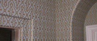
Fans of classic simplicity should choose strict geometric vertical lines on paper canvases. This option goes perfectly with laconic, elegant, soft furniture and gives the room a strict, restrained style, emphasizing the impeccable taste of its owner. Checkered wallpaper will create an avant-garde style, and a polka dot print will add a cheerful, carefree mood. Natural motifs with foliage, branches, vines will relieve stress after a busy day at work. The romantic, provincial style will be reflected in elegant ornate patterns with floral details. Gilded monograms and lines will make the interior royally luxurious. Multi-layer wallpaper has a relief texture, making the room incredibly stylish. Bamboo and wooden canvases are made from natural, environmentally friendly materials and add attractive exoticism to the interior.
Combinations with other colors
Any shades of green are in perfect harmony with all the colors of natural wood. This kind of furniture will be the most successful solution. In small rooms it is advisable to use interior items of light wooden colors, and in spacious rooms chocolate wenge furniture will look chic. Also, the color itself goes well with all its varieties and undertones, turquoise, emerald, light green, pistachio and so on. Excellent companions for green are related representatives of the color palette that are located next to it, blue, cyan, yellow. In addition, you can find other successful combinations.
White
White is a universal color that works well with any other color. The partnership of green and snow-white will not only be a successful and original solution, but is also a fashion trend in modern interiors. This combination is often found in comfortable hotel rooms and lounges. This combination of comfort, tranquility, freshness and cleanliness gives a feeling of confidence and coziness. Visually makes the room more spacious and bright.
Beige
Beige has always been a win-win option for interior design. It is warmer than white, and in combination with green shades it creates a soft, pleasant palette. If this duo is complemented with brown details, an elegant, cozy and flawless combination is formed. This is an excellent solution for classic, modern interiors.
Grey
In combination with a strict and confident gray color, green looks more rich and energetic. Such combinations are typical for modern high-tech style. Shades of natural stone, elevated rocks, lifeless concrete and asphalt seem to come to life next to natural and energetic green. It is better to choose warm and bright shades for gray, pistachio, mustard, kiwi, mint, turquoise. This combination creates an impeccable, ultra-modern style.
Brown
A classic and win-win combination of green and brown shades, which is widely used in design developments. The color of the tree and the earth is in perfect harmony with the natural greenery of spring fields, forest thickets, and impenetrable jungles. In this option there should not be too much brown; it is acceptable to use small fragments on the walls in combination with furniture and textiles.
Black
This is a very effective and extravagant combination. Deep, strict black can unusually highlight green shades. Snow-white, metallic steel accents are ideal for this combination. Do not forget that black can visually make a room smaller, so it must be used with caution, especially in small, dimly lit rooms. But it is he who adds rigor and refined prestige to spacious interiors.
Blue
This duet is associated with heaven and earth, as the embodiment of spiritual wisdom and vitality. All shades of blue have a beneficial effect on mental activity, and green allows you to calm down and concentrate. In addition, these are related representatives of the color palette that interact perfectly with each other. Rich blue goes better with pistachio. Light blue tones, blue, and turquoise go well with fruity bright greens and delicate pastels.
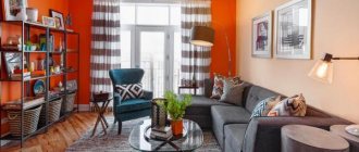
Red and orange
A light orange sunny shade with energetic green combines into a bright and positive duet. This combination is often used in the design of children's rooms and kitchens. Rich red and orange details should be used in the right proportions. The combination of crimson and green creates an attractive, cheerful and appetizing interior. Pink shades work well with bright or soft tones of green, as well as turquoise and gray-green. Red-green colors are often found in modern high-tech or modern styles. These two bright, saturated colors are successfully diluted with white, beige, black and yellow fragments.
Room decoration
When choosing the right shade of green for wallpaper, you should take into account not only the stylistic direction, but also other parameters of the room:
- area and shape of the room, size of window openings;
- location of the room relative to the cardinal directions;
- functional purpose.
For small and dimly lit rooms with small windows, it is recommended to use exclusively light colors in the design. For rooms located on the south side, you can use dark, cool and rich green wallpaper. Warm palettes are more suitable for the north side. Also, for a certain room, kitchen, bedroom, nursery and others, it is necessary to choose not only the appropriate color, but also the patterns on the decorative canvases.
Living room
If you want to create a calm and relaxing atmosphere, then to decorate your living room, you should choose wallpaper in light, neutral tones of green. Emerald and malachite will create a luxurious atmosphere, especially in combination with black furniture or chocolate-colored wenge. Also, pistachio wallpaper harmonizes perfectly with brown details and emphasizes the impeccable taste of the living room owners. Light and delicate green shades can make the room more spacious and bright.
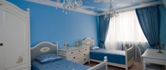
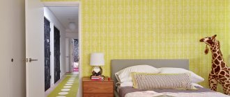
Bedroom
A very good decision to decorate the bedroom with wallpaper in green shades. Thanks to this, a cozy atmosphere will reign in the room, which is conducive to a good rest and helps to restore vitality.
Benefits of using green in the bedroom:
- has a positive effect on vision, helps the eyes to rest;
- relieves nervous tension, promotes recovery from stress;
- neutralizes anxious thoughts, relieves anxiety;
- relaxes, sets you up for peaceful rest and sleep.
It is important to consider that not all green shades create a calming effect. Bright fruit options, on the contrary, invigorate, increase activity and motivate for new achievements. Patterns, prints, designs on wallpaper are selected in unison with the interior style and taste preferences.
Children's
Green color is a universal option; it can be used to decorate a boy’s or a girl’s room. It will have a positive effect on newborn babies. It will help restless and overly active kids to calm down and concentrate. When properly combined with other palettes, quiet and introverted children can become more proactive and cheerful. At the same time, in children's rooms it is recommended to combine different colors rather than using a solid green palette. In combination with yellow it will create a sunny and positive mood. Sky blue will add freshness and emphasize the calmness of green. Red and orange details, in moderation, promote mental activity and creative thinking. It is worth adding brown elements of furniture and textiles to the recreation area. Snow-white will bring additional space and cleanliness. On sale it is easy to find drawings, prints, patterns on wallpaper stylized for children's rooms, which are available in a wide variety. Also, canvases made from natural materials, bamboo, and wood are ideal for a child’s room.
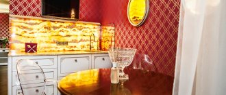
Kitchen
Green will create a summer mood in the kitchen, filling it with positivity and vitality. All walls can be boldly decorated with wallpaper of this color, or one accent, functional area can be selected, which will be surrounded by other shades. Large amounts of green should be balanced with other neutral tones. Rich, rich walls are best matched with floors, ceilings and furniture in restrained, calm and gentle palettes. Dark colors can only be used in spacious and well-lit kitchens, where black, gray, chocolate colors in combination with deep green will create a stylish and sophisticated design.
Cabinet
Napoleon's office in the Fontainebleau Palace is decorated in green and is a worthy example to follow. Massive furniture with elements of artistic carving or strict, laconic options are ideal for such a room. For a study, a good choice would be emerald and dark green wallpaper, which will add seriousness and elegant luxury to the room at the same time. This color of decorative canvases can normalize blood pressure, dilate capillaries, help improve mental performance and increase concentration at work. Vertical stripes on dark green wallpaper will emphasize the strict, laconic interior, and gilded patterns on emerald canvases will create a royally luxurious room.
Green wallpaper design
Wallpaper for wall decoration can have not only different colors, but also texture and pattern. When choosing wallpaper, take into account its purpose for a particular room, its size, general style and your preferences.
- Plain green wallpaper is used as a background against which other objects in the room will look contrasting. They can be combined with other expressive shades.
- Green wallpaper with a pattern, flowers, leaves will organically fit into the living room or bedroom.
- Green striped wallpaper acts as an eye trainer and can visually change the room. Depending on the type of strip - vertical, horizontal, narrow, wide - the effect created depends. A vertical line can lengthen a room upward, while a horizontal stripe can make it wider.
- Geometry on combined green wallpaper will make the room attractive and interesting to look at. Such wallpaper can be combined with other shades in the same tone.
- Green wallpaper to match tiles, brickwork, stone plaster will help hide defects and unevenness on the walls. Best suited for decorating walls in the hallway, hallway or kitchen.
- Green fabric wallpaper is used in bedrooms and living rooms. They shimmer beautifully in the sun.
- Green liquid wallpaper contains natural threads of silk and mother-of-pearl and can smooth out unevenness on the walls.
How to choose curtains and other decorative elements for a green interior
Each shade of green is good in its own way and has certain properties. It is important to find the right combination for them, which will successfully dilute the color palette in the room.
It is unacceptable for the color of wallpaper and curtains to merge together. The shades should match and not form a continuous veil. It is also undesirable for them to contrast; it is better to use small-sized decor as contrasting details.
Against the background of green walls, white curtains will look good, complemented by pink, yellow, and brown decorative details. Ocher curtains with brown or gray elements will suit dark olive walls. Light yellow and purple textile additions will harmoniously fit into the light olive interior. Metallic, silver and gold-plated curtains are in perfect harmony with the turquoise wall decoration. A gray-green room is successfully diluted with dark red or blue-green curtains with beige inserts. It is worth adding contrasting gray, pink, chocolate or beige decor to rich jade. Delicate green colors harmonize perfectly with any representatives of blue, blue, yellow and white shades. A great solution would be to choose textile decor, bedspreads, and pillows to match the curtains.
It is equally important, in addition to a successful combination of colors, to achieve a harmonious relationship between textures. Light, fragile, light curtains will look ridiculous against the background of weighty, luxurious bright green wallpaper, even with a successful color combination.
Choice for the bedroom
For the bedroom, you need to focus on the fact that the day will begin with this room. And a person’s mood depends on what color of wallpaper is used. It should be noted right away that aggressive colors are prohibited. There will be no quality sleep, and annoying ones will lead to frustration and quarrels. Too minor will also not lead to anything good, since the room should not turn a person into a lazy creature.
You should immediately consider a selection of popular shades:
Blue relaxes and calms
- Blues are often chosen because they are calming, despite their coldness. You can only use light blue, not blue. Blue is allowed only for compact rooms - it can visually expand them.
- The mood of green is perfect for the bedroom. Color gives relaxing emotions, relieves stress, and allows you to relax.
- It’s not for nothing that universal ones have such a title - they can be used everywhere. You can combine anything with white. The room will be light and open, but if there are other shades along with white. Having only white will make the room look impersonal. This is a good option for small bedrooms. It goes with most popular colors. These can be used in bedrooms with poor lighting.
- The use of yellow compensates for this deficiency. Like white, brown can be classified as a universal shade. It will never go away in reality. It has the most positive impact. In such a room you can relax.
Brown is a universal shade
Are there any conflicting colors for the bedroom?
There are several colors that can be used in the bedroom under certain circumstances. But we must immediately make a reservation – the colors are contradictory. For example, this is red wallpaper. It is the color of aggression, leadership and dominance. Leaders and easy-going people like him. The color is most often used in the living room, but it can be used in the bedroom as well. But then the red wallpaper will need to be diluted with a light finish.
Blue is cool. It definitely needs to be diluted. Otherwise, blue wallpaper will cause melancholy and depression. For small bedrooms this is prohibited.
Blue only for large rooms
Black can overwhelm its richness, so splashes of beige or white are a must. A completely black interior for a bedroom is unacceptable.
Cardinal directions for the bedroom
As in the living room, the cardinal directions play a big role in the bedroom. Especially if the apartment owner is interested in Feng Shui. If the windows face south, then there will be no problem with light. After lunch there will be too much light, so you need to absorb it:
- blue;
- purple;
- terracotta.
All of the above rules are relevant only for spacious bedrooms. There is no need to use dark ones for compact bedrooms. When the window faces north, there will be a lack of light. Then even opening the curtains will not greatly improve the situation. You will need to use wallpaper in a beige, gold or yellow shade.
Bohemian style
Color combination of wallpaper and furniture
It is customary to plan the overall range in advance, so that in practice you do not end up with a frankly unsuccessful combination of finishing materials and furniture.
- For light furniture, you need to choose materials to match. Such wallpaper can be golden, white and beige wallpaper. In rooms with large walls you can play with contrast. That is, you can use black furniture and white wallpaper and vice versa. Warm and cold shades cannot be mixed under any circumstances.
- As for dark furniture, it refers to warm furniture. Accordingly, cool shades cannot be used in wallpaper. Suitable colors are white, sand, ocher, brown. Furniture should act as a secondary material, while wallpaper will be the main element.
There are also some bold solutions to add some light color to a dull interior. You can try combining different types of wallpaper. The point is that you need to use the same pattern structure. Colors can be any. You can make a vertical or horizontal position, as well as inserts and niches.
Horizontal stripes are good for zoning a room
Horizontal stripes are used to zone the room. At the bottom of the room, dark wallpaper with a dynamic pattern is used. At the top of the room there will be calm tones. Vertical stripes can be made monochromatic. The width of the stripes can be selected to be the same as the dimensions of the bed. The material can either reach the ceiling or go beyond it. Inserts are required to highlight space. The area above the bed is often highlighted.