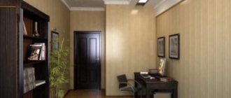
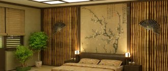
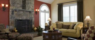
Many owners of apartments and country houses prefer to use paints when decorating their premises. With the help of decorative techniques it is possible to achieve excellent results. By looking at the photo of wall painting, the consumer can find the most suitable option for the room.
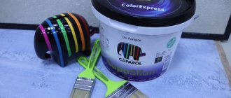
There is a huge selection of colors on sale. Modern paints do not emit harmful fumes; the work is easy to do yourself. It is necessary to carefully prepare the surface before applying color.
Alkyd paint
The material is resistant to mechanical damage and is not afraid of moisture. It is popular among consumers.
To obtain the dye, manufacturers use alkyd varnishes, solvents and fillers. The required pigment is added to the composition. The manufacturer also introduces additives into some types of colors that protect the resulting layer from fungus and mold.
Fashionable colors for 2021 and the first half of 2019
To choose the right range of shades, you can use the trend of 2021, which remains in trend in the first half of 2019.
- Rose Quartz. Otherwise – rose quartz. This color emphasizes nobility and allows you to tune in to a calm mood. Being universal for all rooms, it is diluted with purple or pearlescent shades.
- Greenery. Light green color, which is quite a popular solution. It can become a real decoration of any interior; it can be combined with many tones, but it gravitates more towards natural ones.
- Iced Coffee. Iced coffee is perfect for modern (high-tech) and classic interior styles. Gives a feeling of comfort and style. Diluted with peach dye.
- Hazelnut. A universal color that will fit perfectly into any space and become an indispensable companion for all shades. To enhance the effect, you can use orange or pink accents in the interior.
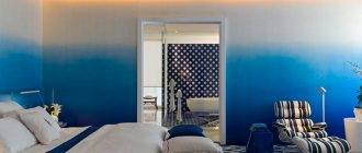
- Serenity. Blue-lilac color is back in trend. Blue is the main color and gives depth to the room, while lilac gives expressiveness. Combine with rose quartz or peach shade.
- Flame. Orange-red color, reminiscent of flames, is an option for strong and confident people who are constantly on the move. Suitable for placing accents, combined with moderate shades.
- Peach Echo. The soft peach color remains an elegant solution for a sophisticated interior, the furniture of which has been selected with special taste. This wall painting is complemented by dark accents and paintings. It is most successfully used in living rooms, bedrooms and children's rooms.
Emulsion paints
There is no unpleasant odor when working with the composition; other types of materials can be applied to the resulting surface. Emulsion paints are a homogeneous composition of antiseptic, thickener, fillers and latex. This dispersion, after drying, forms a durable, uniform coating.
Acrylic color is used for painting walls in apartments in rooms with low humidity. Does not change color when exposed to sunlight. The latex type is abrasion resistant and will hide small surface cracks. It can be used for painting wallpaper and plaster.
The water-based composition has the following features: there is practically no smell when painting, and it dries quickly. Silicone paint is flexible and can be used on any surface.
The most popular combinations and their impact on the interior
We bring to your attention a compact table that not only reflects the most popular combinations of two colors for rooms of any type, but also describes in detail the impact they have on the interior.
| Combination | Influence on the interior | Design style |
| Red - gold | creates a bright festive atmosphere | Classic, modern |
| Green - olive | tends towards a calm effect, brings peace and relaxation to the perception | Classic, eco-style |
| Red White | emphasizes the contrasts in the room, participates in the creation of an extraordinary and colorful interior | Loft, minimalism, modern, contemporary |
| Gray - purple | enlivens the visual appearance of the room, emphasizes the active outlook on the life of its owners | Loft, modern, hi-tech |
| Brown - olive | creates a cozy homely mood, makes the room warmer | Classic, modern |
| Beige - brown | an effective and versatile tool for emphasizing calm accents and overall harmonization of living space | Provence, shabby chic, classic |
| Red Black | Characteristic stimulating effect, recommended only for large rooms | Modern, avant-garde, loft |
| Blue - beige | The ideal balance between cheerfulness and tranquility, the necessary accents can be highlighted by lighting and furniture arrangement | Modern, classic, contemporary |
| Green - red | When properly designed, it emphasizes volume and creates a balanced mood at any time of the day. | Classic, avant-garde, contemporary, high-tech |
Textured paint
When decorating interiors, you can create a relief surface on the walls. To do this, use textured paint, which will help add original elements to the design of the room. The viscosity of the composition allows you to maintain the resulting relief.
Textured paint is produced on the basis of acrylic and polymer components. It includes components that, during the application process, form a relief surface.
This paint will mask minor surface defects and can be washed. It differs in thickness, so it is applied with a spatula, roller, or brush.
Perception of color palette
Any professional designer knows that every color on an unconscious level affects emotional perception. A person may feel constantly tired or irritated and blame it on everyday circumstances, although the reason is the wrong color of paint.
It is advisable to take into account the following features of different shades:
- Red. Has a stimulating effect. In small quantities it can stimulate positive processes, but in excess it causes aggression and irritability. Constant contact with this shade leads to fatigue and psychological devastation.
- White. A universal color that can make a space more spacious and relieve a sense of tension, but in large quantities it will have the opposite effect. In addition, it evokes associations with medical institutions.
- Yellow. A small amount of this color gives confidence and creates a cozy atmosphere, but too much creates an anxious mood and creates mistrust. Orange has a similar effect.
- Blue. Promotes peace. The predominance of this shade does not have such a detrimental effect, but it can interfere with getting into a working mood.
- Green. Creates associations with trees and vegetation. Gives strength, invigorates and helps you focus on the task at hand.
- Black. The color of rigor and tact is responsible for maintaining solidity, but excess leads to depression.
To avoid making a mistake in your choice, you should follow simple rules:
- Everything is good in moderation. This postulate is valid for any palette of colors.
- Natural shades are the most correct. You can mix colors as much as you like and get amazing combinations, but everything you need already exists in nature.
- There are a great many professional craftsmen and designers, but everyone has their own idea, so their advice should only be of an auxiliary nature.
When combining different paints, a preliminary compatibility assessment is carried out. To do this, you can be guided by individual perception or use special color tables.
Preparing the walls
One of the main stages of work is surface treatment before applying the coloring composition. Before this, the previous coating must be removed and wall defects will be erased. Then you should clean the surface from dust.
Many people, before purchasing a color scheme, are interested in the question of how to prepare walls for painting. Puttying the walls will be a mandatory operation. It consists of two stages.
First, starting putty is applied to a special mesh. After drying, it needs to be rubbed. Then the finishing putty is applied.
Then the surfaces are primed. It is necessary to fill defects and strengthen the adhesion of the composition to the wall. After applying the primer, you should wait for it to dry completely.
The influence of shade on the visual size of a room
Each shade affects not only psychological perception, but also visual one. The right color for wall surfaces can expand or narrow a room.
Coloring principles:
- It is better to decorate small rooms in calm, light colors, thereby enhancing artificial lighting and visually expanding the area.
- To make high ceilings appear lower, you can paint the walls in pastel colors and the ceiling itself in darker colors. This combination will increase the overall space.
- Desaturated green and blue visually expand the room.
- Relief moldings painted in the same color will help to enlarge the wall.
- If the room area is small, you should abandon provocative solutions and a combination of many tones. This completely eliminates the feeling of space due to the inability to concentrate. Also, artistic painting, especially with large elements, would not be the best solution.
- To make large rooms smaller, orange and red shades are used, and to emphasize their status, deep gray and dark shades are used.
On a note! Since it is impossible to perceive all combinations, it is worth resorting to the use of special graphic programs. Color modeling in them is not always completely reliable, but it allows you to catch a good combination or reject a bad one.
Combination of wall painting with other materials
To create a modern interior, designers suggest using several types of wall decoration. Wallpaper and paint are often used to decorate one room. The emphasis is on vertical surfaces. Wallpaper is glued to the ceiling.
Insulators ShF-20G- Production of plastic for finishing
How and how to caulk a timber house with your own hands: materials and step-by-step instructions
One wall is distinguished from the others by purchasing photo wallpaper for it. You can apply paint to the plaster, which will create an original relief.
For a country house, you can use wood in combination with plain wall painting. In the living room or kitchen, stone or brick is used for decoration. The remaining walls are covered with a painting composition.
What design styles use painted walls?
Painted walls are used in almost all design styles. They look especially harmonious in the following interiors:
- Scandinavian;
- Loft;
- Provence;
- Eco;
- Minimalism;
- High tech;
- Classical;
- Country.
In each of these interiors, a combination of painted walls and other cladding material is possible.
Painted walls are used in almost all design styles.
How to paint walls yourself
To get a beautiful design, property owners turn to specialists. The price for painting walls can be different, it depends on the type of coating applied and the amount of work.
You can cover the walls with the composition yourself. First of all, select a dye and carefully study the instructions, since each type has its own characteristics.
Painting walls with your own hands begins with preparing the surfaces. Putty should be applied to remove unevenness and minor defects.
Then the walls are sanded, dusted and primed. Several layers of the composition are applied to the surface. When painting, follow the manufacturer's recommendations indicated on the packaging.
Fences-blinds: what are they and what are their advantages- Analysis of competitors' prices. Main stages, methods and services
- About the use of injection molded polyamide
Advantages and disadvantages of painted walls
It seems that painted walls are the simplest finishing option. However, they have their own positive and negative features that are worth remembering. The main advantages of painted surfaces are:
- The modern building materials market offers a huge range of paint and varnish coatings for walls, differing in quality characteristics, purpose and shades;
- When the paint dries, it does not emit toxic chemical gases and does not harm human health in any way;
- You can do the painting yourself;
- It is possible to decorate painted surfaces with special patterns or using a special roller with a convex pattern.
Among the disadvantages of painted walls are:
- Before starting work, the master must prepare the walls well;
- The paintwork on the walls highlights differences and other imperfections;
- If fresh painting is planned, the old layer will need to be cleaned off.
It is possible to decorate painted surfaces with special patterns or using a special roller with a convex pattern.
Photo of wall painting
Mistakes when choosing a color palette for walls
Mistakes when choosing paint colors that cause psychological discomfort:
- The period of illumination is not taken into account. At different times of the day, natural light can change, so the presence of artificial light sources is of great importance.
- The overall perception is influenced by all the details, and especially the furniture: a sofa, armchairs, tables, cabinets should match the main tone or contrast.
- Feng Shui takes into account the combination of colors, because the practice is based on the endless movement of space. A bad solution would be to use yellow and green, red and black, yellow and blue in the same room.
But most problems arise from the fear of making mistakes. You cannot please everyone or adapt to every opinion and recommendation; it is individuality that creates harmony. An example is the conditional ban on painting small rooms dark: if you choose a certain shade, the result can be stunning.