- 1 - RAL Yellow tones
- 2 - RAL orange tones
- 3 - RAL red tones
- 4 – RAL violet tones
- 5 - RAL blue tones
- 6 - RAL green tones
- 7 - RAL gray tones
- 8 - RAL brown tones
- 9 — RAL white and black tones, metallic
- F9 – RAL camouflage color
- PRINTECH - coating with a wood pattern
- PRINTECH - coating with a stone and brick pattern
- NCS
- Antique (copper, bronze, silver, gold, blue, cherry)
RAL color catalog
There are 213 colors in the RAL CLASSIC palette. The color name in the table consists of a four-digit number of the form “#xxx” with the prefix “RAL” (“RAL 8017”, “RAL 5021”). The first digit is the series:
- 1xxx - yellow - 30 shades;
- 2xxx - orange - 13 shades;
- 3xxx - red - 25 shades;
- 4xxx - purple - 12 shades;
- 5xxx - blue - 25 shades;
- 6xxx - green - 36 shades;
- 7xxx - gray - 38 shades;
- 8xxx - brown - 20 shades;
- 9xxx - light, dark and metallic - 14 shades.
Special RAL groups:
- Pearlescent - 15 colors - 1035, 1036, 2013, 3032, 3033, 4011, 4012, 5025, 5026, 6035, 6036, 7048, 8029, 9022 and 9023.
- Luminescent (fluorescent) - 15 colors - 1026, 2005, 2007, 3024 and 3026.
- Metallic – 2 colors – 9006 and 9007.
The Russian-language name for the shade (“chocolate brown” for RAL 8017) is unofficial and is indicated for convenience; to indicate the color, just remember the numbers.
What is the difference between RAL CLASSIC and RAL DESIGN tables?
The DESIGN palette contains 1625 colors, CLASSIC – 213. Color code DESIGN – 4 characters, CLASSIC – 7 characters.
Shades of peach
There are many shades. The simplest classification of five basic shades.
- The most intense is peachy-orange.
- The shrimp shade gives a delicate pink color with an internal shine.
- Peachy pink – warmer, light fresh than the previous one.
- Light peach is a soft pastel tone.
- The “hottest” is peachy yellow.
Harmony with white and brown
What does Pantone say about burgundy?
Panton is a reputable global company in the field of color. Over its 60-year history, it has developed 6 color libraries applicable in a wide variety of areas. According to the textile library, there are several burgundy shades: cardinal red, Pompeii red, chili pepper, Rio red, American beauty, Tibetan red, Marsala and many others.
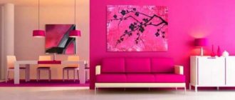
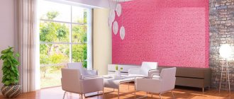
Using peach color in various rooms
It provides great possibilities for decoration, with different functionality. You can choose walls of this color, furniture, curtains, pillows.
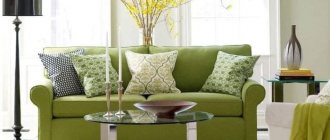
Living room
Living room
Peach color makes her soft, friendly, hospitable. Guests will feel comfortable and relaxed in such a living room. Peach-colored walls, white furniture, and a beige carpet will give the room elegance and some luxury.
Shrimp-colored upholstered furniture looks good with gray-greenish walls. The living room in this case looks restrained, a little strict. To add liveliness to the living room, you should add bright colors to the interior through paintings and vases.
Bedroom
Designed for relaxation, bright colors in its interior should not be overused. A combination with beige, chocolate, and white is ideal for the bedroom. The combination of a shrimp tone, with peach-orange curtains, white pillows, and bedspreads looks good.
Bedroom
If the walls and curtains are peach shades, they should differ in tone - be a little lighter or darker.
The walls and ceiling should be plain light beige, dark beige, with bed linen, bedspreads, tablecloths, and pillows in different peach tones.
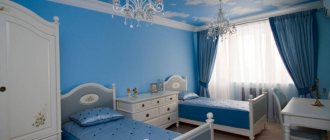
Children's room
Children's
Most children are characterized by increased excitability. Every parent knows how difficult it is to put a child to sleep. Therefore, soft, soothing peach has its place in the nursery. The color of the room depends on who it is intended for. For girls, it is better to choose a peach-pink-lilac color. For a boy, the walls can be kept in peach color, the rest of the items should contain brown and light green tones.
In both cases, it doesn't hurt to add white.
Kitchen
Kitchen
Peach – stimulates the appetite, causes subconscious associations with ripe juicy fruits. You can decorate your kitchen in peach tones (walls of one shade, furniture of another, etc.). A table and chairs of a different color, light brown, diversify the kitchen interior. It's nice to add green and orange.
Colors and human psychology
Constantly surrounding us, color affects our perception of reality. Different tones and shades correlate with emotional states and can affect a person’s performance and mood. The impact of color extends primarily to the senses and, to a lesser extent, to the intellect.
Scientists have found that there is a correlation between colors and their interpretation. It is expressed in typical subconscious associations that are characteristic of most people in the same social context.
The interpretation of color tones is culturally heterogeneous. But there is something in common:
- Black color is most often associated with power, mystery, anger, style.
- Blue represents the universe. It is associated with safety, calming effects, physical and psychological relaxation.
- Green gravitates towards the symbolism of peace, salvation, harmony and love. It is seen as the color of life and growth. Calms and relaxes.
- Red gives rise to the idea of activity, confidence, passion. This is an exciting, stimulating color. However, in extreme terms it is symbolically associated with fire and war.
- Yellow is the color of the sun, the divine incarnation. Joyful and soaring, a manifestation of movement, optimism, expressiveness.
- Purple is associated with wisdom and maturity. Promotes inspiration and compassion. At the same time, it is characterized as mysterious, associated with great ideas and intuition.
Black color is associated with style.
Rules for choosing colors for brown-haired women
Brown-haired girls have beautiful and shiny brown hair of different color tones, an even tone of dark skin. When choosing hair dye, they only need to correctly emphasize their natural beauty.
Colors of hair dyes (photos of shades are placed on the palette of each dye) and several recommendations for brown-haired women:
- You should choose any of the shades of brown.
- Blue reflections in black and purple tones will certainly look advantageous.
- It is not recommended to lighten the hair of natural brown-haired women or dye it in dark copper tones.
Basic colors for mixing
Peach color is light, joyful, pink and creamy, having many shades. If you look closely at a real peach, you can distinguish many shades; an artist’s eye will examine more than three dozen names. The red, almost scarlet sun-warmed barrel smoothly turns into a touching pink flesh, gradually smoothing out and becoming light yellow. A riot of color on one small fruit! And they are all tasty, warm, bearing associative connections with the time of year, abundance, childhood, carelessness, joy.
A riot of color on one small fruit!
I want to bring these emotions into my home: use it for the walls of the kitchen, place it in the bedroom, hide it in the folds of curtains, scatter it generously throughout the interior of the whole house. Modern design uses the entire palette in the tones of nature; this is combined in a subject interior with the philosophy of an urban home.
Upon closer inspection, there can be many shades of peach. A simple way to select wall paint is to choose ready-made paint in the store that includes the word “peach” . You can see what shades are available by looking at the range, a special color palette. RAL is available in every paint department of a hardware store, and once you have decided on the shade, you purchase the required number of liters of paint. There you can also understand which color harmoniously combines with the shade you have chosen.
Related article: Pistachio color: how to get the right shade
The simple path is not always suitable; for those who want to get a specific shade, you will have to make an effort. Designing your home is worth the effort. Basic colors for mixing colors in peach shades: red, yellow, white, brown, green - depends on what color of peach you want to get. After all, there is a light peach, slightly unripe peach, a pink peach, the color of a ripe peach, as this is combined in nature.
There are many shades. There is a light peach, slightly unripe peach, pink peach, the color of a ripe peach!
Ammonia-free paints made from natural ingredients
The use of ammonia-free dyes ensures gentle and gentle coloring of curls. Ammonia-free painting has many benefits. But this option is not suitable for everyone and not in all cases. Since ammonia-free paints are not the most durable and do not have the most intense coloring properties.
Ammonia-free paints are the ideal choice for maintaining an even, rich base color and for adding drama to natural looks.
Among ammonia-free dyes, the following should be highlighted:
- Ollin - ammonia-free series contains D-panthenol and natural oils, thanks to which the hair remains healthy and silky. A high concentration of pigment provides high-quality coloring of curls along the entire length, and is also effective in the presence of gray hair. A rich palette of blonde, ash and golden shades and many others.
- Kapus – the brand has an ammonia-free Non Ammonia series. Useful components and a vitamin complex moisturize and protect hair during the coloring process. A varied palette will satisfy any request from light brown, copper and dark chestnut shades.
- Londa - brand tinting dyes have a wide selection of 42 colors. Special microspheres reflecting light provide radiant shine to the strands. A great option to add depth to natural shades of chocolate, red and platinum white hair.
- Cies – permanent paint with activator oil promotes uniform and safe coloring. Prevents allergic reactions and skin irritations, has no side effects. The Oleo Intense ammonia-free palette contains basic natural shades.
- Faberlic - ammonia-free series is suitable for coloring all hair types, does not irritate delicate skin, and maintains the elasticity of the hair structure. It has a lamination effect using natural components contained in the paint. The palette provides a wide selection of natural and bright colors.
What affects the final hair color
An important stage in the modern field of hair care is professional diagnostics of the condition of curls. During the procedure, the structure of the hair is assessed, the initial shade along the entire length of the curls is determined, and further actions are planned that will ensure the most ideal hair color.
Among the factors that can affect the final hair color after dyeing are:
- Base hair color - determination of the natural and previously dyed original shade along the entire length of the curls.
- Number of gray hairs - it is important to assess the percentage of gray hair, the type of distribution on the surface of the head and the thickness of gray hair.
- Depth of tone – the desired depth in a darker or lighter tone after painting is taken into account.
- Final tone - depending on whether the initial hair color is warm or cold, a decision is made on preliminary procedures before dyeing. Options for using mixtons are being considered.
- The amount of oxidizing agent - the required concentration is selected based on the color base of the hair and the condition of its structure.
- Remains of unwashed pigment on previously dyed hair - the uniformity of tone from roots to ends, the degree of difference in tone levels along the entire length of the hair are assessed. It is also important to find out whether additional procedures were used to maintain the color of the curls.
The most effective for covering gray hair
Gray hair dye must contain persistent dyes; gentle dyes are not the best option. It is worth paying attention to the percentage of gray hair coverage that is written on the packaging - at least 60%.
Well-proven paints for gray hair (photos with examples of colors are on the palette for each paint):
- Next is a German development, created specifically for long-lasting coloring. The caring components of the paint effectively hide gray hair, and the widest palette of 160 colors can satisfy the most sophisticated tastes.
- Indola is a permanent dye based on pixel light technologies that guarantee absolute coverage of gray hair. Color scheme with bright colors and brilliant tints. The shades of the special series for gray hair are successfully combined with the tones from the main palette.
- Kutrin – Finnish paint, based on natural ingredients, ensures uniform coloring and preservation of the natural shade after the procedure. The use of new technologies in creating dyes helps to densely cover gray hair with pigment.
- Revlon is a well-known brand that uses modern developments in nano and molecular technologies. The complex of vitamins in the composition has a healing effect on curls during coloring. Suitable for sensitive skin. The palette includes 35 spectacular shades.
- Chi (CHI) is an American brand from the ammonia-free series, based on ionic action. The palette is rich in natural shades of copper and ash colors. The uniqueness of the dye lies in the action of waves of the long infrared spectrum, capable of lifting scales on the surface of the hair and placing pigment in them.
Combination with other colors
Peach goes equally well with cold and warm tones. Traditional combinations with brown, beige, café au lait, white, terracotta, and green are common.
A brown wooden set looks good with peach-painted walls. They emphasize the natural texture of wood. If you add green, you will get the impression of a blooming garden, where juicy fruits hang on brown branches, surrounded by green leaves.
The combination with beige is common. These are related colors, they merge. You should choose shades that contrast with each other. If one is pale, the second should be rich.
Designers use the combination with the “coffee with milk” shade in kitchens and dining rooms. It increases appetite and puts you in a good-natured mood and friendly table conversation.
Peaches look good on a white background. It highlights the beauty of these delicate fruits. The harmony of colors gives the room lightness, airiness, and spontaneity. Associated with young age. This color combination is good for decorating children's rooms and teenage girls' rooms. Brown is added as a third shade. It gives earthly strength and reliability to the interior.
Combination with terracotta
Terracotta color gets its name from ceramics made from colored clay. Looks like a brownish shade of red. Doesn't go well with other rich tones. It goes well with peach. Terracotta prevents peach from getting lost among other tones and emphasizes its originality. This allows you to fill the interior with colors from an “unrelated” palette, turquoise, graphite.
Harmonious palette of peach, green and white
Pairs well with green. For a rich peach, a light green addition is better, with a lighter tone - a marsh or olive shade.
In addition to traditional combinations, a combination with blue, gray, red, purple, light blue, and black is not excluded. How original and successful they turn out depends on the designer. If he does not have experience, the interior will turn out to be clumsy, flashy, falling apart into colorful pieces.
The best inexpensive paints for home use
Choosing the best paint for home use takes into account important factors. The paint should be easy to use, with a clear palette of colors and clear instructions. The ideal option for painting a house is high-quality paint with a harmless composition, high durability and an affordable price.
Rating of paints suitable for home use:
- Wellaton – paint of a well-known brand, in the production of which advanced technologies and natural ingredients are used. The paint is available in two formats: cream paint and mousse paint. The color palette is rich in bright colors and a large selection of natural tones: brown, light brown and red shades.
- Excellence Creme from L'Oreal - a distinctive feature is gentle coloring and increased hair care. The box with the dye contains a set of special serums, masks and balms that protect curls from damage, deeply nourish the hair and improve its structure. The choice of color is carried out using a convenient palette of 21 shades, most of which are light tones. There are also light brown, chestnut tones and one black shade.
- Studio Essem Hair is a budget line with decent quality and high color fastness. Coloring compositions for home use are available in three series: Studio 3D lightening, Holography and Mixing colors. The brightening series does not require preliminary lightening procedures, the holographic series has reflective properties, and the mix of tones allows you to emphasize the main colors or experiment by mixing different shades.
- Palette is a brand from Schwarzkopf. It occupies a leading position as a durable paint with gentle coloring of professional quality. There is a division of the paint palette into classes, in accordance with durability parameters: washable after 6-8 procedures, after 25-28 hair washing procedures, and a wide series with a high degree of durability of dyes.
- Сoncept – uniform coloring in a variety of natural and bright shades. Production is carried out in accordance with European quality standards. A good composition is rich in pigments and does not damage the hair. The palette consists of 40 colors for every taste.
Don't miss the most popular article in the section: Fashionable bob haircut for short hair. Photo, front and back views.