For those who have already gotten rid of stereotypes about the color pink and allow it to be used for the interior of their home, it should be taken into account that its palette includes more shades than it seems. Such dissimilar appearances as tea rose and fuchsia, bubblegum and salmon, cyclamen and pink-peach, can not only not be combined with each other, but also show their own individual character. Pink color is used in the interior of absolutely any room to make it not only fashionable, but to add comfort and tenderness or energy and positivity. Having chosen the mood that you expect to get in the end, with the help of this color you can experience everything when you open the door to the room: plunge into the aura of light pastel or into the glamorous world of hot pink.
The most famous combination
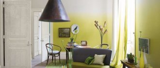
The combination with gray in interior design has become a classic of the genre, breaking stereotypes and revealing itself with unexpected elegance. The secret of popularity is versatility:
- suitable for many interior styles;
- a perfect fusion of masculine and feminine: the design is suitable for married couples.
- Applicable to all rooms, from the kitchen to the family bedroom.
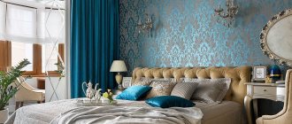
Gray is valued for its achromatic nature, its ability to emphasize neighboring colors; any shade of pink can be combined with it. Combination allows you to give the room character, and depending on the intensity - cheerful and cheerful notes. The use of velvety, silky textures with mirror surfaces makes the room luxurious. Adding silver, for example, to metal bathroom fittings, allows you to sparkle with new colors against a gray background. Even when made with the simplest, budget materials, the gray-pink interior looks stylish and expensive.
One of the bold, successful experiments can be considered painting the wall with gray, and the opposite wall with bright fuchsia or another shocking pink, complementing the design with white, black, and blueberry. A duet of calm shades - it is better to adhere to conciseness in the introduction of details and other colors. Light accents: white, cream, light olive, light green, pale blue are suitable. Furniture of complex shapes and unique decorative items will never let the eye get bored in a gray-pink room.
Dye
Pink wall paint will allow you to decorate your room beautifully. It is advisable to choose a water-dispersed type. The advantages of this paint include:
- formation of a matte film;
- dries in a few hours;
- no odor;
- there are moisture-resistant paints;
- tinting;
- durability;
- possibility of repainting.
But the walls will need to be carefully prepared. Even small imperfections will be visible. According to reviews, this is a great way to decorate any room.
Alternative combinations
Pink, gaining popularity, has allowed designers to introduce many stylistic solutions based on contrast or harmony. The most successful combinations with colors began to be considered:
- Cream. One of the most popular is not accidental - special tenderness and elegance are achieved when using smoky pink, powdery in combination with all light beige. Option: only pink walls, the rest is decorated in cream.
- White. It will enhance the brightness of bold shades and add airiness to pastel pink tones, giving the room a somewhat “marshmallow” look.
- Green. Eliminates excessive frivolity, adds freshness, and lifts the mood. Ideal for the dining area and living room. Delicate, pastel shades of both color partners with snow-white splashes will create a bright, cozy atmosphere.
- Brown. Shades of chocolate and coffee are appropriate for the living room, highlighting furnishings and pink accessories. Beige, cream, sky blue, soft green help to support the play of opposites.
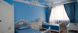
- Yellow. Light, clean - ideal for decorating a nursery or bedroom. Only pastel colors can make the interior soft and relaxing. Bright options will bring expression, for example, to pop art in the living room.
- Lilac. Will give tenderness and romance in the case of pastel colors; mystery and awe, if closer to purple.
Designers advise caution when independently combining with the following colors:
- Red. Even a large amount of white will not save the situation in case of incorrectly selected shades.
- Blue. A fresh combination with bright shades, such as turquoise, is creative. But the final result of the design may cause confusion, unless it is a nursery for a boy and a girl.
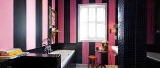
- Black. A dangerous neighborhood for decorating a room. It is important to strictly observe the proportions, otherwise a rather daring idea will turn, for example, a bedroom into a crypt for Barbie. Adding white fragments and dark wood helps to avoid vulgarity.
- Orange. The combination is common in oriental styles, but combining these similar shades of the palette threatens to create a merging effect and an unclear final result.
- Blue. The tandem looks cold and gloomy; choosing harmonious combinations is quite problematic.
Matching Styles
Pink color in all its various manifestations and perfectly adjusted quantities will be appropriate in almost all styles. Sympathetic to this color: its presence is most characteristic:
- Ethno: Arabic, Moroccan, Indian. Pink is presented from a completely different perspective: no candy sweetness, femininity, or cloying. Only the sultriness and passion of ethnic motifs, and the brightness will appeal to many men.
- Classic. Pink-peach, salmon shades are used, which are very harmoniously combined with gilding and light surfaces, characteristic of the classics.
- Baroque. If you gravitate toward luxury and pomp, then excess will not be inappropriate in this style.
- Pop Art. This is a real surge of emotions, and what can stun you more than the active use of pink, emphasized by an unusual, bold design.
- Glamor. A beautiful style that can become elegant, especially with light, cool shades and a reasonable amount of detail.
- Shabby chic. An amazing style created by a woman for women, where one of the main colors of the palette used is pink - delicate, airy, candy-like.
Design features: general rules
The most important thing is to stop in time. In pursuit of the sensuality and tenderness that pink can give, it is easy to get carried away and give the room, especially a small, trashy and comical look. Fuchsia and other flashy colors are especially dangerous: when decorating, the requirements for form and content are too high. A win-win option: a small area of the entire room or use in decorative items is optimal.
Modern decoration does not imply totality: there are many other colors in the world that go well with it. Another not very successful manifestation of “total pink”: banal pink roses, only if it is not a delicate vintage or modest Provence. A large number of details will not save you from the monotony of the interior, even in the company of white, if one shade is used, otherwise it should be very light.
Cunning is manifested in an attempt to combine shades of warm and cold colors: the polar ones will strongly conflict. It is better to use one version of pink, but base the design on intensity: the lightest for wall surfaces, the more saturated for large accessories, the darkest and thickest for small details. Pink shows itself amazingly on textured materials - velvet, velor.
When decorating any room, you should focus on lighting: daylight and artificial (especially cold) have different effects on many shades of pink and can not show it in the best light.
Decorative rock
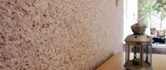
You also need to choose the material that will be used to decorate the pink walls. Decorative stone is often used, which is called tiles made from natural stone or other materials, for example, gypsum or plastic concrete. Artificial stone is almost no different in appearance from natural stone.
In the interior, the material looks impressive. Plus, it suits a variety of styles. Decorative stone is rarely used as a base stone; it is combined with wallpaper and plasters.
The advantages of the material include:
- high strength;
- practicality;
- easy installation.
Tile adhesive is required for cladding. During installation, uniform joints and leveling of the tiles are not required. Therefore, the work is quite accessible for beginners.
Main room
Shades of pink are perceived differently by different people, so to definitely please a man, use one that won’t turn the main room of the house into a girl’s bedroom. Alternative shades that can please even the most demanding: tea rose, pink-peach, salmon. To avoid fatigue, designers recommend using the following options for the living room:
- muted tones;
- dilution by others;
- only accents.
As for dosed, proportional use, room decorators offer the golden rule: 6:3:1. It is possible to get the perfect interior if you give pink the last place in this scheme, add white, and the main part will belong to the classic colors used for the living room:
- beige;
- chocolate;
- green;
- blue.
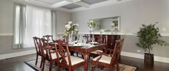
The interior of the living room usually involves a large amount of wood: the floor, decorative panels on the walls, beams on the ceiling, furniture. Pastel shades harmonize wonderfully with all this natural splendor. You just need to take into account that a particularly fashionable combination of gray and pink for the living room does not involve honey, brown tones of wood, but white ash and milky oak varieties.
Pink shows itself amazingly on textured materials - velvet, velor. Therefore, a great option for those in doubt is to try introducing it into the interior through a sofa cover and accessories. In case of negative experience, it is easy to replace without making new repairs.
Recommendations
If pink walls are chosen, then it is important to decide what shade is needed. Each tone has its own characteristics, which you should learn about in advance in order to create a harmonious interior. To create a relaxation area, you need light shades like nude or beige. And bright colors charge with energy.
You also need to choose furniture to match. Since it usually takes up a lot of space, these large color zones must be combined with each other. It is advisable to harmonize walls of delicate shades with pink furniture. Sofas and armchairs in light colors - beige, flesh, gray - also look great against a pink background. According to reviews, wood is perfect for this interior.
Housewife's dream
Pink tones have become increasingly used for the kitchen-dining room. Perhaps associations with cakes and candies played an important role, or perhaps the fact that the kitchen, as a rule, is a feminine kingdom. Rooms with different emotional colors are created:
- Bright pink - the ability to increase appetite;
- Smoky pink, pastel - a recreation of peace, spiritual gatherings.
The latest design solutions are a throwback to the past: increasingly, kitchens are made in retro and vintage styles. All kinds of light pink shades are offered by manufacturers of household appliances that can harmoniously fit into this style.
For modern kitchen style - cyclamen, fuchsia and other shocking pink variations. If you want to soften the effect, replace white with cream, milky.
Non-standard shades are protected by the fact of visually increasing space. The quantity can be dosed using standard application schemes:
- background - walls;
- tabletop, apron;
- cabinet fronts;
- textiles, accessories, kitchen gadgets.
Plastic panels
This is also a popular material, suitable for home and apartment. The panels are moisture-resistant, durable, and are chosen for corridors, kitchens, and bathrooms. They are able to imitate different materials:
- tree;
- tiles;
- marble.
Therefore, panels are chosen for different interiors. They do not require rough finishing of the walls; they are easy to install. The material is also quite easy to clean. This is a budget option for updating a room.
To install panels without rough finishing, a frame is required. It can be done in the same way as for drywall. The main thing is that the profiles are placed across the panels. Often the frame is made of wooden slats. But this does not change the principle of its design.
Pink dreams
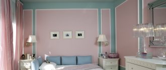
A bedroom in which the main color is pink is very bold and unusual, but in order for a man to live in one, several conditions must be met:
- Use pink-peach, any ash-pastel shades.
- Pair with dark chocolate. It is even possible to use pink wallpaper: furniture and decoration will give the room stability and some brutality.
- Maintain moderation in decorative elements.
With the help of pink it is possible to make the bedroom ideal, the way you personally see it. If you want an active morning, use white color with its tonic effect as a companion. Acceptable for pastoral and modern styles. The combination of powdery shades with delicate greenery and olive will add naturalness, freshness, and comfort. Adding blue and white shades at the same time will make the room look more spacious. This is relevant if the bedroom, in addition to a relaxation area, provides additional functionality, such as a work area. Light and space will be brought by accent colors of pillows, bedspreads, curtains:
- turquoise;
- light green;
- light emerald.
If the bedroom is constantly flooded with light (windows to the southeast), the “cooling” function will be taken over by purple-pink and other cool shades of purple-pink design. The opposite desire - to give more warmth, is possible with the addition of a golden color. Option: bedroom interior with pink wallpaper and golden textiles - pillows, ottoman upholstery, headboards.
Decorative plaster
You can make the walls pink using decorative plaster. Previously, it was a facade material, but now it is used to decorate the interior space. Common types include:
- Marble chips. It is glued together with adhesive components.
- Venetian plaster. This is a glossy finish that is quite difficult to work with.
- Textured plaster. Presented in the form of an elastic coating that can be given any texture.
This material is easy to apply. It can be chosen for surfaces of complex shapes. The coating will hide small unevenness in the wall. Plaster is suitable for different rooms, as it does not deteriorate from moisture and temperature changes.
Verdict on pink
Undoubtedly, some will associate pink with femininity and frivolity, but there will be those who will see real comfort and warmth in these interiors. After all, even opponents of this color cannot deny that it helps get rid of negativity and improves mood, as color therapists attest.
It is even more difficult to dispute that this season pink color in the interior of rooms is still in trend. The option in the top ten was “pink yarrow”, which, among such a huge variety of flowers, is a serious bid for further success. Among fashion designs, not only interiors, there is an increasingly visible trend: it is becoming a universal color, changing color boundaries in gender components. This is confirmed by samples of interior solutions for common areas: living room, dining room. What do you personally think about pink? Are you ready to give him a chance?
Liquid wallpaper
This is a liquid material similar to decorative plaster. The composition of such wallpapers is different. Typically they consist of:
- cotton and silk fibers;
- cellulose;
- acrylic dispersion;
- dyes;
- plasticizers.
Due to the presence of silk and other fibers, this coating, after drying, is similar to fabric wallpaper. Their advantages are the same as those of decorative plaster. But liquid wallpaper deteriorates from moisture, but it can be reused. In this situation, they are soaked and removed from the surface of the walls. To make the wallpaper moisture resistant, they are coated with varnish. The only disadvantages include the high price.