Despite the abundance of available wall finishing materials, painting still remains relevant. Still, accessibility and simplicity of design are not an empty phrase for most owners. However, one should not think that this is where all the benefits of paint end. In fact, it is one of the most effective and expressive ways to give your interior a memorable personality. At your disposal are all the colors of the rainbow and countless shades that can create the necessary mood and atmosphere in your apartment or house. Meanwhile, very often the walls in an apartment are painted in two colors. And today you will find out why this is not a desire to complicate the color scheme of the room, but a deliberate move to create a catchy and remarkable design. Photos with popular ideas will come in handy.
- Benefits of use;
- What you need to consider when choosing paint;
- Features of using contrasting pairs;
- 6 options for using two colors in painting;
- The most popular combinations and their impact on the interior;
- A selection of photos with the best ideas for your apartment;
- Conclusion.
Benefits of use
First, let’s try to figure out what is hidden behind this undeniably noticeable trend: the indirect influence of dualism, practicality, or convenient integration into any design concept. Let's take a look at the obvious advantages of two-tone painting of walls in an apartment:
- zoning the room
- using this painting method, you can organically divide the room into functional zones, and do this with a minimum of material and time costs; - correction of visual perception
- a skillfully selected combination in a pair can help you visually make the room taller or wider, depending on the specific goal; - the principle of contrast
- without light there is no darkness, and in painting one of the shades serves as a natural complement to the other to create an impressive harmonious design of the walls; - color balance
- some shades seem boring and urgently require addition, so the use of a gradient tone can enliven the interior and emphasize some notable features in the design; - strong expressiveness
- skillful management of color pairs helps to correctly place accents in the design of an apartment using painting, muffle an undesirable effect and, conversely, bring the desired motives to the fore.
Beige color in different rooms
Beige can be used in the design of almost any room, but most often experts advise using it in the living room, kitchen, and bedrooms.
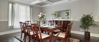
Beige in the living room
Guests are greeted in the living room, so beige will demonstrate the excellent taste of the owner and will encourage intimate conversations. This shade will be no less pleasant for family gatherings or relaxing after work. Typically, beige is used for the living room in country, Provence, classic, and modern styles. The main color combinations for this room are:
- with blue - for lightness, freshness;
- with yellow – to fill with sunlight and warmth;
- with red, burgundy - for elegance, luxury;
- with brown - for nobility;
- with purple - for unusualness, brightness.
In a small room, it is better to use cream walls and sand floors - this will expand the boundaries externally. A dark floor and light walls in combination with light furniture look good. It is better to make the walls plain, and furniture, textiles, and decor - with drawings. Furniture made of rattan, precious wood, stone and metal accessories will fit perfectly into the living room. Textiles used include linen, silk, wool, and heavy fabrics.
Beige in the kitchen
For kitchen decoration, beige is suitable for any part of the decoration: floor, walls, ceiling. The set and furniture can also have any of the shades of beige. Recommendations for creating a kitchen interior:
- strive for the rule: dark below, light above;
- add bright accents - burgundy, red, purple elements in the decoration of the set, dishes, accessories;
- buy lamps with a warm glow, otherwise the beige will have a dirty tint;
- complement the interior with a refrigerator, kettle and other metallic-colored appliances;
- “enrich” a darkened room with orange and yellow decor, and a well-lit room with blue and green details;
- dilute beige with chocolate (in the color of curtains, textiles, paintings).
Beige in the bedroom
The bedroom should be conducive to relaxation, so it is best to decorate the walls with beige light: such decoration will make the room clear and spacious. To avoid depersonalization of color, different shades, textures, and patterns are used. Furniture should contrast with the tone of the walls and floor. For example, a corner for cosmetics, a hobby or a headboard can be made darker using wenge or walnut. As an accent, you should use textiles and accessories in green, orange, and lavender.
What to consider when choosing paint
It seems that choosing a couple of shades you like and fitting them into the interior is a trifling matter that deserves absolutely no attention. However, in reality it turns out that you need to take into account not only your taste preferences in color and the wishes of your loved ones, but also the features of the room. Let's consider the issue of choosing colors when painting walls in more detail.
- the specifics of the layout
directly affect the final result, because what is good for one apartment may seem like a creepy stylistic experiment with an unsuccessful conclusion for another; - features of lighting
- lighting has long stepped beyond the purely practical functional level, declaring its rights to full participation in interior design, and it would be very reckless not to take this fact into account; - purpose of the room
- we mean its basic functionality, which determines the nature of daily use (modern options for wall decoration in the kitchen).
Take a look at the photo where interesting wall painting led to the creation of a beautiful and original design. And if such interiors do not seem lively enough to you, then we advise you to read the article: “Drawings on the walls in the apartment.”
Psychology
Green is the result of mixing yellow and blue. This fact is reflected in his psychology. She is multifaceted.
Green is a reflection of the duality of the world. This is exactly what most psychologists think. Its purpose is to help in comprehending universal wisdom.
Green is the choice of calm and self-confident people. No wonder it is used as a hospital ward.
walls painted accordingly normalize blood pressure and improve the functioning of the cardiovascular system, and also have a beneficial effect on the functioning of the entire body as a whole.
Different tones and halftones of green have different interpretations. So, coniferous symbolizes stability and confidence.
In general, this information is quite interesting and even useful. Especially if one of your loved ones or colleagues has such a color preference.
For example, if a person chooses a color with a predominant shade of sage or moss, it means that he is subconsciously looking for a way to relax and calm down.
And those people who stop at shades of emerald and malachite actually want to become rich.
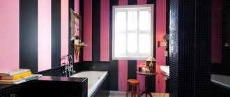
Features of using contrasting pairs
You may not know anything about the nature of the interaction of contrasting pairs of colors in the interior of one room, but you definitely won’t be able to ignore the effect they create. Especially if this effect does not at all correspond to the desired result. Let's highlight four active contrasting pairs of colors:
- black White;
- Red Green;
- orange – blue;
- yellow – violet.
Most often, the first combination of colors is used in the interior, which involuntarily evokes a fairly logical association in people - day and night. It is quite calm due to its spectral characteristics and is widely used in any room.
But the use of all other pairs of colors is limited only by the desire to highlight one of the walls. This emphasis is most often characteristic of modern design styles that boldly break traditions.
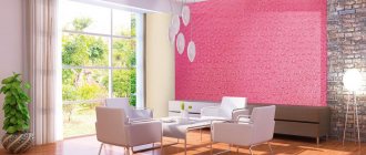
If you do not want to focus attention on any one wall, then it is best not to use such pairs of colors. Except, of course, in those cases where the use is purely contextual. Here is a small selection of photos where the contrasting method of painting walls in an apartment turned out to be successful in the context of the entire design of the room.
Basic shades of yellow
When talking about the color yellow, many people associate it with a chicken, a sunflower or the sun. Of course, in this case, yellow is perceived as a spectrally pure color with all its inherent brightness.
But, in fact, it is more multifaceted and diverse. Its main shades are:
- Sandy yellow.
- Light yellow.
- Straw.
- Bright yellow.
- Orange-yellow.
- Lemon yellow.
- Electric yellow.
The variety of yellow is provided either by lightening the tone by adding white to it, or by mixing in a color, such as green, resulting in a lemon tint.
The most popular combinations and their impact on the interior
We bring to your attention a compact table that not only reflects the most popular combinations of two colors for rooms of any type, but also describes in detail the impact they have on the interior.
| Combination | Influence on the interior | Design style |
| Red - gold | creates a bright festive atmosphere | Classic, modern |
| Green - olive | tends towards a calm effect, brings peace and relaxation to the perception | Classic, eco-style |
| Red White | emphasizes the contrasts in the room, participates in the creation of an extraordinary and colorful interior | Loft, minimalism, modern, contemporary |
| Gray - purple | enlivens the visual appearance of the room, emphasizes the active outlook on the life of its owners | Loft, modern, hi-tech |
| Brown - olive | creates a cozy homely mood, makes the room warmer | Classic, modern |
| Beige - brown | an effective and versatile tool for emphasizing calm accents and overall harmonization of living space | Provence, shabby chic, classic |
| Red Black | Characteristic stimulating effect, recommended only for large rooms | Modern, avant-garde, loft |
| Blue - beige | The ideal balance between cheerfulness and tranquility, the necessary accents can be highlighted by lighting and furniture arrangement | Modern, classic, contemporary |
| Green - red | When properly designed, it emphasizes volume and creates a balanced mood at any time of the day. | Classic, avant-garde, contemporary, high-tech |
Properties of yellow color
The main features that are inherent in yellow are:
Its ability to brighten an interior that has insufficient lighting levels.
Warm yellow shades, which have a rich hue and are formed by mixing orange, visually reduce the space. This must be taken into account if you want to make bright, warm yellow walls.
As opposed to a warm shade, yellow walls in the interior will increase the space, but only if they have a cool shade.
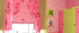
A selection of photos with the best ideas for your apartment
If you are decorating your own space, then this selection of photo designs for painting the walls in your apartment in several colors can greatly help you decide if you still haven’t come to a specific decision about the chosen couple of shades. Of course, the interior context itself influences the perception of examples. However, blindly copying its features is an approach doomed to failure. Your job is to creatively process the information you see, which will lead to the creation of the ideal design for you.
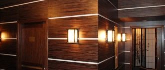
Selection of materials and textures for a beige interior
An excellent companion for beige wallpaper is natural wood, imitation wood and various plant materials. Shades of beige include rattan, bamboo, veneer, cork, as well as less expensive materials, such as laminate. Wood treated with stain looks good.
An interesting design element will be a wall with light decorative plaster, cork and stone inserts. Ideal for interiors in light colors are leather furniture in coffee, cream, milky shades, as well as sand floors with an imitation of wood structure. The right approach to interior design will ensure comfort and visual pleasure from being in the room; it is only important to correctly combine colors and place accents!
Zoning rules using color
You can zone a room through visual design, without large-scale redevelopment and construction. Zoning by changing the color scheme of the walls is a simple and affordable option. It is enough to paint the surface of the walls of the allocated zones in different shades. It is allowed to paste walls with contrasting wallpaper. There is an original and effective division of space.
For a non-professional, choosing the right color palette combinations for a common space is difficult. Knowledge of color and the basics of color combinations is required. But information is available on the Internet.
Isolating contrasting colors on the walls, floor and ceiling allows you to realize an excellent result of the zoning technique. The interior of the room becomes expressive, filled with new colors, and acquires positivity and cheerfulness.
It is allowed to use a combined space zoning scheme. The color design of not only walls, but also furniture, accessories, decorative elements and other things changes. If necessary, additional separation structures in the form of partitions are installed.
Special attention is paid to the lighting system. Its multi-level implementation is expected. It all depends on the area of the room, its architecture and design features, the purpose of the room and the preferences of the owners. The main thing is to create a holistic interior in which every family member will feel comfortable.
Wall color - test painting is required!
The same paint looks different on different surfaces: on smooth it looks lighter, on rough it looks darker, on matte it looks warm, on polished it looks cooler. If you are not completely sure of the chosen color, paint a small fragment of the wall as a test.
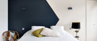
Tired of walls of the same color? Take a contrasting color of paint and paint one wall with it. This simple change will make your interior look summery!
The color of the walls does not have to be a calm background for the interior. It is becoming increasingly fashionable to paint one wall in such a way that it is different from the rest - for example, it would be a contrasting color.
The contrasting technique of painting walls has many advantages. You will give the room a new look, while saving time and money. And if you get tired of the color, you can quickly change it to another.
What style is this color suitable for?
Thanks to the versatility of this tone, it can be used in almost any style.
This is how bright yellow walls fit the style:
- Boho.
- High tech.
- Modern.
- Light yellow walls will suit;
- Classic.
- Swiss chalet.
- Classic English.
- Country.
- Ethno.