Painting walls in two colors: working recommendations
Combined painting requires planning and preparatory work. First of all, you will have to puzzle yourself with the selection of harmoniously combined tones. This is possible only after you decide for yourself what kind of result you want to get:
1. Contrast effect.
2. Ombre effect.
In the first case, you will need bright colors that are noticeably different from each other, possibly diametrically opposite in spectrum. If this is your first time deciding to paint walls with two colors, use a combination of shades that are similar in intensity and color scheme.
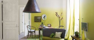
Contrast effect
In the second option, you will need to connect consonant tones that can smoothly replace each other. It would look so good to paint the walls in two neutral colors, say gray and cream. You can choose a combination of pastel colors, combining peach with sand or turquoise with delicate mint.
Ombre painting
You should always take paint with a reserve, since it will be extremely difficult to choose an absolutely identical shade. In fact, this will only become possible if the required tone was given to the composition automatically in a specialized store. If you are going to mix colors for painting walls in two colors yourself, then it is better to have an extra reserve liter of shade than to try to mix it later.
What else you will need to do the job well is masking tape. With its help, you can protect untreated surfaces and even create a pattern.
Painting tape will help you create a design
When painting walls in combination, you need to be prepared for the fact that the color joints will not look like a neat, perfectly straight line. Without experience in painting work and possession of special skills, it will certainly not be possible to achieve an effective result. So you need to be prepared to perform additional corrective finishing work. How to correct the deficiency will be described in detail below.
Preparing walls for painting
Before plastering the walls for painting or gluing the appropriate wallpaper on them, you need to do the following:
- Completely remove any coverings from the walls. This applies to old plaster and wallpaper. The walls should remain “bare”.
- Before painting the walls, the bedroom must be thoroughly cleaned, dried and ventilated. Dust on the walls can form clumps and be visible under the paint layer.
- All unevenness must be smoothed out using plaster.
- Apply 2-3 coats of latex primer to the walls. It will increase adhesion and the paint will adhere better to the walls.
- After each coat of plaster or primer is applied, leave the room to dry for at least a day.
- Before starting work, apply masking tape to the ceiling and floor plinths.
- If you are mixing or tinting paint, dilute enough material to cover the entire desired area. It will be very difficult to get exactly the same color again.
- Apply the paint with a roller from top to bottom, and then horizontally, so that the paint lays more tightly on the wall.
Benefits of use
First, let’s try to figure out what is hidden behind this undeniably noticeable trend: the indirect influence of dualism, practicality, or convenient integration into any design concept. Let's take a look at the obvious advantages of two-tone painting of walls in an apartment:
- zoning of the room
- using this painting method, you can organically divide the room into functional zones, and do this with a minimum of material and time costs; - correction of visual perception
- a skillfully selected combination in a pair can help you visually make the room taller or wider, depending on the specific goal; - the principle of contrast
- without light there is no darkness, and in painting one of the shades serves as a natural complement to the other to create an impressive harmonious design of the walls; - color balance
– some shades seem boring and urgently require addition, so the use of a gradient tone can enliven the interior and highlight some remarkable “features” in the design; - strong expressiveness
- skillful management of color pairs helps to correctly place accents in the design of an apartment using painting, muffle an undesirable effect and, conversely, bring the desired motives to the fore.
Using water-based paint for walls
The most popular painting option is painting the walls with water-based paint. Bedroom design photo ideas. Modern compositions differ in their features:
- Dries quickly - it only takes a couple of hours.
- They are safe and non-toxic.
- There is no strong smell - you can spend the night in the bedroom a couple of hours after work.
- Do not burn or ignite.
- Resistant to ultraviolet rays, do not fade.
Water emulsion is widely used in children's and adult bedrooms and living rooms. It is easy to apply and does not leave streaks. Thanks to the wide color palette, you can choose a shade to suit every taste.
Water-based paint easily hides minor wall defects
Combined wall painting: selection of partner colors
To choose a harmonious pair of shades, it is enough to have a color wheel at hand. When you approach the matter with imagination, you can get the perfect combination of color ensembles that generate impressive effects.
Today it is fashionable to mix black and white paints, cool pastel colors, gray and beige spectrum. If you look at photos of options for painting walls in two colors, you will notice such a trend in decoration as the use of related tones and tint variations from the same spectral range. In the latter case, the shades should be similar in such indicators as saturation, intensity, color temperature and please the eye with a smooth transition.
What is meant? Let's look at a specific example. Green goes well with orange, but it won’t work as a partner to peach when painting walls in two colors. In this combination it is better to replace it with an olive tone.
Harmonious combination of green and olive colors
In general, it is better to select colors using a computer. This way you will be able to more accurately imagine what the color duet will look like in reality and evaluate its relevance.
If the selected shades cannot be found in finished form, they can always be obtained by tinting. In the latter case, you need to order portions of paints for combined painting of walls with a good supply, since the second time it will be extremely difficult to exactly match the tone, and the surfaces will turn out to be unevenly painted.
When painting walls in two colors, consider color compatibility
In addition to the ratio that is pleasing to the eye, when choosing background colors, one must take into account the psychological aspect of their personal interaction and impact on a person. This is worth talking about in more detail.
Some useful tips
There is nothing complicated about painting walls . Why do many owners not fully like the result:
- The paint on all the walls has a different shade . One of the possible reasons is diluting the color in small “portions”. If tinting white paint occurs at home, then it will not be possible to make the same color for 3-4 compositions. Therefore, it is better to immediately combine the color with all the available paint, rather than “conjure” each “portion” later.
- The paint is uneven. To ensure an even layer, the coloring composition is applied first from top to bottom, then from left to right, and then crosswise.
- A room painted in one tone looks boring, cold, and faceless . Preventing the problem is simple: just choose two or three shades of color and decorate different walls with them. For example, an accent surface can be painted a darker color, and all others a lighter color.
Attention
Don’t neglect the designer’s favorite technique – zoning. This will help to divide a single room into several functional areas. For information: cold shades of paint visually reduce the area of the bedroom, while warm shades expand it.
Accent wall
This is a fashionable solution that allows you to make a bold statement in the interior without the risk of oversaturating it. Three walls in the room are painted in one color, usually neutral or quite light. The fourth is painted with a different color - it can be very discreet or very bright, depending on the desired effect.
Only part of the wall can be painted - for example, in the form of a wide vertical stripe. Read more about creating an accent wall in our article.
Color accents in the bedroom
The use of several colors in the decoration of the bedroom is required in order to create functional areas.
Implementing zoning is not difficult, you just need to decide for what purpose both parts of the room are needed, as well as:
- Where should the bed be located?
- How the lighting will be installed;
- Do you need a wardrobe?
The relaxation area must be light and gentle, but for the working part of the room colors such as yellow, blue and green are quite suitable. If a room is decorated for a child, in particular a student, then the shades should be rich, invigorating and energetic so that the child is always in high spirits. The accent in the room can be a bright ceiling. Nowadays it is very popular to install bright glossy ceilings, which not only decorate the space, but also visually expand it. The ceiling covering can be in the form of wallpaper, but in this case the hand of a master is required to carry out the designer finishing without mistakes. The choice of bright wallpaper is not acceptable, since a matte and too pretentious canvas will reduce the height of the walls and will put pressure on the psyche.
It is much better to choose a material that is lighter in texture and also lighter in color.
The meaning of color in the interior
The right combination of colors is a whole science. Especially if the interior is designed to combine several shades at once. When choosing a palette, it is worth remembering that each color has a different effect on a person’s mood and well-being.
Gray color makes the bedroom interior strict and laconic.
Black is rarely used as the main color. More often used in an ensemble with other colors. If you decide to focus on black, choose glossy surfaces of furniture and textiles. Matte materials will make the room look like a crypt.
White color gives the bedroom a feeling of lightness and cleanliness. It is better to use warmer shades of white as the main color or complement the snow-white interior with colored details.
Orange tones and gives vigor. For the bedroom, it is better to combine it with calmer colors or use muted shades of orange.
Blue is great for the bedroom. This color is calming, but you should choose warmer shades for rooms with insufficient light.
Turquoise tone gives a feeling of cheerfulness and lightness.
Beige and pastel yellow colors make any bedroom sunny and cozy, which helps you calm down and fall asleep.
Grassy green shades soothe and rest the eyes.
"Gradient"
This is a method of combined painting similar to the previous one, in which the entire surface of the wall has one color, different from the color of the other walls. But in this case, paint is used not of different colors, but of tones of the same color of different saturation. A sort of gradient is created. You can use 4 tones - a separate shade for each of the walls of the room.
Properly designed walls are the basis for a bedroom interior
This type of room should create a good atmosphere for relaxation. Sleep is an important time for human health; good sleep affects the mood and general condition of the body.
And the color of the walls in the bedroom to be painted significantly affects the quality of sleep. For this reason, you need to carefully choose a shade so that it promotes relaxation.
This type of room should create a good atmosphere for relaxation.
Technologies for painting walls in two colors
Designers know a dozen ways to make the walls of a room colorful using paints of two shades.
Colored horizontal lines
In the standard version, such division of walls when painted is perceived as decor with panels. The shade border line runs at a height of 1/3 from the floor, which is important for classic and new-fangled stylistic interiors.
But look at the photo of the combined painting of the walls in two colors. You will see that this is far from the only possible solution. The border can be moved to the middle or even pushed under the ceiling. Moldings are used for its decorative design.
Original painting of walls in two colors
If you want to tinker, a striped print may appear on the wall surface. To implement the idea, specific skills and great care will be required. The process is labor-intensive, but satisfying with the results.
Striped print on the wall
Colored inserts
Painting walls in two colors using this technology also imitates panels, but vertical ones. It looks truly luxurious, so the technique is often implemented in glamorous Baroque-type interiors.
Vertical painting imitating panels
Accent wall
A technique of combined wall decor that is very popular these days. The idea is simple to implement, but at the same time allows you to get a creative interior.
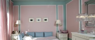
The idea of painting walls in two colors is as follows: three of the four surfaces in the room are decorated with one pastel or neutral shade of color, and the fourth stands out against their background with a bright contrast in the living room and kitchen or a calmer, but different tone from the background in the bedroom.
Painting walls in two colors will help you get a creative interior
By using the technology in a slightly different aspect, you can get rid of the flatness of wall surfaces, which will also add creativity to the decor and present the interior from a completely new perspective. For this purpose, only part of the walls receives combined painting. A wide vertical stripe of a different color from the background will appear at the joints of the walls or in their center. This technique is good when you need to hide the shortcomings of the layout or, on the contrary, highlight some of its advantages.
Contrasting painting will eliminate the flatness of wall surfaces
Color accent often serves the purpose of zoning. With its help, areas for relaxation or eating are highlighted, attention is focused on the arch or fireplace, niches and partitions. As the photos show, painting walls in two colors is attractive not only for the decor of living space. The reception is also relevant for corridors with bathrooms. In the first case, in this simple way they get rid of the monotony of the situation, in the second, they allocate a shower or washbasin area.
Highlighting a recreation area using a contrasting color
Combinations of complex shapes
In this case, we will talk about the appearance of repeating figures against the general background of the walls. These can be scatterings of squares or bundles of triangles. The idea is good for decorating children's rooms, kitchens, and bedrooms, decorated in a vintage spirit.
This technique of painting walls in two colors is difficult to implement. To apply an ornamental geometric pattern on the surface, somewhat similar to the pattern on a sweater, you will have to work hard.
An example of applying a graphic pattern to a wall
The process will be step by step. First of all, you will have to paint the walls a base color. The next step will be marking the location of future ornamental elements. This is done on a well-dried surface. Painting tape is glued over the resulting lines, after which the delimited area will need to be painted over with the selected shade. You can search for unconventional options for painting a wall in two colors on the Internet.
Sometimes patterns are complemented by gradient transitions or the decorative finish is enhanced by frames made of molding. The latter are glued strictly along the contours of the figures.
A polka dot wall will make a great impression. The latter can be located on the surface in any order or drawn according to some pattern.
It is not necessary to make peas of the same diameter. Here it is quite acceptable to play on a variety of forms. What you should strictly adhere to is the contrast in painting the walls in two colors. The decor should be bright, clearly visible, not merging or spreading across the base layer.
A polka dot wall will make a great impression
Pea walls will decorate a nursery or kitchen, interpreted in a retro style.
In principle, you can draw whatever you want on the wall. Fantasy patterns, linear ornaments that repeat the shapes of furniture, and drawings with a meaningful plot are also suitable. But if in the first versions it is permissible to use a stencil to implement ideas, then in the latter, painting the walls in two colors will have to be done live, that is, to show your artistic talent. Aren't you scared by the prospect? Then consider that an exclusive interior is already in your pocket.
Linear ornament on the wall
Color gradation
The secret of this technology is that when decorating a room, the walls are painted not with two colors, but with a tint palette of one. Different tone saturations, smoothly transitioning into each other, give the required color gradient.
Gradient wall painting
Usually four shades are used in the work, the most delicate of which greets you in the hallway. As you move deeper into the house, the color saturation increases. The interior solution looks exciting, so don’t rush to dismiss it, but rather look at how impressive such a combined wall painting is in the photo. Surely what you see will inspire you.
Gradient paint looks exciting
Mistakes when choosing a color palette for walls
The walls, neatly and beautifully painted, look very aristocratic in the bedroom. However, it is important to follow certain rules when choosing paint and applying it to the surface. Let's look at the main mistakes most often made when choosing the color scheme of a room:
- Lighting is not taken into account: the bedroom can be located on any side of the house, so it is important to pay attention to artificial light sources.
- Color combination: an unsuccessful combination will lead to inconvenience.
- Incorrect arrangement of furniture: bulky cabinets or sofas should be contrasting or in the same color palette as the walls.
However, you should not rely only on Feng Shui or the taste of designers: your bedroom should be individual and the atmosphere harmonious.
First of all, the wall decoration should please the owner of the bedroom
How to paint wallpaper?
What nuances should be taken into account when combining wallpaper and paint? First of all, this is the choice of wallpaper for painting, which must be approached quite seriously, since it is assumed that the paint should be long-lasting and durable, and repainting is not excluded.
Features of each type of wallpaper:
- Embossed paper wallpaper is inexpensive, repels moisture, environmentally friendly, but short-lived.
- Non-woven wallpaper is also quite inexpensive, but more durable. They stick well and wash well. Since most non-woven wallpaper has an uneven surface, when painting it is better to use a hard brush rather than a roller.
- Fiberglass wallpaper is the most durable type. They tolerate any mechanical stress and moisture.
The combination of wallpaper and paint has a number of advantages. For example, if there are unevenness on the walls, then it is easy to disguise them with embossed wallpaper, and then paint them in two colors, thereby hiding all the nuances. In addition, paintable wallpaper is easy to clean, which, if coated with sufficiently durable paint, will not spoil your favorite color.
Getting to know the nuances of combined coloring of a room gives you the opportunity for independent creativity and design decisions. Now you know how to paint walls in 2 colors so that the quality of surfaces painted with different materials perfectly matches the rest of the objects in the interior.
And two-color painting of walls and wallpaper will allow you to transform your favorite home, make it even more comfortable and warmer!
Rules for painting in two colors (2 videos)
Two-color walls as a unique design solution (34 photos)
How to do the work yourself
Painting work in a cottage can be done with your own hands if you proceed step by step and do not violate the principles of work. This choice will save money, because professional services are expensive.
You can do the painting work in the cottage yourself.
What you need
Before painting the bedroom, prepare the tools and materials required for successful painting. You should prepare:
- Various types of spatulas;
- Containers for preparing solutions;
- Sandpaper;
- Grater;
- Brushes, rollers;
- Film material;
- Primer and putty solutions;
- Dye.
Before painting the bedroom, prepare the tools and materials required for successful painting.
Sequence of work
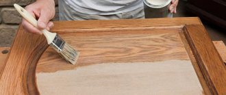
Coloring begins with preparation. Therefore, first the surface is cleaned, the old coating is removed, defects are removed, the surface is leveled, primed, puttied and sanded. Paint is prepared, if required, color is added. Afterwards you can apply paint; all solutions on the surface must dry completely before treating with a new product.
All solutions on the surface must dry completely before treating with a new product.
Important Requirements
If a dye is used, then it is added to all the paint at once, otherwise it will not be possible to repeat the desired shade later. You should not add a lot of pigment at once; the shade may turn out to be too saturated. If you choose a high-quality paint and varnish material and act step by step, the result will be the desired one.
If a dye is used, then it is added to all the paint at once, otherwise it will not be possible to repeat the desired shade later.
Walls to be painted in bedroom interiors are an excellent option for renovation work. You can cope with the task with your own hands, but you should choose suitable colors taking into account the specific purpose of the room. The suggested options in the article should help with the choice.
The most popular combinations and their impact on the interior
We bring to your attention a compact table that not only reflects the most popular combinations of two colors for rooms of any type, but also describes in detail the impact they have on the interior.
| Combination | Influence on the interior | Design style |
| Red – gold | creates a bright festive atmosphere | Classic, modern |
| Green – olive | tends towards a calm effect, brings peace and relaxation to the perception | Classic, eco-style |
| Red White | emphasizes the contrasts in the room, participates in the creation of an extraordinary and colorful interior | Loft, minimalism, modern, contemporary |
| Gray – purple | enlivens the visual appearance of the room, emphasizes the active outlook on the life of its owners | Loft, modern, hi-tech |
| Brown – olive | creates a cozy homely mood, makes the room warmer | Classic, modern |
| Beige – brown | an effective and versatile tool for emphasizing calm accents and overall harmonization of living space | Provence, shabby chic, classic |
| Red Black | Characteristic stimulating effect, recommended only for large rooms | Modern, avant-garde, loft |
| Blue - beige | The ideal balance between cheerfulness and tranquility, the necessary accents can be highlighted by lighting and furniture arrangement | Modern, classic, contemporary |
| Green – red | When properly designed, it emphasizes volume and creates a balanced mood at any time of the day. | Classic, avant-garde, contemporary, high-tech |
Which color to choose
The color of the bedroom walls, like the color of its interior, has a great influence on our peace of mind and mood. The wrong color can be the culprit of sleep disturbances, chronic fatigue and anxiety. According to psychologists, healthy sleep and good mood are guaranteed by the following color schemes:
- Pastel colors are a classic choice for many. They are believed to have a calming effect on the psyche, relieve stress and induce relaxation. Almost every color has a delicate pastel shade, so if you wish, you can decorate your bedroom in any color scheme.
- Classic style - beige, gray, brown, milky, ivory. The combination of these shades is a win-win option. Psychologists advise decorating your bedroom in this style if there is a lack of stability and confidence in your life. A morning spent in an atmosphere of respectability will set the mood for the whole day.
- Delicate cool shades - light blue, lavender, pistachio, sea green combined with light gray, beige, white, cream. Recommended for rooms facing the sun. They help create a feeling of coolness and freshness, which is very important for quality sleep.
- Warm colors - yellow, peach, terracotta, pink, golden. They are ideal for dark or cold rooms. Delicate shades will create a cozy atmosphere; they are best used for small bedrooms. And for spacious rooms, a rich, but not too bright, palette of colors is suitable.
- White color – it should be mentioned separately. There is an opinion that this is a bleak and cold color that is not suitable for the bedroom. But still, if you skillfully combine it with other shades and decorate it correctly, it will look very decent.
Please note that there are some shades in which it is not recommended to decorate the bedroom:
- purple color – causes despondency and depression;
- shades that are too dark (black, dark brown, etc.) are depressing and provoke a feeling of anxiety;
- Defiantly bright colors act aggressively and excite the psyche. It will be impossible to relax and unwind in such a bedroom. Only some decorative elements can be bright.
In pursuit of fashionable design, remember that the main purpose of the bedroom is relaxation. If the color scheme is chosen correctly and harmoniously combines with the furniture and decorative elements, in such a bedroom you will definitely be able to fully relax and get a good night's sleep.
How to calculate the ideal paint combination for a wall
To calculate paint consumption, measurements are taken of the surface to be painted and the surface features are taken into account.
On average, paint consumption is 1 liter per 8 square meters. meters. Window and door openings are taken into account, the areas of which are subtracted, the areas of window sills and baseboards are added to the areas of the walls. Before painting, the walls are leveled, prepared by sealing defects and treating with a primer. Painting is carried out from corners, door and window openings, baseboards with final treatment with a spray gun. Paint consumption is determined taking into account its specific consumption indicated on the packaging.
When making adjustments, the characteristics of the surface being painted are taken into account:
- color;
- texture;
- number of layers.
The basis is a plastered primer.
On wooden plastered surfaces, consumption increases by 6-10%, on metal - 13-15%, on unpainted plasterboard - 40%, on embossed wallpaper - by 70%.
The tool for applying paint is taken into account: roller, brush, spray gun. The roller and spray gun reduce consumption.
Types of modern paints
Paints for a bedroom can be of several types:
- Water-based paints
are the most popular because they use water as a solvent, due to which the paint dries quickly, and the application process itself is environmentally friendly. - Acrylic paints
are compositions in which the base is acrylic resin, due to which, after drying, a dense film is formed that is impermeable to moisture and resistant to mechanical damage. Another advantage of acrylic paints is their ability to retain their original color for a long time. - Latex paints
, which are based on latex polymers: such compositions have good water resistance and vapor permeability. The coatings tolerate temperature changes well, which means that they can be used both indoors and outdoors. - Acrylate paints
are relatively new materials, you can call them premium paints, so many are skeptical about them, in particular due to their high cost. However, in terms of their quality, these compositions fully correspond to their price, since they do not lose their original appearance and properties for a long time.
Polka dot walls
This idea is usually embodied in children's rooms. Although polka dots are also appropriate in living rooms, bedrooms, and kitchens, if we are talking about styles such as country and retro. Painting walls with polka dots is easy: first you need to paint the walls with a lighter paint, then using a stencil, using a brush or sponge, apply another color or several other colors in the form of randomly or systematically located circles.
Cream color
Eternal classic. There is nothing stopping you from using a similar color scheme in your home. It will look good in a democratic Scandinavian interior, but in an expensive classic space this shade will become truly luxurious.
Author of the project: Natalya Samoilova. Photo: Dina Alexandrova.
Author of the project: Natalya Samoilova. Photo: Dina Alexandrova.