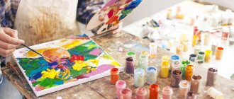
When we hear the word “palette”, the image of an artist appears in our imagination who performs some kind of magical ritual with paints, as a result of which new colors appear. And indeed, the process of mixing dyes is impressive, especially when, when combining two completely different shades, a third one is born, unlike any of them.
You can mix a larger number of paints in different ratios, which allows the artist to obtain any color tone that the human eye can perceive. Thus, the palette is one of the main attributes of an artist using standard painting methods. However, there is an alternative and, as practice shows, more effective way to obtain new shades. We are talking about the technology used by Renaissance artists, whose paintings are the standard of color harmony and realism. What is the difference between the traditional method and the technique of the Old Masters, and why does the second one allow you to accurately convey shades and achieve coloristic unity?
Types of palettes
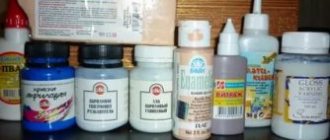
Translated from Latin, “paleterum” means “plate” or “tablet”. However, today palettes are made not only from wood, but also from plastic, glass, canvas paper and other materials, so everyone can choose the best option for themselves.
Oil painting palette
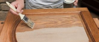
The classic palette for oil painting is a thin sheet of wood coated with varnish. The industrial version is plywood that is light, rigid and durable, but if you decide to make the palette yourself, do not forget to varnish the front surface. Otherwise, the oil will seep into the wood and the paint will become too thick, which will lead to inconvenience in work and deteriorate the quality of the covering layer.
Palettes for watercolors and other water-based paints
Many artists, when painting with water-based paints, prefer white paper as a palette. The dye adheres well to the paper base, mixes easily and allows you to see a result close to what it will look like on the canvas of the future painting. The front surface of the sheet is impregnated with a water-repellent layer that prevents the palette from getting wet. In addition, the paper is a disposable palette, so there is no need to wash it.
Plastic and glass can be used to obtain the desired color by mixing water-based paints. The main advantage of plastic and glass palettes is their smooth surface, which is easy to clean. True, this is not the best option for watercolors, since drops can form when mixing watery paints. As an alternative to glass, plastic and paper, you can use canvas, which should be pre-painted to level out the graininess.
A Guide to Creating a Wet Palette
Just now, one of my friends, who knows how to paint very well and has been in the hobby much longer than me, dumbfounded me with the phrase “should I try a wet palette?” and immediately asked me a number of questions about its use. Which immediately made me think about the question “How many people use it, besides professional artists?” Since I promised him a detailed manual for preparing and using a wet palette, I decided to make one for everyone, and not just for the wet palette, but for all the palettes that I use. I hope that Dimka will add something of his own to it.
Wet palette. The main palette I use. Its main task is to retain moisture and feed the paint with it, avoiding it from drying out.
It can be made from anything, but it is optimal to make it from a more or less hermetically sealed container. I have seen it made from a tin box of chocolate (at the time of writing this article in METRO 200 rubles) or cookies (I never found it, but I saw it with foreign comrades), from a sandwich maker (if you’re lucky, about 20 rubles) and from a flat tray for food products (about 100 rubles). I’ll say right away that finding the optimal container is not so easy.
Inside the tray I put sponge rags (about 80-100 rubles per package) in two to four layers. Their task is to retain moisture, as well as to raise the working surface of the palette as close as possible to the boundaries of the container.
I put a couple of layers of paper towels on them. The fact is that rags are usually colored: yellow or blue. Accordingly, a layer of napkins is needed to eliminate the influence of the color of the rags on the color of the paints on the palette.
Main ingredient of the wet palette: tracing paper
And the last and main ingredient of the wet palette: tracing paper. Any element can be replaced with anything except it. Neither baking paper nor anything else works as well as ordinary drawing tracing paper, sold in bookstores for 150 rubles per huge roll. Hint: if your wife, or mother-in-law, or mother sewed, ask them: perhaps they have a supply of that same tracing paper, it was used for transferring patterns from magazines. On the plus side: paint lying on a properly damp palette does not dry for weeks. The lifespan of the palette is determined only by how actively you move your brush over it. It is necessary to change the working layer when paper pellets or holes appear in the surface. It is necessary to moisturize by adding water to the sponge layer. I also keep a fine spray bottle of water on hand so that I can moisten the tracing paper before I start working and before I close the palette after working. Among the disadvantages: a damp palette left hermetically sealed for a couple of weeks completely goes rancid and the next time it is opened it delights you with a completely inimitable amber. PS I don’t store it in the refrigerator and I don’t understand why I should do this. Well, that is, theoretically I understand (so that the water evaporates more slowly), but I don’t think it’s necessary to do this. I pour regular water from a filter. So I will also transfer the distilled one to this.
Palette for acrylic stains and tinting. I use it for mixtures based on matte/glaze mediums, paint and water, as well as lice and inca (yes, oddly enough, I also use them, but not always for their intended purpose and I certainly don’t dip soldiers in it). Most often, ordinary school plastic palettes, tablet blisters, or any container with indentations are used. Often they put foil in it so as not to wash it later. I went further on this issue. When painting with detachments and armies, I often did not complete the work with the induced mixture in one working day. The slurry in the worst case and most often dried out, less often thickened, and I needed a palette that I could work with for at least a couple of days.
The ice tray that came with the refrigerator was absolutely convenient.
And then the ice tray that came with the refrigerator turned up quite conveniently. It fit perfectly (with a little modification) under the existing tray, became incredibly convenient after cutting, and even turned out to be cellophane.
That is, dried paint literally flies off after you splash boiling water on it. Similar containers sometimes come across on sale; you even come across ice trays with their own sealed lid. Let the seeker find.
And the last palette, a simple school one, found in every second bookstore or stationery store, with a price ranging from 11 to 30 rubles. I use it for working with oil paints. I don’t wash off the oil after work, I just wrap it in a plastic bag, and when the oil dries completely and there’s no clean space left on the palette, I just throw it away and take a new one. If you know something about palettes that I haven’t written here (which means I most likely don’t know), don’t be shy and add it in the comments.
Source
Video on the topic
How to make a wet palette. How to make a wet palette.
A guide to making a wet palette that prevents water-based paint from drying out over time...
How to: Make wet palette
How to: Make wet palette / Training: How to make a wet palette.
How to make a palette, what a palette should be #21 - Tips for a beginner | artist Anna Miklashevich
How to make a palette, what a palette should be #21 | Tips for a beginning artist | artist Anna Miklashevich...
Palette sizes
The optimal size of the palette is 30-40 cm. The small surface is not very convenient, since it has to be constantly cleaned to make room for new mixtures. It’s especially frustrating when you accidentally delete a combination that you’ve carefully and long-selected, and you have to “suffer” all over again. Artists who prefer creative space use boards up to half a meter in size, and when working standing they use two palettes - a stationary one, located near the easel, and a mobile one, which is held in the hand when you have to often approach and move away from the painting.
Leonardo da Vinci (1452 - 1519) BIOGRAPHY and CREATIVITY
There are palettes for working with oil paints and for watercolors in tempera. Palettes are made from wood, metal, earthenware, enameled tin and plastic. Palettes for oil paints are made of wood and plastic.
The palette should be comfortable and light. Near the thumb hole, the palette becomes thicker and gradually thins towards the upper left edge. A lead plate is attached to the lower right edge of large palettes to serve as a counterweight. Such palettes do not tire your hands, do not cut your fingers and can lie on your hand without support. Wooden palettes are made from durable, lightweight, well-dried wood, mainly hardwood (walnut, pear, maple), as well as high-quality plywood. Wooden palettes are thoroughly impregnated with warm drying oil or varnish, applying the impregnation with a flute brush. After applying the impregnation, the palette is placed horizontally for 2-3 days to allow the impregnation to penetrate into the wood. With good impregnation, the palette does not de-oil the paints, maintaining their quality. The shape of the palette is oval, square, rectangular and curly. When working, paints are placed on the upper edge of the palette so that the rest of its surface remains free for mixing paints. Mixtures are made in the center of the palette, while adhering to a strict order: a certain place should be for green-blue paints, for orange-red, brown, blue- purple. To ensure clean mixtures, the palette must always be clean. After use, the palette should be cleaned with a spatula and wiped with a cloth. If the palette is dirty, covered with half-dried paint, scrape it with a knife, but so as not to cut the wood. When it is difficult to clean a palette with dried paint with a knife, the paints are softened by heating them. To do this, place sheets of paper moistened with kerosene or thinner No. 2 (white spirit) on the palette and light it, but make sure that the wood does not catch fire. The heated paint softens and is easily removed with a spatula or knife. It is best to heat the palette over a closed fire. In addition to wooden palettes, palettes are produced from sheet plexiglass and polyethylene. Palettes made of polyethylene are made mainly in rectangular shape and are produced with special removable cups for working with tempera paints and gouache; the cups can also be used when working with oil paints for various additives. Wooden and sheet plastic palettes are made in the following sizes (in mm): 497 x 373, 374 x 252, 376 x 228, 376 x 227, 163 x 169. Palettes for watercolor paints are most conveniently made from white earthenware or porcelain, as well as from tin , coated with white enamel, or tinned sheet coated with enamel paint.
The whiteness and opacity of the palette, like the whiteness of the paper, is necessary in order to see the paint in the light, that is, to see it as it will look on paper. A watercolor palette should have recesses for diluting paints. Palettes for watercolor paints are often used for tempera. The most common sizes of watercolor palettes (in mm) are 220 x 310 and 340 x 450. Large palettes are convenient for the workshop.
| < Previous | Next > |
Disadvantages of the palette
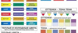
Despite the fact that the palette is a fairly simple tool, it plays a key role in the artist’s work, relieving him of the need to buy a huge amount of paints. To get an alternative color, it is enough to have several basic dyes - the main thing is to choose the right proportions. At first glance, it’s nothing complicated, but in fact this is the “stumbling block” that does not allow you to convey the desired shade.
The problem is this. Firstly, paints from different manufacturers give different color tones when mixed. Secondly, there is no formula to get the exact color. Even when using a color wheel, the artist has to act intuitively and add dyes virtually “by eye.” Thirdly, paint transferred from the palette to the canvas often looks different, and the artist has to “play” with color again, which leads to dirt. It takes a natural flair and great talent to overcome all these limitations, so it is not surprising that most painters, even after spending decades, cannot figure out the “secret” of mixing paints.
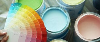
How to convert RAL colors to other standards and vice versa
When you need to select paint according to RAL in cans or other materials, but it is difficult to decide on the color, the RAL system is used. In any color you can find an option close to the required one, but to convey information to another person it is more convenient to use the digital designation according to RAL.
To make it easier to convert colors from other standards to the Ral standard or in the reverse order, special programs have been created. You can use options that are available on the Internet. Many construction companies and online stores offer on their websites the use of a special color converter, which quickly allows you to find the appropriate shade and its number in standardized catalogs.
But it is important to remember that the perception of shade from the screen is distorted by its parameters. It all depends on the settings of the device itself. Therefore, it is advisable to also study the paper version before making your final choice. Otherwise, the final result after using paint in cans and drying it may turn out to be completely different.
Ral colors in official use may have slightly different names.
RAL is a system that has existed for many years, but it remains in demand among a large number of industrial areas, as it helps to standardize work related to color solutions. Its use is convenient and allows you to quickly decide on a shade, as well as choose a combination of options when designing an interior.
To make it easier to convert colors from other standards to the Ral standard or in the reverse order, special programs have been created.
The company has created several versions of layouts for different areas of use. Thus, by choosing the right one, specialists simplify their activities. But the first and classic layout remains the most popular.
Obtaining harmonious shades using the technique of the Old Masters
The great artists of the Renaissance never used a palette, but their works are striking in their realism, color harmony and fine elaboration of the smallest details. How did they do it? Did they really hold thousands of bottles of paint?
Of course not. It's all about technology, which differs significantly from traditional techniques, which focus on paints. The technique of the old masters is multi-layer painting, where the palette itself is dense, and the dyes are mixed not physically, but optically, similar to the overlay of colored glasses on top of each other. Imprimatura, glazes, tempera mixtures and watercolors act as translucent layers. An important role is played by preparing the canvas, working with sandpaper and local application of paints in the thinnest layers without strokes. Only by using an integrated approach can you achieve:
- accurate colors;
- interesting color relationships;
- depth of space;
- realistic texture;
- correct volume.
The technique of the old masters involves working “from a spot” using the laws of aerial perspective, which allows them to paint “living” paintings that compare favorably with “artificial” works of corpus painting, which use a palette.
Most colors are obtained after working the canvas with tempera mixtures, and paints are applied spotwise to enhance the effect and revitalize the tone. The essence of the technique is described in a book dedicated to optical transmission technology, which is based on the technique of the Old Masters and includes modern techniques, tools and materials. You can download the book for free using this link. In contact with
Copying a color scheme
The first rule is to learn from the work of others. Artists of different eras constantly took other people's elements and very often got the desired result. This is an immense field for experimentation. After all, there are so many masterpieces that we enjoy now.
Let's imagine that you have a sketch drawn, but you have no idea how to properly manage the color scheme. The problem is quite common. After all, how many good works can be ruined by choosing the wrong colors. To solve this problem, you can look for similar examples, look at the color palette used, compare with our expected result and understand whether it suits our feelings.
Most likely, the required range will have 2-3 primary colors and 3-5 additional colors. During the rough draft you can practice mixing paints to achieve the desired result. The most important task is to maintain the main color of the drawing.