For gray wallpaper
Gray color is universal, so most shades go with it.
But if you want to create a calm, “enveloping” interior, choose curtains and wallpaper of a similar color. When you get tired of a monochromatic decor, you can introduce bright color accents in the form of furniture or textiles for it: pillows and bedspreads. Designers often use this technique in their projects, mixing shades of the gray palette. But the main advantage of this option is that following it, it is impossible to make a mistake.
Which wallpaper goes with which curtains?
If you bought the curtains you liked before going to the wallpaper salon, when viewing catalogs, it is recommended to start from the following considerations:
- matte curtains made of dense smooth fabrics look stylish against the background of metallic or actively printed wallpaper with an original texture (snake skin, animal hair, etc.); the juxtaposition of equally smooth surfaces will either make the room boring if the same monochromatic furniture is selected, or will make it possible to place bright accents with the help of other items;
- curtains with lambrequins, tassels, bows and other expressive details are best complemented with textureless matte or satin wallpaper;
- short, light curtains in light shades are complemented by wallpaper in the Provence style - checkered or printed with small flowers;
- bright roller blinds hint at minimalism and oriental themes, therefore they are combined with wallpaper with hieroglyph prints, plain walls in neutral pastel shades: white, gray-beige, beige;
Curtains and wallpaper in the interior look harmonious and appropriate when the designer remembers a sense of proportion: if there is no experience in design, it is better to make 1-2 accent details; the remaining fabrics and surfaces should not loudly “scream” about themselves. Find out which curtains are suitable for walls of a particular color below.
To the whites
Plain walls tinted white and other shades close to it are a conservative finishing option, which opens up a lot of possibilities for choosing fabric and design of curtains. It’s easy to choose curtains to match white wallpaper: find your favorite color in the catalog and order it made from the fabric you like. Bright or dark, pastel matte or with a metallic shimmer - all shades will look advantageous against white walls. But attention should be paid to the correspondence of the style of the pattern on the wallpaper and curtains and the combination of the style of curtains with the design of furniture and interior decor. The main advice is to ensure that nearby surfaces differ in texture: smooth white walls - textured curtains, wall covering with texture - smooth curtain material and laconic cut. Almost any curtains with white wallpaper will look appropriate.
To the blacks
Curtains with black wallpaper should be such that the space, which has become overloaded due to the dominance of a deep, heavy shade, is unloaded, and the windows become light or bright accents. A golden shiny fabric and the same tulle will visually add sun rays to the room. Satin or silk curtains in cappuccino or caramel colors will look mysterious and elegant.
The combination of black walls with white curtains is dramatic and extravagant.
Scarlet curtains and white or golden tulle look hot, passionate and energetic against the background of black wallpaper.
Lambrequins, brooches, clips, heavy curtains, complex cuts - such decorative details will distract attention from the dominant dull color, but they are recommended for use in spacious rooms with smooth or slightly printed walls.
Well-chosen curtains with black wallpaper will add mystery and charm to the room, adding light and airiness to it.
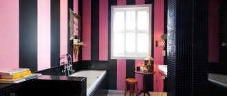
To the reds
The sensual burgundy-red color scheme is combined with a large number of colors. The classic option is white curtains with red wallpaper, and such an ensemble will look most advantageous with a monochromatic texture of the walls and curtain fabric. The cut of the latter should be simple. The colors of the red range are very expressive and do not need additional accents. It is worth experimenting with tulle patterns: smooth matte walls in red and burgundy, smooth shiny curtains and white matte tulle with an active white pattern (plant motifs, vertical stripes, abstraction, geometric patterns) - a win-win solution for rooms of any size.
If white curtains are suitable for scarlet, watermelon, strawberry wallpaper, then for dark-colored walls - burgundy, marsala, cherry, cold red - it is better to choose curtains in emerald and cold green shades. This combination looks luxurious and mesmerizing: the hot atmosphere created by dark red flowers will be muted by a neutral green shade, and the room will turn out harmonious.
To the yellow ones
Wallpaper in juicy, joyful yellow shades - egg yolk, lemon, yellow-salad - can be muted or enhanced with the color of the curtains. For those who find yellow walls too bright, it is recommended to choose curtains in a brick shade, salmon color, coffee, coral, bottle green, or olive color. Silver, steel, matte gray, azure curtains will make the yellow color less intense.
If you want to emphasize the expressiveness of yellow wallpaper and make the room as bright as possible, curtains in white, mustard, golden, light green, and red will come in handy.
It is advisable to choose curtains without a pattern for the wall covering in a rich yellow shade. An exception is the combination of plain bright wallpaper with dark curtains with an expressive large pattern. But this combination is only suitable for spacious rooms with high ceilings.
To the blue
The need to order curtains to match white wallpaper is a great opportunity to show your creativity and find the color, pattern, cut and material that you like without regard to rules and fashion. Noble, but demanding dark blue walls do not require such liberties: it is recommended to select additional shades for this color, taking into account the purpose of the room.
Auxiliary rooms - halls, bathrooms, dressing rooms - with dark blue walls should be “illuminated” with curtains of golden yellow or orange tones.
The combination of blue and white looks elegant and stylish. To prevent it from looking cold and uncomfortable, it is advisable to introduce bright accents into the room: red, orange, light green, peach. Such shades can be involved, for example, in a pattern on fabric.
Beige and golden brown fabrics, as well as olive and mustard curtains, go well with blue walls in offices and bedrooms.
To the green
The combination of curtains with green wallpaper is a great scope for the designer’s imagination and at the same time a non-trivial task: green is considered one of the complex colors, since it noticeably changes its undertone depending on the lighting and proximity to other colors.
All shades of green become expressive, fresh and pleasing to the eye when highlighted with white and beige. Green decoration of a room with white, milky, cream curtains is a good combination for any room, which thanks to this ensemble will become bright, calming and uplifting.
Green wallpaper with blue curtains is a classic design for children's rooms for boys and girls. Light green and blue will look fresh, bright green and dark blue will look more sophisticated.
Green walls and golden brown curtains with white or beige tulle will make the room warm and cozy. This is a win-win combination that is found everywhere in nature and appeals to most people.
The richness of green color and its complexity require careful work with patterns and textures. Thus, it is advisable to combine green wallpaper with a bright pattern with curtains of one of the shades that are present in the pattern.
To lavender
The delicate lavender shade of the wallpaper suggests the selection of curtains that are equally delicate in color and sophisticated. A combination of light lilac wallpaper with white and cool pink shades of curtains will be refreshing, light and comfortable for the eyes.
Multi-layer curtains look good in lavender interiors. Since this wall color is often chosen by those who want to decorate a room in the spirit of Provence, shabby chic and other naive romantic styles, it is permissible to hang curtains with lambrequins, floral prints, ruffles and other expressive details.
In a girl’s room, lavender wallpaper will look original next to olive curtains and fuchsia fabric.
Lavender curtains with beige wallpaper are a universal option for the living room, as is lilac wallpaper with beige or golden curtains. The light and bright lavender color itself looks advantageous when it has a matte or satin texture - this applies to both wallpaper and curtain material. It is recommended to mute shiny lilac wallpaper with matte curtains of cherry, emerald green, coffee, royal blue.
To the purple
Choosing the color of curtains for a room with purple walls is a task for those who prefer complex paths and like to experiment. White, beige and golden curtains match all shades of purple wallpaper. If the walls are very bright or dark, you should choose a fabric with shine and a small, delicate pattern. In kitchens and children's rooms, purple walls will be successfully combined with azure and turquoise curtains, in living rooms and dining rooms - with bright green and golden-brown curtains. For bedrooms, a duet of purple wallpaper plus silver or steel curtains with tulle of the same shade is suitable.
In rooms with purple wallpaper, it is not advisable to hang curtains with a complex cut or voluminous decor: if you want to make the window decoration an accent, it is better to choose a light fabric with an expressive pattern and abandon lambrequins, massive curtains, and large brooches.
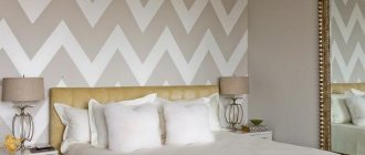
To the gray
Almost any curtains with gray wallpaper look fresh and beautiful: the gray range is universal and tends to emphasize the richness of different shades.
A feeling of elegance and calm settles into rooms with gray or silver wallpaper and beige or light gold drapes. In rooms with gray walls and white curtains, it is recommended to place additional color accents from a warm range, otherwise the room will turn out to be cold and depressing.
Gray wallpaper looks great next to curtains in golden brown colors and warm shades of pink. Purple and dark green drapes next to gray walls look harmonious if the fabric has shine or a contrasting pattern. If you choose from the blue range, then turquoise fabric with a warm undertone goes well with gray and silver.
All shades of red form an expressive combination with gray wallpaper. With regard to rich red curtains, a strict rule will apply: smooth walls - curtains with a pattern, textured or printed wallpaper - plain curtains with glitter.
For beige wallpaper
Beige color is found quite often in Russian apartments: it is the favorite shade of those who dream of a cozy and warm interior. Sand colors provide calmness, but make the atmosphere inexpressive.
Curtains of all shades of brown, natural green and white are suitable for such walls. But if you want to achieve an interesting effect, combine beige wallpaper with deep blue curtains with a matte texture.
Types of premises where they are used
Combinations of wallpaper and curtains with patterns can be seen:
- Office and office. Here you can find wallpaper with a strict pattern: stripes or checkered patterns. Classic plain curtains are suitable for them: Japanese, pleated, with eyelets or loops.
- Vacation home. In this room you can most often see wallpaper with a floral pattern, then the curtains can repeat the pattern or color of the walls.
- Shop. In salons and boutiques, the wall pattern can be decorated with monograms, while the curtains are plain.
- Cafe. Expensive wallpaper imitating artificial stone looks great with calm, pastel-colored curtains made of organza or veil.
- Restaurant. Here, wallpaper is rarely chosen to decorate the walls, but monograms and imitation stones can be found - curtains without patterns, but often made of expensive fabrics: silk, brocade, velvet.
- Hotel. If the wallpaper has a geometric pattern, then it is better to choose plain curtains of the same shade as the background of the walls.
The main thing to remember when decorating an apartment is the combination of colors and patterns.
How to choose curtains for a complex interior:
For light wallpaper
When choosing curtains for white walls, it’s impossible to make a mistake: any color and any texture will do. If there is little light in the room, use translucent curtains in pearl shades; if you want a brighter interior, hang colored textiles that will stand out against the background of light decoration.
If white fabrics have a noticeable pattern, give preference to plain curtains so as not to overload the decor.
Applicable colors
So, first you need to figure out whether the color of the curtains will repeat the tone of the pattern on the wallpaper. Designers advise adhering to the following rules when decorating rooms:
- If the patterns on the walls are pastel colors, then the curtains should also be in calm shades.
- If the patterns are large, then the curtains should match their color.
- If the pattern on the wallpaper is shiny, then the curtains can also be metallic.
- When there is a large pattern on the wallpaper, then on the curtains it can be the same, but small.
You should not forget about a sense of proportion when decorating a room if you are dealing with patterns.
For dark wallpapers
Dark walls in black, emerald or deep blue look luxurious and create a magical atmosphere in the room. Be careful when choosing curtains: too light fabric will become an intrusive contrast, and dark fabric will enhance the gloomy impression.
The best option for dark walls is neutral pastel shades: gray, sand, smoky pink. If you want as much light as possible to enter the room, choose translucent fabric or opt for light-colored roller blinds or Roman blinds.
Rules for selecting curtains
- Wall coverings and textiles must match each other in texture. Choose tulle airy curtains for paper wallpaper, and massive curtains for vinyl or non-woven surfaces.
- When selecting patterns, take into account the style of decoration of the room. Ornaments should not be too large, as they can visually reduce the space of the rooms.
- To prevent the interior from looking gloomy, dark and rich tones should be diluted with lighter elements. Look at the photo.
- When choosing curtains, use shades that are one or two shades lighter or darker than the wall coverings.
- Wallpaper with imitation stone, brick, plaster is combined with plain blinds and roller curtains.
- In a room with a combination of paintings, choose textiles that match one of the tones of the wall coverings.
How to choose the right textile elements in the interior, the following photo can help:
For green wallpaper
The choice of curtains for green walls directly depends on the temperature of the shade. Intense natural tones look great with yellow and turquoise, and trendy dark tones look great with a straw and linen palette.
Ash green is best revealed when paired with “cold” curtains: silver, pearl gray and snow-white curtains with a shimmering texture will give the interior a noble look.
For purple wallpaper
The eccentric palette of lilac and purple is not for everyone. Such walls come to the fore, so they should be muted with light colors. Mustard, milky and sandy shades of curtains look good paired with them.
But deep velvet curtains add elegance and “expensiveness” to light lilac wallpaper, and smoky gray ones to purple wallpaper, as in the photo.
For blue wallpaper
To prevent the interior from seeming faded, hang rich blue or light curtains with an active pattern: they will become an accent that will harmoniously fit into the decor. Gray textiles with a cool undertone or silver texture look good.
But to create coziness, designers often use beige textiles, which mute the intensity of blue and harmonize well with the furniture.
If the room is small
In this option, designers do not recommend framing the window in dark colors, and it is advisable to drape the walls with light wallpaper. In this case, the beautiful curtain design is plain beige or light gray curtains made of natural fabric. The wallpaper is in the same range, but a couple of shades darker.
In a small room you can hang curtains with vertical stripes or small patterns. Sprawling patterns or flowers will visually “steal” the space. The color combination in the interior of a small room should be laconic. Monochrome is preferable, or using just a couple of shades of the same range.
For pink wallpaper
Usually pink rooms are created for romantic people: most often these are bedrooms where there is no place for flashy colors. The atmosphere of lightness and tenderness will be supported by smoky pink walls, and ivory-colored curtains will act as a softening element and add even more airiness to the atmosphere.
It is best to combine transparent tulle and curtains made of thicker fabric.
For yellow wallpaper
For such a bold decision, you will need “muting” curtains: beige and gray shades. Choose curtains with ornaments to match plain walls and vice versa. Let the elements echo each other, but avoid overloading - too bright an interior will quickly begin to irritate.
Pay attention to pastel yellow, honey and golden shades, but avoid poisonous yellow, which “cheapens” the interior.
Interior Applications
Living room
This room can be decorated with gray-green wallpaper with light brown monograms, then the curtains should match the tone of the pattern on the walls.
The living room can be quite bright: purple wallpaper with large blue flowers. Then the curtains are also chosen lilac, you can have sliding ones or with tulle.
Bedroom
Small flowers in a blue tone will go well with curtains a tone darker than the color of the walls and with large bouquets on the walls.
A light blue bedroom with white monograms will match the same Roman or roller blinds. Then, when lowered, a feeling of a complete room will be created.
Children's
This room may have a pattern of birds on the walls. Then it can be completely repeated on the curtains.
Large geometric patterns on the walls in bright colors will match plain curtains of one of the shades. It is better to take natural fabric: cotton, linen, viscose.
Kitchen
Small black flowers on a white background, decorating your walls, look harmonious with light-colored curtains.
Under wallpaper with bright horizontal stripes, translucent curtains with black and white lines running across will be suitable.