A powerful light bulb without the participation of an appropriate palette in the design is not able to compensate for the shortcomings of a dark room. Light colors are responsible for a good mood and cheerfulness, capable of quickly transforming a room. Thanks to the pleasant radiating energy of the colors present, the overall impression of the house is formed.
A boring design can be refreshed using decoration, furniture, light and paraphernalia. The light palette fits wonderfully on any area, in harmony with neighboring tones, and takes root in different schemes. The delicacy of the delicate background is supported by the neutrality of the interior groups, where a moderate contrasting color range is encouraged.
We maneuver with flowers
The use of exclusively achromatic tones presupposes an original design. This is due to the highlighting of the textures involved in a monotonous space, and their structural features: transparency or dullness, roughness or velvety. The harmony of white, gray and dark is self-sufficient without auxiliary tones and is ideal for creating a background.
The emotional expressiveness of such a composition depends on the intensity scale of the tones used. So, if you replace the whitish lightness of gray mother-of-pearl with the richness of steel, boring notes will ruin the bright mood. In the version with dynamic black and white contrast, silhouettes and perimeter boundaries will be more clearly outlined, rhyming with good taste.
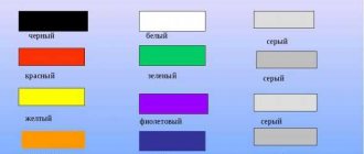
By varying between warm and cold combinations, it is possible to indicate the design’s belonging to the style. If you invite brown to complement the composition, the solution will remind you of Japanese design. Barely noticeable touches of color will serve as the basis for hi-tech or minimalism. Pure color will indicate a Scandinavian theme, and will require the presence of white furniture. A white and black duet with a third color quoted will clearly indicate Art Deco.
Colored blankets and pillows, window textiles and wall decoration with frames with shiny surfaces compensate for the missing warmth. It is allowed to insert lighting into the metal or plastic frame, consolidating with the base colors.
Decor and textiles
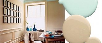
Pearl is a neutral color, it can harmonize with any shade of curtains and curtains. By combining warm colors with cold ones, you can create original compositions, because depending on the color scheme of the curtains and the main pearl one changes its tone, becoming more comfortable or, on the contrary, fresher.
Don't shy away from rich velvet tones: pearls combined with burgundy, dark green or dark purple will look rich and conservative.
In a pearl kitchen with a brown set, cream, milk or coffee curtains will complement the interior. If the walls are darker than the set, then a white or milky curtain will add a fresh and elegant note.
A warm spring interior will be created by soft pink curtains, where a light set is combined with soft orange or peach walls.
Light green curtains will help achieve cool notes in a kitchen with pearl furniture and beige walls. But be careful, such a color scheme must be implemented carefully so as not to make the room completely cold and uncomfortable.
If the kitchen is small and completely decorated in light colors, white-pink, white-orange or white-peach curtains will add warm and delicate notes.
Bright purple or lilac will look harmonious in combination with a pearl set and milky walls.
When choosing curtains, it is also important to consider the style in which the kitchen is designed. For example, if it is high-tech, it is better to use Roman blinds or blinds of a single color. And the tandem of pearl, silver and gray in the Scandinavian style will be complemented by rough linen curtains.
A few secrets of decorating the interior in monochrome pearl color:
- Wooden pieces of furniture will warm up the pearl interior and add a touch of rustic charm.
- Decorative elements (candles, vases, figurines) in soft pink, peach, mint, turquoise and cream colors will create an airy and romantic atmosphere.
- Floor mats in pink, peach or cream will warm up a light tile floor, while white or pale beige will soften the severity of dark laminate flooring.
Focus on light
The lack of intense light turns white walls into gray. It is not difficult to get confused when choosing sources of artificial radiation, but in reality everything is simple if you focus on the task of spatial organization. It doesn’t hurt to know a couple of tricks that can be used to correct planning flaws along the way.
- For high ceilings and an asymmetrical room, it is better to prefer a pendant ceiling lighting scheme. It is always in demand in the kitchen and will come in handy in long vertical walls. A project from 3 different adjustable sources, used according to mood, is welcome.
- In the classic case, the light should fall from above, and its pouring rays should clearly highlight the lines and configurations of the furniture group. Garlands of LED light will solve the problem in their own way, and in the selected color mode, they will support the background.
- Floor-standing devices are used for local lighting. They zone the room with flows and highlight a specific segment. If you want to move the walls apart, place them around the perimeter at the bottom of the corners. The idea of a point system built into the floor or staircase is actively used.
Wall variations have a predominantly decorative purpose, but a specific technique will also solve a functional problem. It is necessary to hang the lamps opposite the wall to “move” it slightly. Beams of light will mystically solve architectural shortcomings.
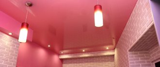
Trend of the year: mother-of-pearl surfaces in the home Bookmark 6
Pearl glitter is now in fashion. Not only domestic followers of “European-quality renovation”, but also the trendsetters of interior design are tired of the ringing gold. There are others like that. We will tell you in the article how we, the owners of ordinary standard apartments, can live with this mother of pearl. Read it, it's cool!
That’s right: while we are gluing wallpaper the old fashioned way, changes are taking place in the world of design and trends are changing. Not as fast as in clothing fashion, but still. Having assessed a number of new design products, The Telegraph announced at the beginning of the year that there is no place without “pearl”, and luxury is worth looking at in a new way.
So bright gold and silver surfaces are becoming a thing of the past. Like everything bright and pompous: even luxury should be modest and comfortable. Therefore, if the door handle or other metal part is not chrome and gold, but delicate brass or copper. If it’s fabric, then something soft and elegant is better: here’s velvet, which is also very fashionable now. In short, goodbye to “cool” renovations; now the key is restraint.
Solving a geometry problem
The advantage of light interiors comes down to unobtrusiveness and a feeling of freedom, where nothing irritates or tires. Conducting colors will ensure the creation of visual illusions. The walls can noticeably stretch out or become squat, and the interior can be perceived as more massive or dissolve against an airy background. However, if you like specific colors, it doesn’t hurt to do some independent decorating.
Decorate your wall design with gentle motifs of sky and water, mother-of-pearl, pearls, pastel colors and a number of delicate shades, according to your spiritual impulses. The desire to fill a room with more active energy can be expressed by saturating one of the sides, for example, with amber or caramel.
This technique will also be relevant in the case when you need to open a closed perimeter. Lighten the wall that requires distance, and darken the rest a little - and the narrow room will become wider. The geometry of the square “box” will be corrected by one of the verticals, made in a richer tone. The conclusion is clear: cold colors give a three-dimensional perception, while cozy and dark colors have the opposite effect.
The need to reduce the height is due to the color of the ceiling, which is exactly one tone different from the base one. A wide stripe at the top of the vertical to match the top plane and decorative borders create exactly the same impression. The desire to have an original ceiling can be reinforced by the use of suspended ceilings with a laconic inclusion of a light, delicate shade. In the solidarity of light and idea, the plot will look unobtrusive and stylish. A crystal chandelier will reflect a thousand kaleidoscopic variations, and in the mirror of light planes the contents of the room will literally “hang” in the air.
How and which headset to choose
When it comes to choosing furniture, there is no need to be modest - you need to carefully consider all the options, their pros and cons, and weigh the pros and cons.
Typically, a kitchen set includes the following designs:
- cabinets, cabinets;
- cabinet furniture: pencil cases;
- free-standing furniture: sofas, chairs, tables;
- wall cabinets, shelves;
- movable elements: transforming tables, various furniture on wheels.
Decide what task your headset will perform and follow the tips:
- Take accurate measurements of the kitchen.
- Decide on the number of items and equipment available. This way you will understand how spacious a headset you need.
Choose a kitchen based on the layout:
- Linear - furniture is placed along the wall.
- Two-line - furniture is installed along two parallel walls.
- U-shaped - suitable for large kitchens. Each side is functionally selected for a specific area. This could be a dining area, work area, sink or food storage area.
- L-shaped - a universal option, suitable for both large and small kitchens, installed along two perpendicular walls.
- Island - appropriate in a large kitchen, part of the set is located in the center of the room.
In all these headset options, for any kitchen area, you should adhere to the rule of the working triangle.
To do this, it is necessary to place three important areas: the refrigerator, stove and sink in close proximity (maximum 1.5 meters) from each other. In order not to accumulate significant mileage, it is better to think over the area of the working triangle in advance.
The next stage is choosing a model. Take into account such characteristics of the set as its contents, type of cabinets, methods of fastening doors and opening them, furniture legs, appearance and design of facades, and countertops. Cabinets can be floor-mounted or wall-mounted, although these two types are usually used at once.
The shape of the cabinets can also be different: straight or angular. Corner ones deserve a special word: they not only fit well into the interior, but also significantly save space, which is convenient in small-sized kitchens.
There is also a very interesting option - cabinets under the ceiling. They are especially relevant in small kitchens, where you have to fight for almost every centimeter of free space. Such a set successfully accommodates numerous small items, and a lot of pearl color visually expands the space.
Pay attention to the contents of the kitchen set: ideally, it should contain not only standard shelves, but also drawers, a stand and drying rack for dishes, containers for chemicals, spices, etc.
The method of opening doors also plays an important role:
- swing - standard and simple. The inconvenience is that when opened they take up free space and are inconvenient in small kitchens;
- folding ones are similar to swing ones, but they open not to the side, but up or down;
- Lifting - open upwards, fold when opened. A very convenient option;
- sliding - with the help of guides they move to the side. Convenient but expensive option.
You don’t have to settle on one specific option; you can get creative and choose several.
Assembling the constructor
The light background of horizontal and vertical surfaces creates a canvas that requires skillful brushstrokes. The silent space will begin to sound precisely at your suggestion, and will acquire its own notes due to accent touches on furniture and accessories that create the ambiance. Natural shades of plants in beautiful tubs - figs, yucca, citrus or mini-greenhouses on the windowsills will smooth out the touch of coldness and will be in accordance with the chosen idea.
Coverings of dark walnut and with a chocolate tint will emphasize the panoramic whiteness and will be familiar to perception. This solution has its own charm, but the asterisk problem also has an alternative solution. Modern designs initially require more white. The decorative laconicism and asceticism of fashionable designs goes hand in hand with laminate floors or tiles in whitish shades.
If the usual “wood” imitation does not surprise you, the unusually white color of the floor cannot be called a standard coating. In this case, parquet with a “walnut satin” finish or a variety of variations on the oak theme: bleached, polar, sand, gray or ivory ash are responsible for the originality.
The transparent background is self-sufficient and it is not advisable to overload it with objects. It is difficult to refuse dark classic furniture, but it is still better to focus on combinations where the body and surface will contrast in texture and tone. The advantage, naturally, lies in the light design, glass fragments and weightless objects, such as a coffee table and interior decoration details. The idea will be supported by the lightness of the window drapery and penetrating daylight.
At the same time, in small rooms, interior groups must duplicate the background colors, otherwise the scattered colors will divide the walls into segments. And it’s a completely different matter when such schemes are deliberately created in spacious perimeters. Particularly impressive are the inlaid fragments, which focus the main attention on themselves.
How to choose an interior style
In pearl tones you can create a kitchen of any style, from classic to high-tech. This color is universal, suitable for both large and very small kitchens. You can choose almost any color as a companion, which gives free rein to your imagination and creativity.
Classic
The classic style in pearl colors is gaining popularity. Most often, for this style, a background color of pearl ash or linen is chosen, and decorative elements of a different tone allow you to focus on the necessary details. A classic kitchen in pearl pink tones will create the mood of a romantic idyll, and combining it with shades like burgundy will create a luxurious and rich interior.
In the interior of a classic kitchen, it is advisable to use furniture with rounded shapes.
Retro kitchens
For rustic, Scandinavian, country or Provence style, the colors of pearl linen or olive are perfect. They complement styles and create maximum warmth and comfort.
For such kitchens, it is preferable to use matte facades. The apron should also not stand out from the overall interior, so artificial aging and light abrasions on the surface of the tile will come in handy.
When decorating a kitchen in the style of Scandinavian minimalism, use a richer tone in combination with the main pearl color. You can, for example, highlight your work area by painting it green or orange. For the dining room, calmer shades would be appropriate.
An interesting solution would be a room made in the color of pearl linen with rough rough walls, for example, lined with stone. Expensive textiles and careless surfaces will complement the idea.
High tech
High-tech style is straight forms and strict lines, simplicity and functionality. Pearl lavender is ideal here - it neutralizes the severity of metal decorative elements and tempered glass, thereby creating a more homely atmosphere. For the apron, you can use gray or brown MDF panels. The upper cabinets of furniture are usually lighter, the lower ones are several shades darker.
Art Deco
Elements of laconic form define the entire luxury of the style. The dining area is decorated with tiles with a metallic sheen, and spotlights zone the room. The rich palette of walls and apron plays with the color of the furniture.
Eco style
Pearl linen is the best solution for eco-style. Additions are not necessary here; monochrome color and linen fabrics in the interior (for example, curtains or tablecloths) will do the job quite well. Kitchens in this style and color radiate purity, improve mood, and create a feeling of freedom.
Different textures are appropriate here: gloss, matte or thematic pattern, density or weightlessness, roughness or smoothness - just choose what you like, and it will be the ideal option.
Minimalism
The minimalist kitchen, decorated in pearl olive color, is a delight. She looks beautiful and unusual. The absence of a large number of piled-up objects, straight geometric lines of furniture, a slightly subdued but exuding shine background makes it truly luxurious.
It is the kitchen set that plays the role of the central and leading element. A beige or cream background will make the kitchen warmer and more comfortable, while a creamy or milky background will create an atmosphere of calm and ease.
Using color zoning you can create an unusual design. For example, a kitchen apron can be designed according to the mosaic principle, and the wall near the dining table can be highlighted in bright green or orange. Purchase textiles, dishes, and floor mats in bright spring colors.
Glossy facades in chameleon or metallic colors will become indispensable: by reflecting light, they visually enlarge the room, making it fresher and brighter.
Wallpaper paint
Pigments with pearlescent effect.
Natural mother of pearl is obtained from oyster shells and rejected pearls. But the price of such raw materials is too high for use in paints.
Therefore, pearl color for paints and varnishes is made from ground mica or glass. Due to the refraction of light on their grains, a rainbow tint effect appears. Wherein:
- on natural mica, ordinary opaque mother-of-pearl is obtained;
- on particles of the synthesized mineral it is translucent;
- On glass, mother-of-pearl is absolutely transparent.
The shade, level of hiding power and gloss of the paint depend on the diameter of the grains and the number of their layers. The smaller the particles, the less shiny they are. However, the hiding power of the paint increases.
Colors based on mica and glass:
- non-toxic and environmentally friendly;
- UV resistant;
- resistant to chemical and thermal effects;
- do not conduct electric current.
Ready-made composition of golden tone.
Pearlescent wallpaper paint for painting is produced by manufacturers only in three tones:
This allows users to tint the material with their own hands to achieve the desired shade.
Water-dispersive compositions are best suited for painting wallpaper. Most often they are made on the basis of acrylic resins.
The advantages of such compositions:
- they are environmentally friendly;
- they have good hiding power;
- they dry quickly;
- The material has low cost.